The network for creativity
Join 1.25M professional creatives like you
Connect with clients, get discovered, and run your business 100% commission-free
Creatives on Contra have earned over $150M and we are just getting started
Back to feedPost

Why is making a new thing look old, harder than making it at all?
I spent the day iterating on a landing page I'd previously built, adding new elements and illustrations into the page using Cursor’s Annotate feature. Nearly every note I drew was something along the lines of “rougher,” "More worn," "make it look like its been there 200 years."
All in all came away impressed with how well Annotate handled the challenge.
What would you mark up? #cursor
#cursor #webdesign #motiondesign #designtools


Why is making a new thing look old, harder than making it at all?
I spent the day iterating on a landing page I'd previously built, adding new elements and illustrations into the page using Cursor’s Annotate feature. Nearly every note I drew was something along the lines of...

Faking age is tricky because the wear has to feel random but still read as intentional. Did Annotate get notes like "more worn" right on the first pass, or did it take a few rounds?
The network for creativity
Join 1.25M professional creatives like you
Connect with clients, get discovered, and run your business 100% commission-free
Creatives on Contra have earned over $150M and we are just getting started


Related posts


When you forget that it's not 2005 and you don't work for 2Advanced... 😅
Designed and animated in Figma.
(it's about time to finally discover these new animation features).


That looks like an underwater design😊 Great Work!

Same product, same button, two ways to say "added to cart". Which one makes you buy?
Burst: springy, the bottle flies into the cart. Calm: a quick spinner, then a tick.
Vote, and tell me what you'd change. Both built from scratch in code.
4 voted
57%
3 voted
43%
7 votes
Closed

Burst — the flying bottle makes adding feel fun.

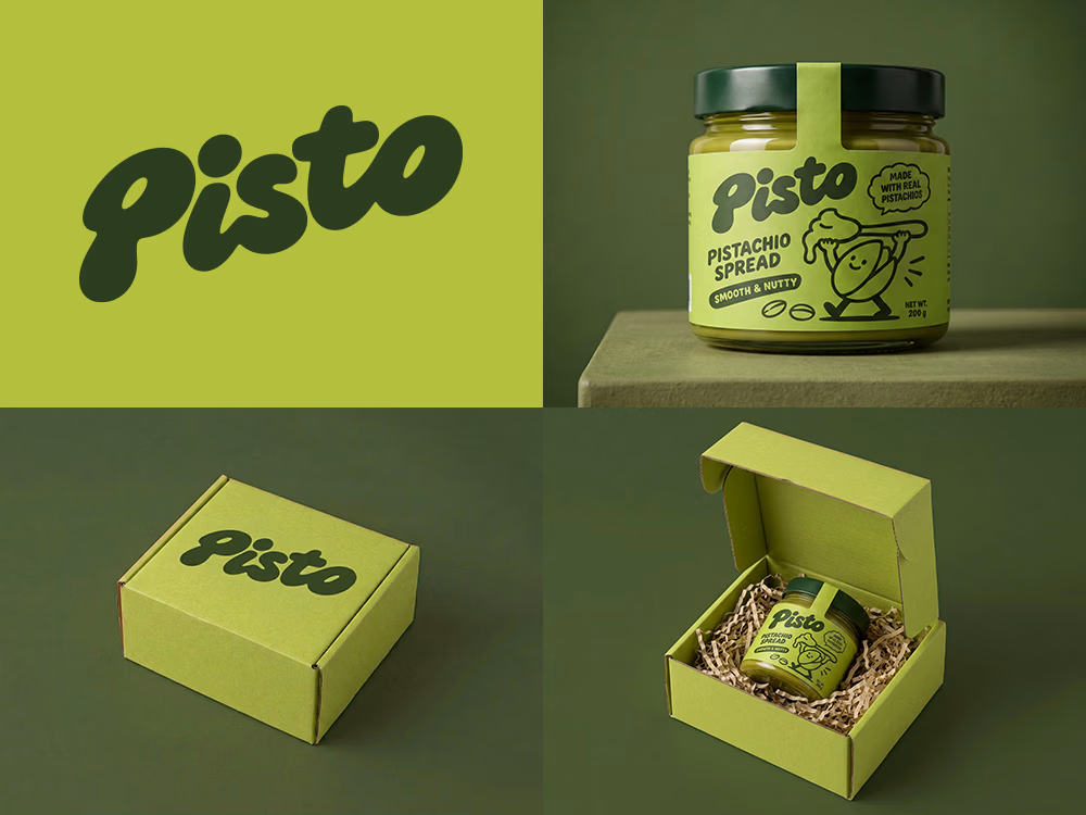
Can AI create a professional-looking logo?
I tried to create a logo concept for a pistachio spread brand using Recraft Logo Maker.
After answering a few questions about the brand and going through several variations, I finally landed on a logo that felt right and captured the fun, fresh personality I had in mind.
But I didn't want to stop at just the logo.
I took it a step further by exploring how the identity could come to life through product packaging and a branded mailer box.
A quick process video is included in the comments.
What do you think?