The network for creativity
Join 1.25M professional creatives like you
Connect with clients, get discovered, and run your business 100% commission-free
Creatives on Contra have earned over $150M and we are just getting started
Back to feedPost

What if one sneaker could adapt to your entire lifestyle?
Whether you’re running errands, heading to a meeting, or stepping out with friends, Loopo fits the moment without compromise.
Using Kittl, I developed the full visual identity from scratch,Then I pushed it further with AI-powered content creation:
Generated high-quality product visuals
Produced brand-style video content optimized for social media
The result? A cohesive, modern sneaker brand that feels ready for market powered by creativity + AI.
This project shows how I help startups and brands:
Turn ideas into visual experiences that convert.
If you're building something and need branding, visuals, or high-converting content, let’s talk.
#SneakerBranding #AIContentCreation #BrandIdentityDesign #KittlDesign #ProductDesign #StartupBranding


The network for creativity
Join 1.25M professional creatives like you
Connect with clients, get discovered, and run your business 100% commission-free
Creatives on Contra have earned over $150M and we are just getting started
Challenges
View all


Related posts

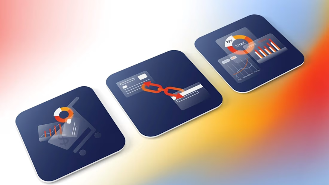
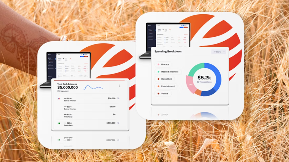
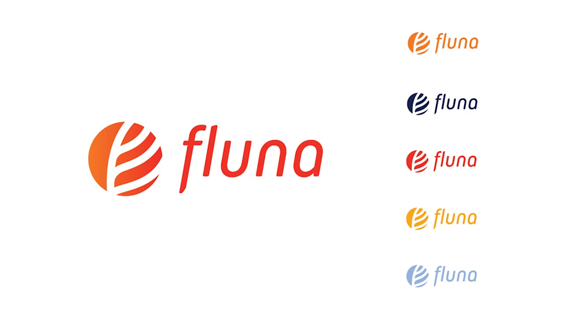
Fintech for agriculture doesn’t have to look earthy, heavy or industrial.
With Fluna, the goal was to create something more premium, distinctive and forward-looking, while still feeling relevant to the market it serves.
What I value most about this project is its longevity. I created this identity four years ago, and the client is still using the logo and visual system today.
For me, good taste in branding is not about following a visual trend. It’s about making choices that still feel right years later, and building a system strong enough to evolve with the company.
#BrandIdentity #BrandDesign #CreativeDirection #FintechBranding




Great work 👍

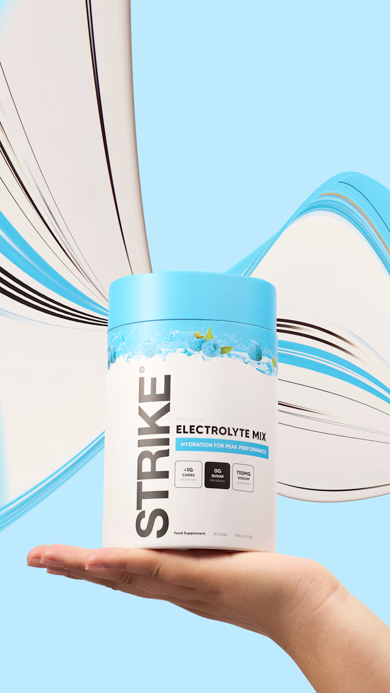
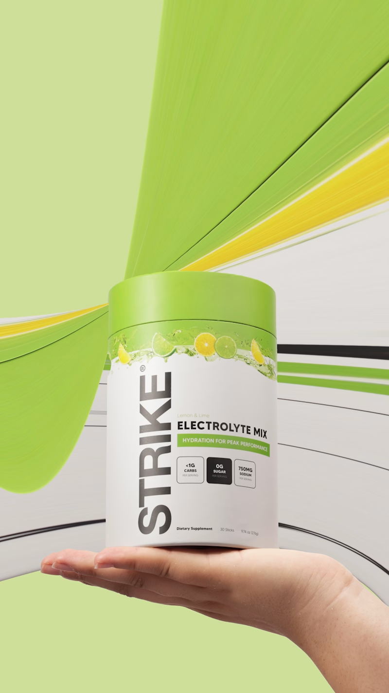
The Tube won and as promised I am making another round to compare 'tube to tube'. Please rate the better pixel stretch effect I did.
Packaging was done in 2023/24 and client operates in UK and UAE. Project can be seen in my work archive: https://www.mariya.design/work-archive/strike-nutrition
8 voted
67%
4 voted
33%
12 votes
Closed

green..(Lemon&Lime)

The Heron chat widget is the product's main touchpoint. It floats over the architect's design software, answers questions about the model, and executes changes once approved.
Designing UI that lives inside another application changes the constraints. It has to hold legibility over dense linework, keep a small footprint, stay clearly branded without competing with the host software, and dismiss cleanly.
The product page demonstrates rather than describes. The widget is shown over a real floor plan, mid-conversation about an HVAC clearance issue, with the affected room highlighted in the drawing behind it. The surrounding layout is kept deliberately quiet so the widget holds the visual weight.


Very professional! 😃