The network for creativity
Join 1.25M professional creatives like you
Connect with clients, get discovered, and run your business 100% commission-free
Creatives on Contra have earned over $150M and we are just getting started
Back to feedPost

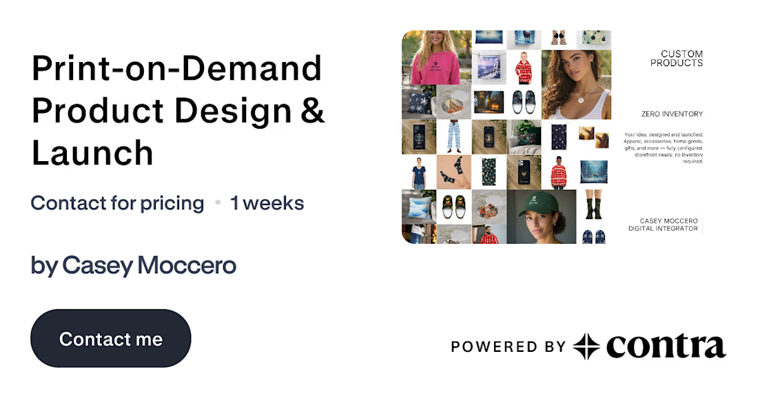
Just listed: Custom Products, Zero Inventory
Print-on-demand design and launch — apparel, accessories, drinkware, home goods, gifts, and more. I handle concept, design, configuration, and storefront setup. No stock, no minimums, no risk.
Open for projects. Let's build something.
#PrintOnDemand #ProductDesign #Merch #Ecommerce
https://contra.com/s/Y7qUEom6-print-on-demand-product-design-and-launch
The network for creativity
Join 1.25M professional creatives like you
Connect with clients, get discovered, and run your business 100% commission-free
Creatives on Contra have earned over $150M and we are just getting started







Related posts

Most people set a budget once and forget it exists until it's too late.
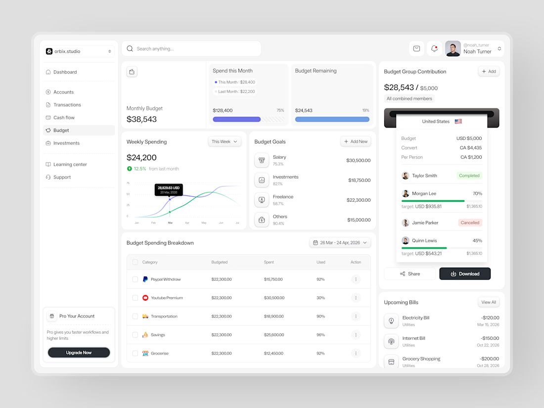
This dashboard was designed to fix that. Weekly spending at $24,200, up 12.5% from last month. Monthly budget at $38,543 with 75% already allocated. Budget goals tracked by category salary, investments, freelance, and others each with a completion percentage and a dollar target that makes progress visible before the month ends.
The group contribution panel takes it further. Four members. One shared budget of $5,000. Taylor completed. Morgan at 70%. Quinn at 45%. Jamie cancelled. A collaborative finance tool that makes shared budgeting feel as clean as personal budgeting should.
Upcoming bills electricity, internet, grocery listed before they hit. A spending breakdown table that shows exactly what was budgeted, what was spent, and how much is left in every category.
This is what budget management looks like when the design treats users like they actually want to be in control of their money.
Does this feel like a dashboard that would change how a team manages their finances together? 👇
Designed by Orbix Studio
Tools: Figma
#DashboardDesign #FintechUI #BudgetApp #UIDesign #WebDesign #ContraFreelance #ProductDesign #SaaSUI


This caught my attention immediately. Great use of contrast and visual hierarchy.


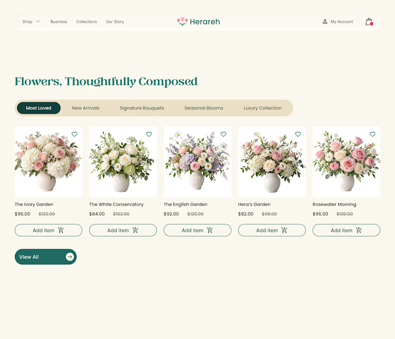
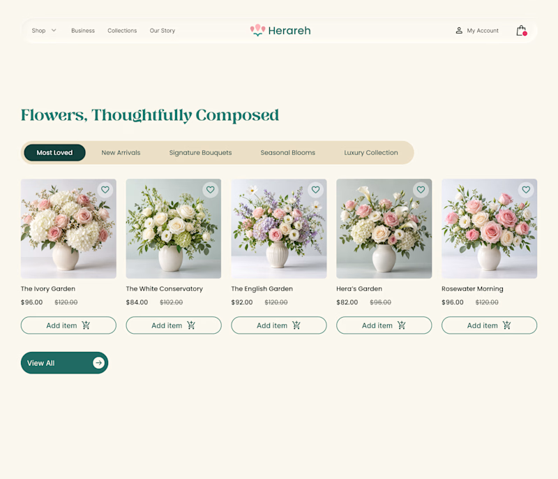

White backgrounds for me, it keeps the flowers as the hero and won't fight with the product grid once you scale past a handful of items. Are you testing this with actual customers or is it mostly a gut call at this stage?

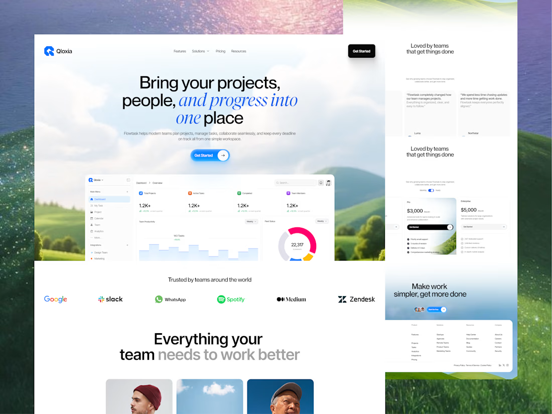
Qloxia - Project Management SaaS Web UI UX Design
Complex workflows deserve clearer interfaces.
Qloxia is a project management and team collaboration SaaS concept designed around a simple product promise:
Bring projects, people, and progress into one place.
The experience combines:
• Project management
• Task management
• Team collaboration
• Planning and analytics
• Progress visualization
• Social proof
• SaaS pricing
• Conversion-focused UX
The design direction uses soft visual environments, editorial typography, rounded components, product-led storytelling, and structured content hierarchy to make the platform feel both professional and approachable.
The goal wasn't to make another dashboard-heavy SaaS website.
It was to create an experience where users can quickly understand the product, explore its capabilities, build confidence, and take action.
Building a SaaS product, dashboard, or web application?
Taqwah can help you transform your product idea into a clear, scalable, conversion-focused UI/UX experience - from strategy and UX to polished interface design.
👉 Send us your product idea and let's discuss how we can design the experience around your business goals.
Project ManagementtaskmanagementsaaswebsiteProduct DesignUX DesignAdobe IllustratorAdobe PhotoshopFigma