The network for creativity
Join 1.25M professional creatives like you
Connect with clients, get discovered, and run your business 100% commission-free
Creatives on Contra have earned over $150M and we are just getting started
Back to feedPost
Design a logo for a Pharmacy Brand
Essence / story: The circular swoop + cupped hand immediately reads as care, protection and service, while the two capsule-like shapes form an abstract M or a pair of pills perfect for a community pharmacy identity. The little human figure above the pills adds a friendly, human-first touch. Key ideas that i use to emphasize in the concept: Care & trust — keep the hand + circle as the anchor element. Medicinal clarity — keep the capsule shapes visually distinct; keep the human figure silhouette intact.

The network for creativity
Join 1.25M professional creatives like you
Connect with clients, get discovered, and run your business 100% commission-free
Creatives on Contra have earned over $150M and we are just getting started
Related posts
Simon Sinek said "People don't buy what you do; they buy why you do it."
This is one of the most important truths many businesses today overlook, and it’s quietly costing them customers. Here's why;
You can have a brilliant idea, hire top engineers and designers, and build an excellent product. You can run different marketing campaigns, yet still struggle to attract customers. Often, what’s missing is the ability to clearly communicate why your product exists which is the real problem it solves.
This isn’t about saying “I built this because I love it.” It’s about explaining, in the simplest and most relatable way, how your product makes life better for your customers. That requires deeply understanding your audience, their challenges, needs, and desires, and shaping your offer to meet them.
And this is exactly where strong branding and marketing comes in.
Through thoughtful branding and logo design, we translate your solution into visual elements — marks, symbols, colors, and style that instantly connect with your audience. So people feel drawn to your brand even before they fully understand your product.
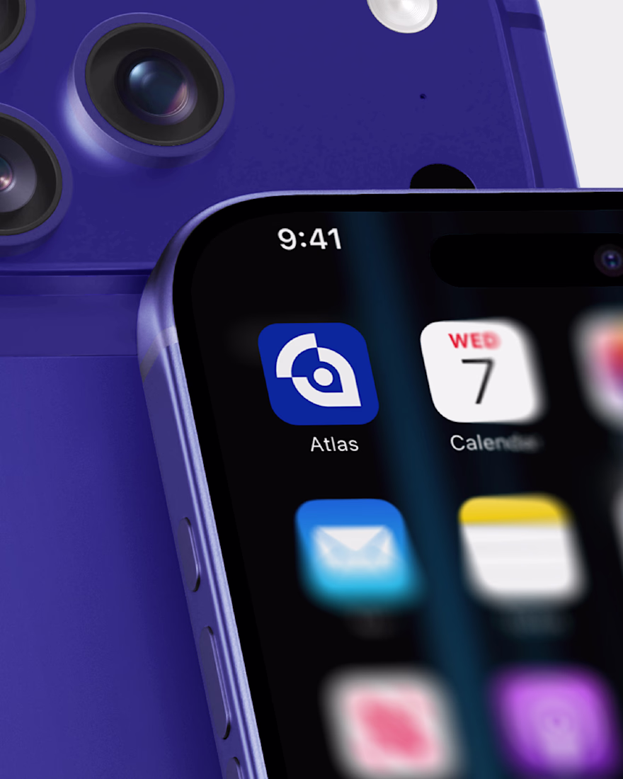
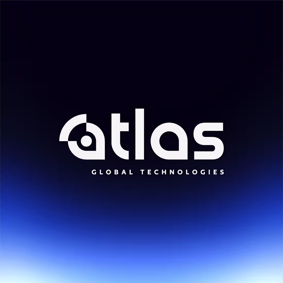
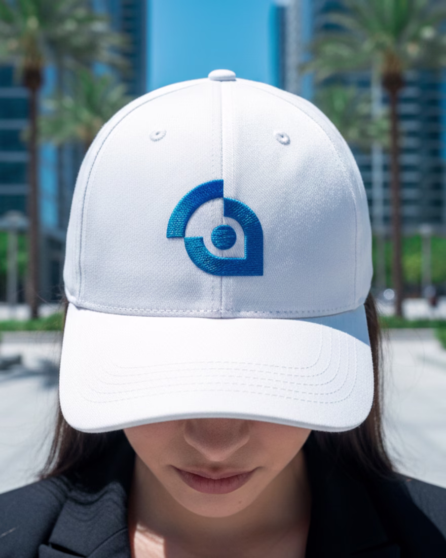
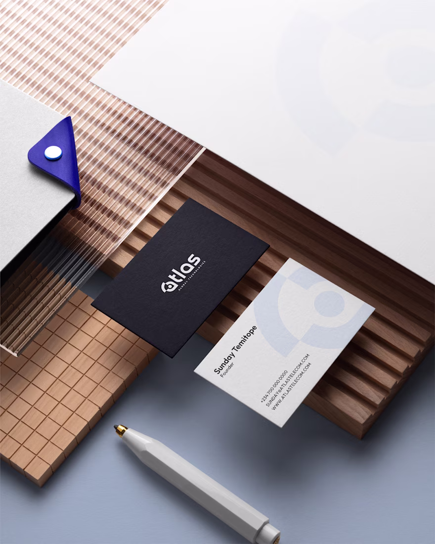
That’s precisely what we did for Atlas Global Technologies. View the case study here ➤ https://www.behance.net/gallery/242205107/Atlas-Telecom-Brand-Identity
Logo, Branding & Marketing Visuals for Atlas Global Technologies ©2025
logodesignerbranddesignerbrandidentityLogo DesignbrandingBrand DesignGraphic DesignAdobe IllustratorAdobe Photoshop
Looks good
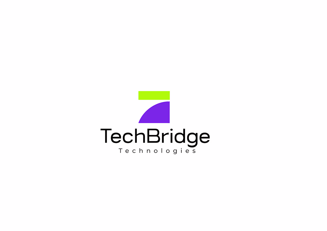
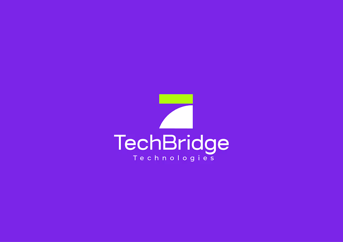
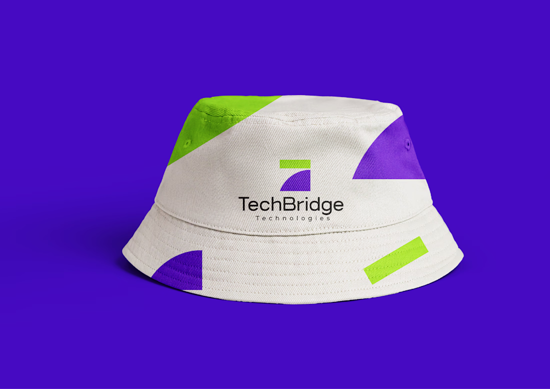
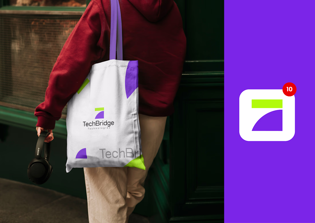
TechBridge Technologies Ltd connects people and businesses with the technology and digital solutions they need to grow. They supply quality laptops, gadgets, and accessories, while also offering website development, branding, and graphic design services.
Thier mission is to bridge the gap between modern technology and creative digital experiences, delivering reliable products and innovative services under one trusted brand.
Awesome!
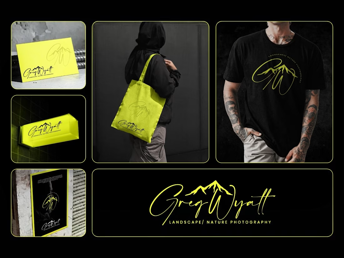
Greg Wyatt — Landscape & Nature Photography | Full Brand Identity System
Project Summary:
A complete brand identity built for a landscape and nature photographer who needed more than a logo — he needed a visual world that matched the scale of what he shoots.
The Brief:
Greg Wyatt captures landscapes the way most people only dream of seeing them. The work is cinematic, emotional, and deeply personal. But his brand wasn't reflecting any of that. The goal was to build a cohesive identity system from the ground up — one that could hold its own across every surface it touched.
The Approach:
Every decision in this project started with one question: does this feel like standing at the edge of something vast?
The signature wordmark was hand-lettered in style to feel personal and authorial — because the best landscape photography is never accidental. It carries the photographer's fingerprint. The mountain mark was integrated directly into the initials rather than placed beside them, making the connection between artist and subject inseparable.
Color was the most strategic call in this project. Neon yellow on deep black creates the kind of contrast that stops a scroll, but it wasn't chosen for that reason alone. It references the exact quality of light that makes a great outdoor photograph — that electric moment just before or after darkness. The brand lives in that moment.
The system was then pressure-tested across real-world applications: a neon illuminated storefront sign, business cards, tote bags, apparel, and a brand pattern — because a logo that only works on a white background isn't a brand system. It's a starting point.
What Was Delivered:
— Primary signature wordmark
— Mountain monogram mark
— Circular badge logo
— Submark and watermark variations
— Brand color and typography system
— Business card design
— Tote bag design
— T-shirt / apparel design
— Illuminated signage mockup
— Brand pattern / texture
— Full brand presentation
The Result:
A brand identity that works as hard as the photographer behind it. Cohesive across every format. Instantly recognizable. Built to grow with the brand rather than date it.
Services Provided:
Brand Identity Design · Logo Design · Visual Identity · Brand Strategy · Print Design · Merch Design · Brand Presentation
Keywords:
Brand Identity, Logo Design, Photography Brand, Signature Logo, Handwritten Logo, Mountain Logo, Nature Photography Branding, Outdoor Brand Identity, Monogram Logo, Visual Identity System, Photographer Branding, Custom Logo Design, Dark Brand Aesthetic, Neon Branding, Apparel Design, Print Collateral, Brand Strategy, Creative Direction, Full Brand System, Freelance Brand Designer
Looks good
Trending
Claude
Claude has entered the design space. How are you using Claude Design?
Contra University
Learn from expert creatives how to earn more using next-gen AI tools.
creativeaiflow
Creative AI workflows are evolving. What tools do you use, and what are their strengths and weaknesses?
portfolioreview
The best portfolios tell a story, not just show a grid. Share yours for feedback.
freelancerlife
Freelancer life is wins, pivots, and everything in between. What’s yours right now?