
tanisha garg
Graphic Designer | I help you designs that grab attention.
Profile in progress
tanisha is building their profile!

Banner Design for the Bm pharmacy.
0
13

Design a logo for a Pharmacy Brand
Essence / story: The circular swoop + cupped hand immediately reads as care, protection and service, while the two capsule-like shapes form an abstract M or a pair of pills perfect for a community pharmacy identity. The little human figure above the pills adds a friendly, human-first touch. Key ideas that i use to emphasize in the concept: Care & trust — keep the hand + circle as the anchor element. Medicinal clarity — keep the capsule shapes visually distinct; keep the human figure silhouette intact.
0
15
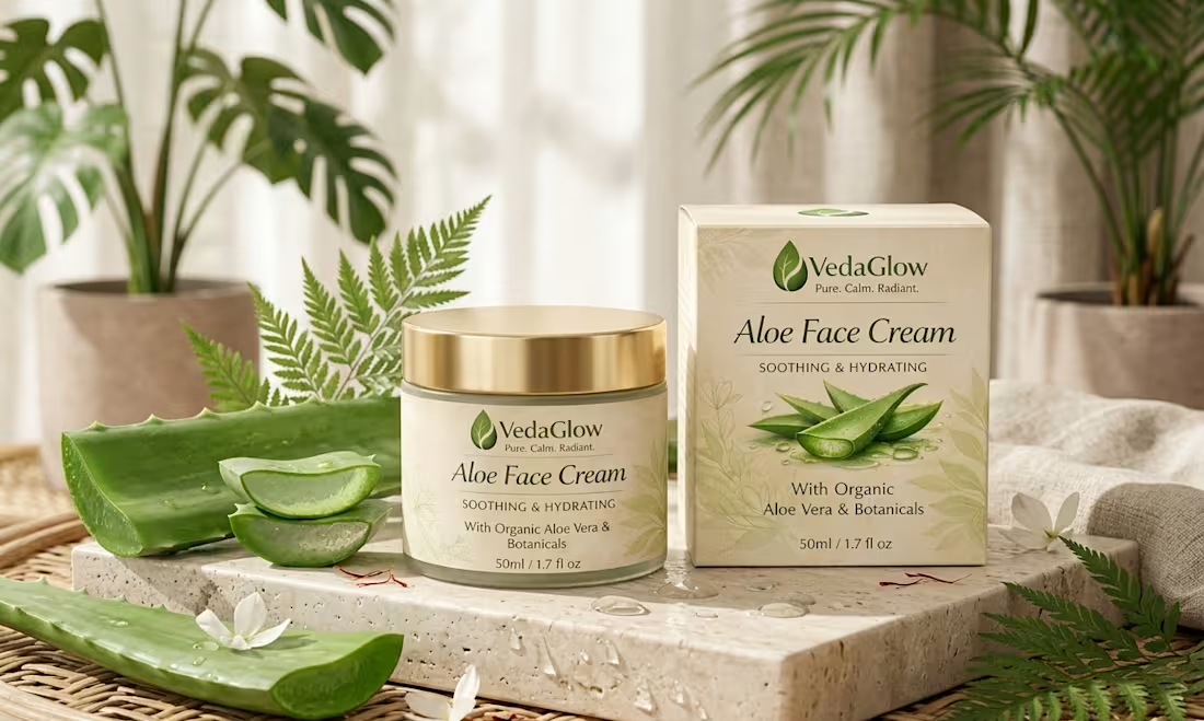
Complete packaging design for the Veda glow Aloe face cream. The packaging uses VedaGlow's signature earthy palette with botanical motifs, creating a cohesive brand experience from shelf to skincare routine.
0
23
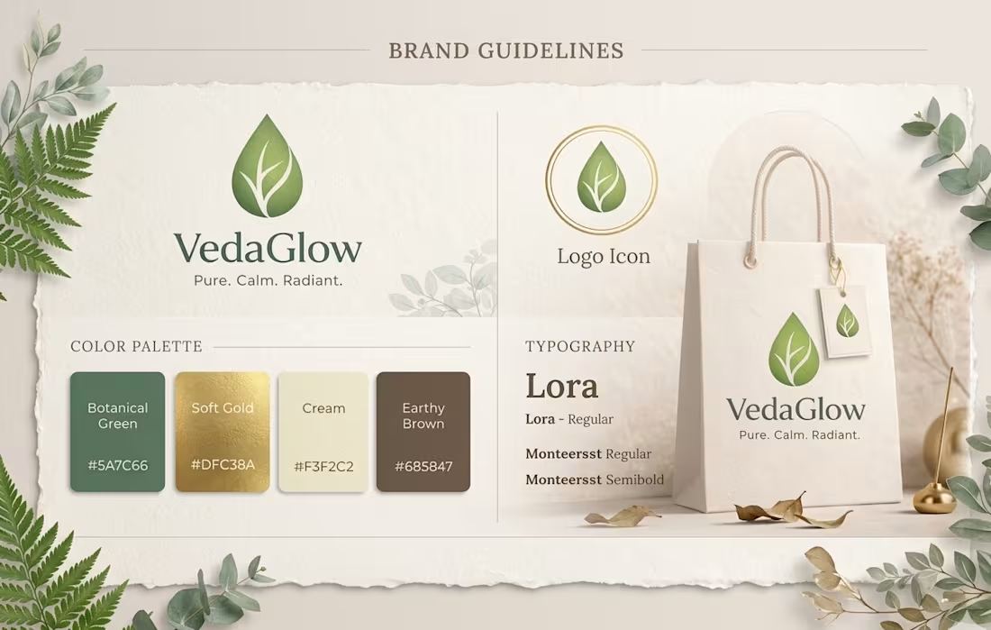
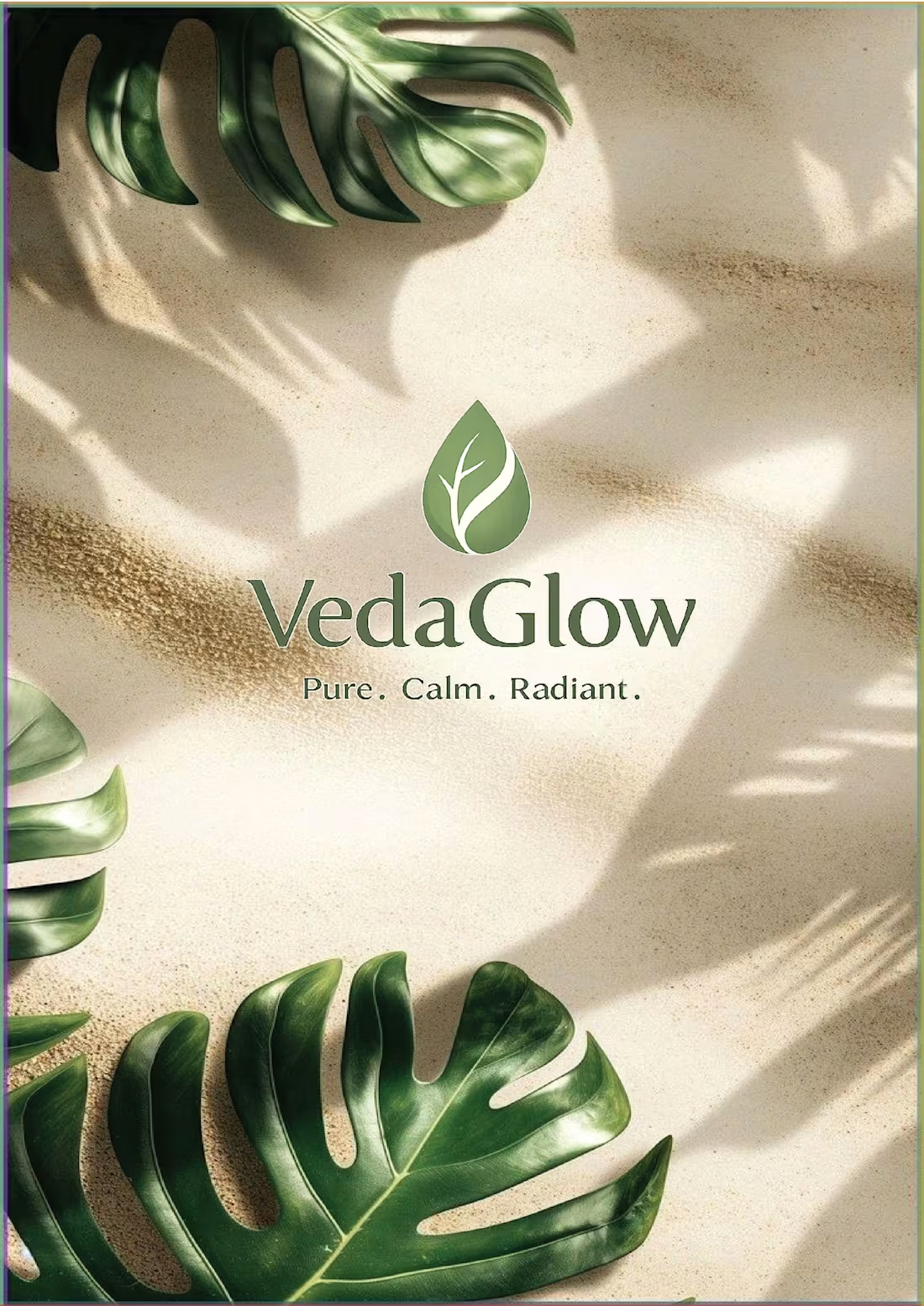
This is the brand identity for Veda Glow - an ayurvedic brand.
2
1
58
A logo is more than a symbol—it's the first impression of a brand.
I create this logo for a ayurvedic brand.
Concept that we use: Nature + Radiance The VedaGlow logo combines a botanical leaf and a glowing drop to represent the fusion of natural ingredients and radiant skin. The leaf symbolizes purity and herbal wisdom, while the drop reflects skincare hydration and nourishment. The surrounding glow represents healthy,luminous skin — the ultimate result of VedaGlow products
What do you think of this concept?
#LogoDesign #BrandIdentity #GraphicDesign #LogoDesigner #Branding #VisualIdentity #CreativeDesign #Contra
0
53