The network for creativity
Join 1.25M professional creatives like you
Connect with clients, get discovered, and run your business 100% commission-free
Creatives on Contra have earned over $150M and we are just getting started
Back to feedPost


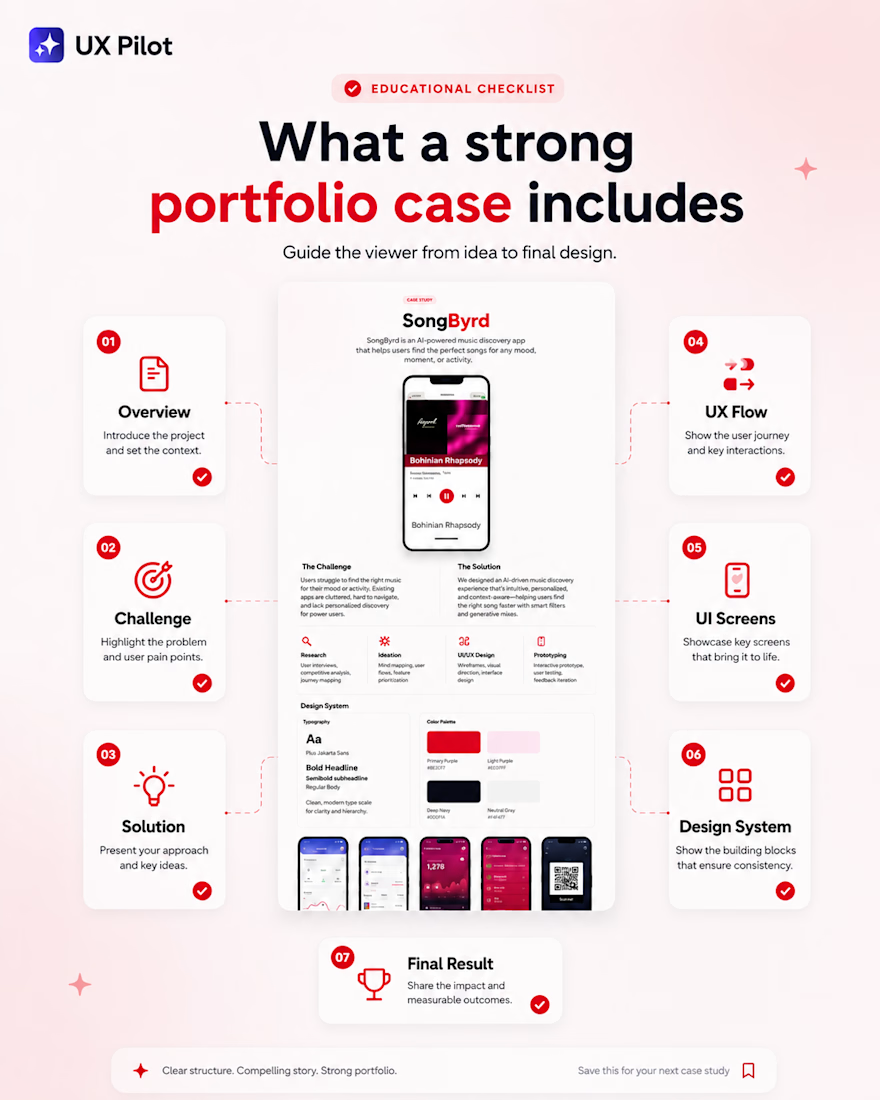
𝗔 𝘀𝘁𝗿𝗼𝗻𝗴 𝗰𝗮𝘀𝗲 𝘀𝘁𝘂𝗱𝘆 𝗻𝗲𝗲𝗱𝘀 𝘀𝘁𝗿𝘂𝗰𝘁𝘂𝗿𝗲.
If your project feels random, it’s usually because the viewer doesn’t understand the journey from idea to final design.
A good case should include:
- hero section
- project overview`
- problem / challenge
- solution
- user flow or UX logic
- key features
- UI screens
- typography and colors
- final result
𝗬𝗼𝘂 𝗱𝗼𝗻’𝘁 𝗻𝗲𝗲𝗱 𝘁𝗼 𝘄𝗿𝗶𝘁𝗲 𝗮 𝗵𝘂𝗴𝗲 𝘀𝘁𝗼𝗿𝘆. 𝗬𝗼𝘂 𝗷𝘂𝘀𝘁 𝗻𝗲𝗲𝗱 𝘁𝗼 𝗴𝘂𝗶𝗱𝗲 𝘁𝗵𝗲 𝘃𝗶𝗲𝘄𝗲𝗿 𝘀𝘁𝗲𝗽 𝗯𝘆 𝘀𝘁𝗲𝗽.
👇 Save this checklist for your next UI/UX case study
The network for creativity
Join 1.25M professional creatives like you
Connect with clients, get discovered, and run your business 100% commission-free
Creatives on Contra have earned over $150M and we are just getting started




Related posts


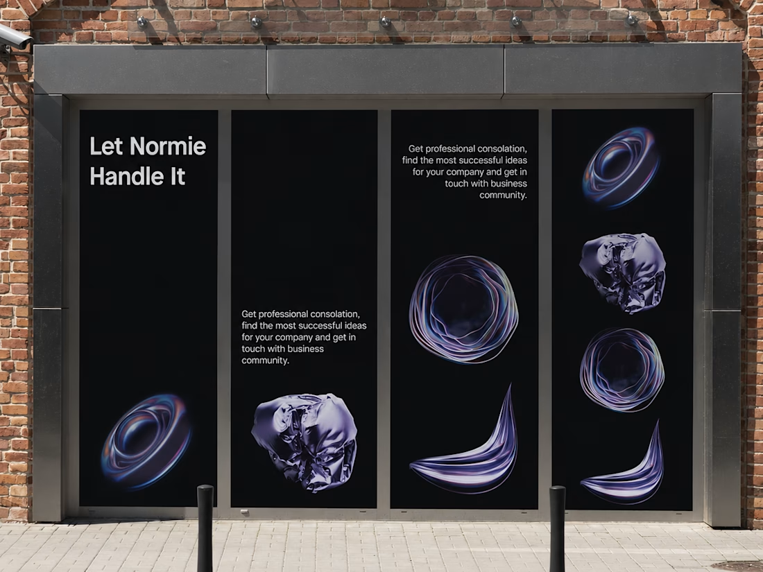
Fantastic execution man, what is the billboard for?

💳 Making Financial Products Feel Simple
I designed this finance website for Sendit, with one goal in mind: make everyday payments feel simple, trustworthy, and effortless.
The design focuses on:
Clear messaging and strong visual hierarchy
Trust-focused finance UI
Simple payment interactions
Clean, modern layouts
Conversion-focused sections
A responsive experience designed around the user
For fintech products, good design isn’t just about looking modern. It’s about making people feel confident when money is involved.
If you’re building a fintech, SaaS, payment platform, or financial product and need a website that communicates trust and clarity, I’d love to work with you.


Solid execution on a hard brief.

Title:
VAULT — Personal Finance & Wallet iOS UI
VAULT is a modern personal finance & wallet app designed for iOS, focused on making everyday money management simple, clear, and intuitive.
The complete UI includes:
• Overview / Home
• Transactions
• Transaction Details
• Budgets
• Analytics
• Profile & Settings
Designed in Figma with an iOS-first approach, clean layouts, clear financial data visualization, and a consistent mobile experience.
📱 iOS UI Design
🎨 Figma
💰 Personal Finance App

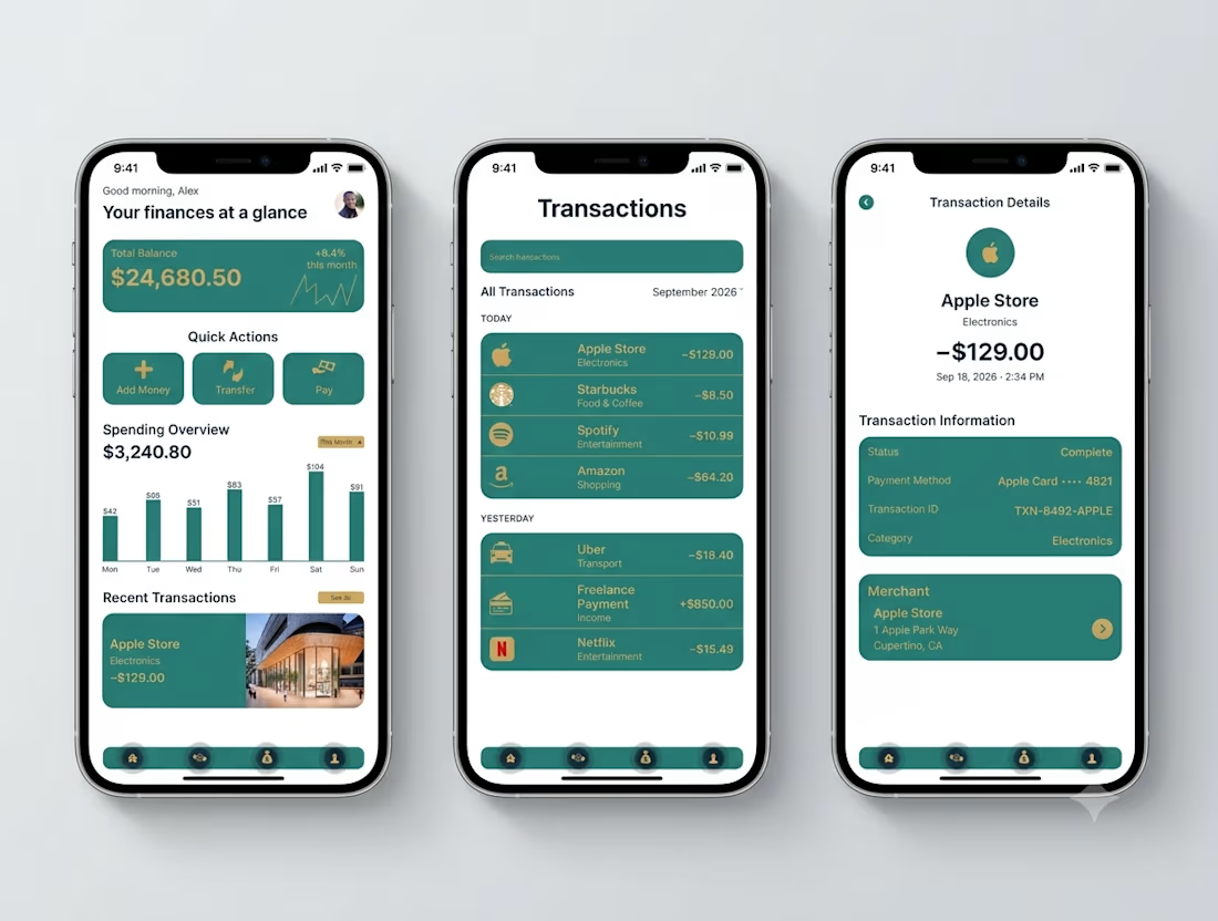

Transaction Details splits the payment record from the merchant card - status, card, transaction ID in one block, the store address in another. That separation is what makes a dispute resolvable.