The network for creativity
Join 1.25M professional creatives like you
Connect with clients, get discovered, and run your business 100% commission-free
Creatives on Contra have earned over $150M and we are just getting started
Back to feedPost
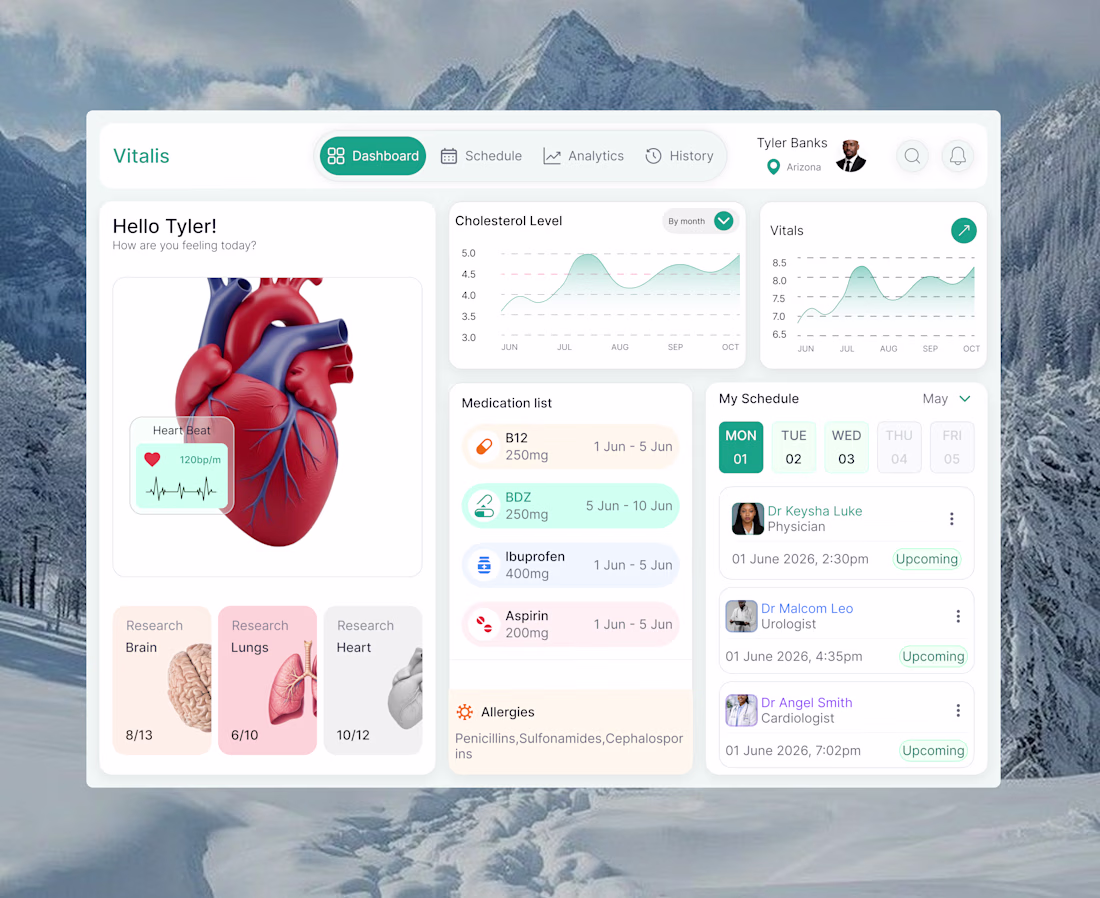
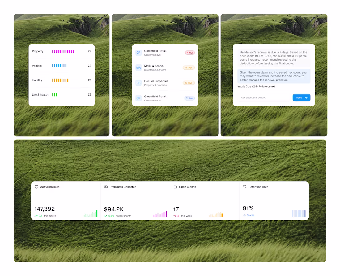
Just wrapped up this healthcare dashboard concept for Vitalis 🩺
The challenge was designing an interface that could present a lot of medical information while still feeling approachable and easy to navigate.
I focused heavily on spacing, visual hierarchy, soft colors, and card-based layouts to create a more comfortable healthcare experience.
The network for creativity
Join 1.25M professional creatives like you
Connect with clients, get discovered, and run your business 100% commission-free
Creatives on Contra have earned over $150M and we are just getting started
Related posts
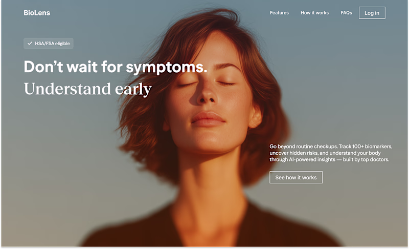
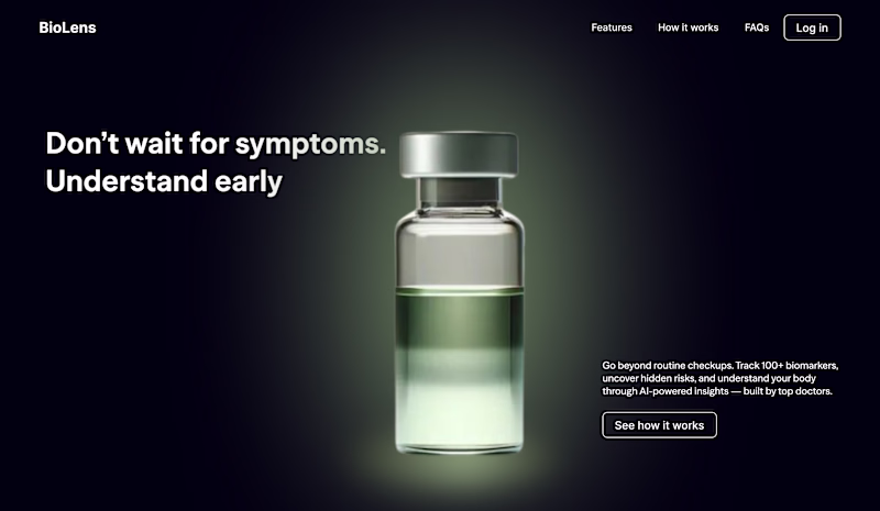
Exploring two visual directions for BioLens — a proactive health intelligence platform designed around early detection, biomarker tracking, and AI-powered insights.
One feels more human. Other feels more clinical-tech.
Which direction feels stronger for a modern healthcare experience?
18 voted
75%
6 voted
25%
24 votes
Closed
Both directions look strong 👏 Personally, I think the human-centered approach feels more trustworthy and modern for healthcare. Curious though which direction did the client connect with more?
Sharing a recent Kajabi build for a concierge pet care brand 🐾
The brand is warm, premium, and very lifestyle-forward – think beach outings, wedding pet coordination, and dog reiki. The site needed to reflect that level of care from the first scroll.
We adapted an existing template into a completely fresh color palette and visual direction, then built it all out in Kajabi – sales page, offer setup, and supporting system pages. Simple scope, but the design work was where it all came together.
Really enjoyed this one.
Stunning!
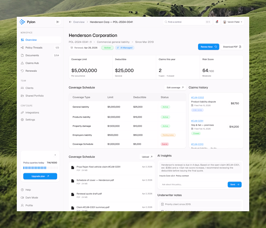
we just wrapped a full redesign, including dashboard, entire application, end to end.
they came to us with cluttered layouts, a SaaS aesthetic that felt heavy and outdated. the kind of ui that makes users feel like they're doing work just to navigate it.
we stripped it back completely with adding more modern visual language, minimal layouts, intentional use of whitespace, a design system that actually scales with the product.
what the client said when they saw it: "you all just changed it and made it so minimal, soothing to the eyes and for greater user experience."
if you are looking for a design partner, dm us or book a call. let's talk about what your product could look like.
Trending
Claude
Claude has entered the design space. How are you using Claude Design?
Contra University
Learn from expert creatives how to earn more using next-gen AI tools.
creativeaiflow
Creative AI workflows are evolving. What tools do you use, and what are their strengths and weaknesses?
portfolioreview
The best portfolios tell a story, not just show a grid. Share yours for feedback.
freelancerlife
Freelancer life is wins, pivots, and everything in between. What’s yours right now?
