The network for creativity
Join 1.25M professional creatives like you
Connect with clients, get discovered, and run your business 100% commission-free
Creatives on Contra have earned over $150M and we are just getting started
Back to feedPost

Bringing Corporate Web Architecture to Enterprise Manufacturing
Industrial and B2B websites are notorious for looking like they were built decades ago. We engineered Khan Textile's new digital presence to prove that massive manufacturing powerhouses can have sleek, high-performing corporate platforms.
Here is a look at a clean, professional, and content-rich multi-page application tailored for international B2B clients, wholesale partners, and global supply chains.
Core Modules Built:
B2B Product Catalogs: High-fidelity, multi-category galleries highlighting detailed technical specifications (GSM, weave structure, sizing, and cotton composition).
Industrial Process Mapping: Custom-designed step-by-step interactive breakdowns showcasing production and multi-stage quality control loops to build client confidence.
Lead Generation Architecture: Location-optimized map configurations, structural contact endpoints, and automated inquiry funnels to handle high-volume bulk order requests.
The Architecture:
Next.js • React • Tailwind CSS • Responsive Grid Layouts
Need a high-converting B2B portal or enterprise software solution for your business? Skip the generic templates. Book your next build with us directly through our Contra profile.
link--> khantextilepk


The network for creativity
Join 1.25M professional creatives like you
Connect with clients, get discovered, and run your business 100% commission-free
Creatives on Contra have earned over $150M and we are just getting started







Related posts

Ventox — Hypercar Landing Page 🏎️🔥
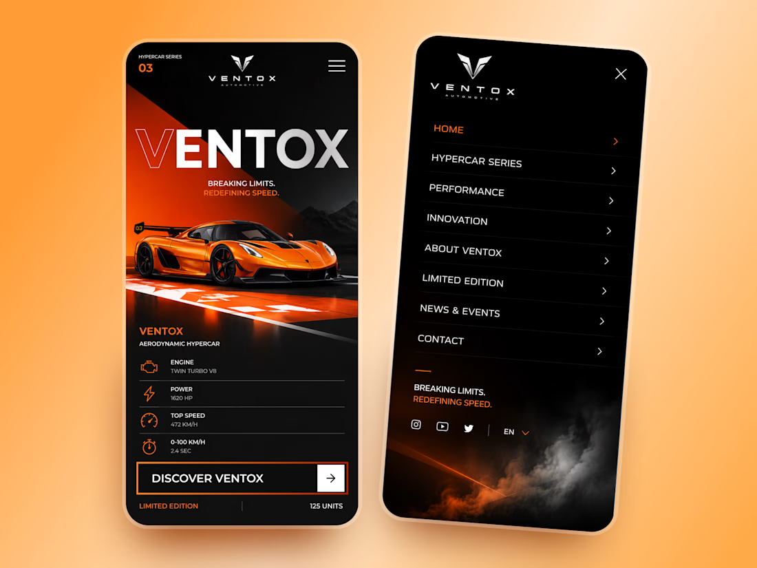
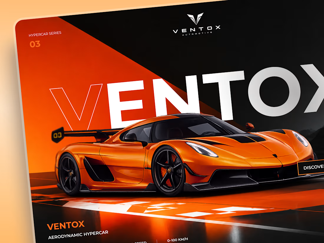
Ventox is a high-performance automotive landing page concept built around speed, exclusivity, and bold visual storytelling.
The design combines a striking orange hypercar, oversized typography, and a dramatic black-and-orange palette to create an immersive digital experience.
Special attention was given to:
A cinematic hero composition that puts the hypercar in the spotlight.
Oversized typography that reinforces the brand's identity.
Sharp geometric shapes and high-contrast colors inspired by speed.
Performance specifications presented in a clean, structured layout.
A prominent CTA that directs attention to the vehicle.
Responsive mobile layouts with simplified content and intuitive navigation.
The result is a bold automotive experience that brings together premium aesthetics, performance-focused storytelling, and clear navigation.
Looking to create a distinctive website for your automotive or luxury brand? Let's build something extraordinary. ⚡





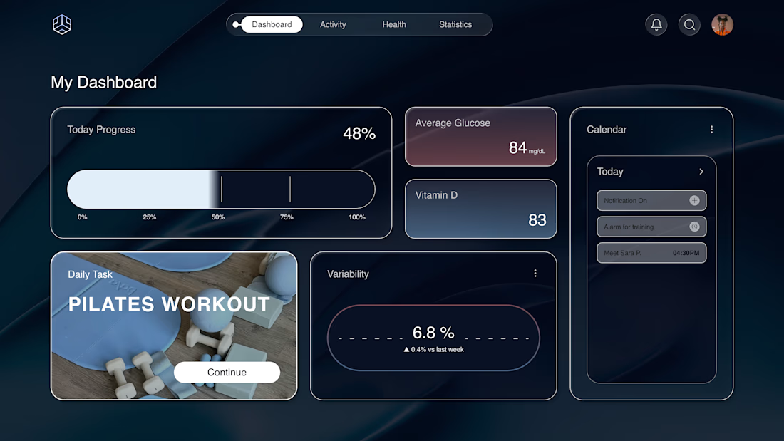
Why does a dashboard full of numbers still feel calm?
Bento grids are everywhere, and done right it's not a trend, it's information design. Each cell = one number, one meaning. The grid does the hierarchy for you.
Our three rules for a bento that works:
One idea per cell. Progress, glucose, one task. If a card needs two sentences, it needs two cards.
Mix the scale. One hero cell, a few mediums, one tiny stat, same gap everywhere.
One warm cell. A single card runs warm against the cool, dark screen; it carries the eye, and the rest stay quiet. No neon needed. Grids are calm. Content is loud. That's the whole trick.

Love the three rules. How do you handle this grid when it collapses to mobile without losing the hierarchy?

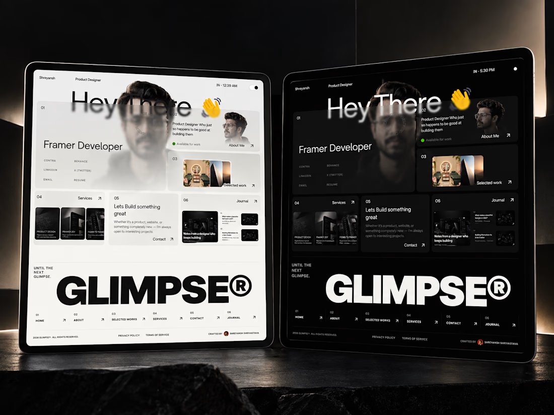
I didn't want to make another “pretty Framer template.”
So I built Glimpse® as a complete portfolio system — motion, CMS, Journal, bento layouts, responsive behavior, and light + dark mode included.
Now I’m curious: does it actually feel like a system, or does it still feel like a template?
I’d genuinely love your take. 👀