The network for creativity
Join 1.25M professional creatives like you
Connect with clients, get discovered, and run your business 100% commission-free
Creatives on Contra have earned over $150M and we are just getting started
Back to feedPost

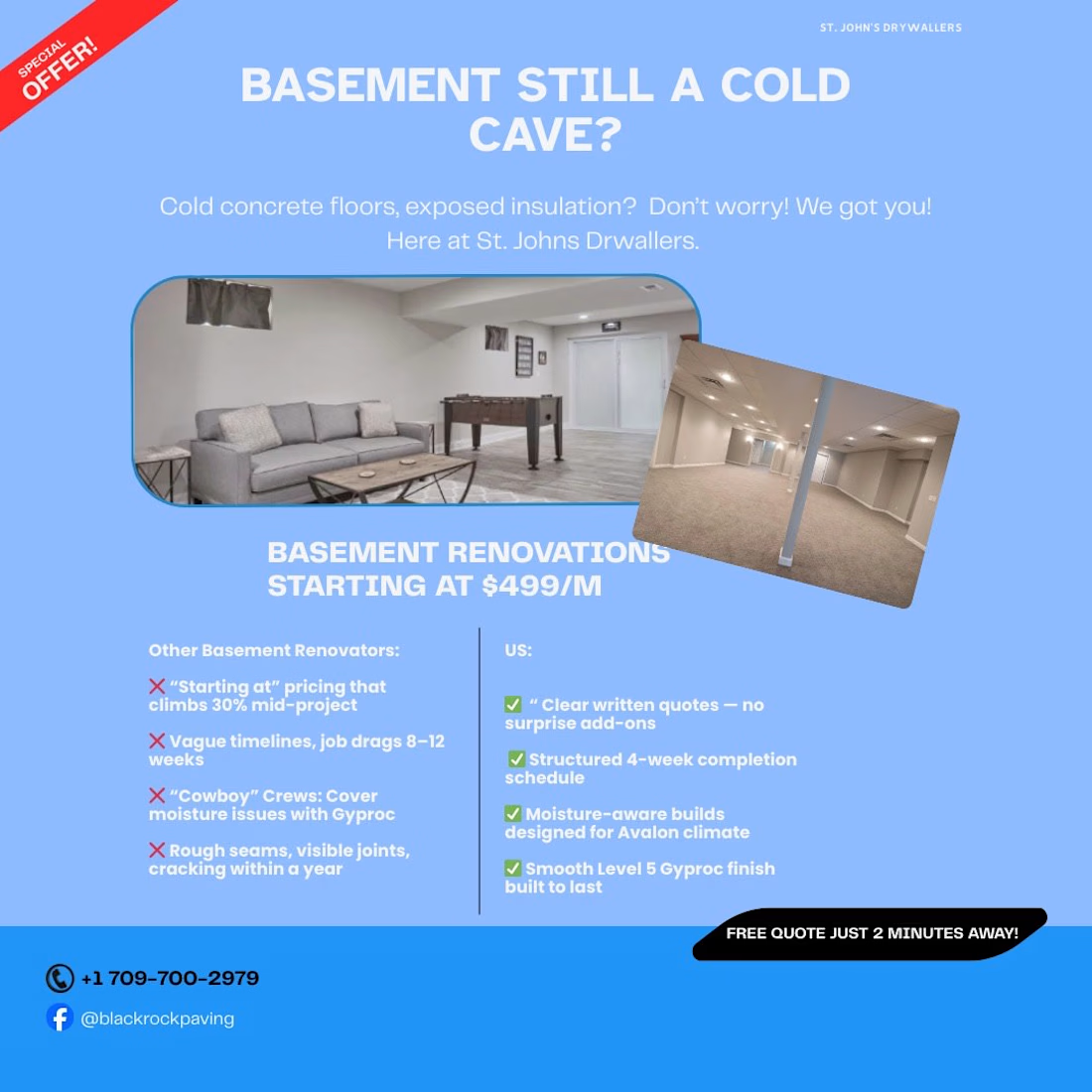
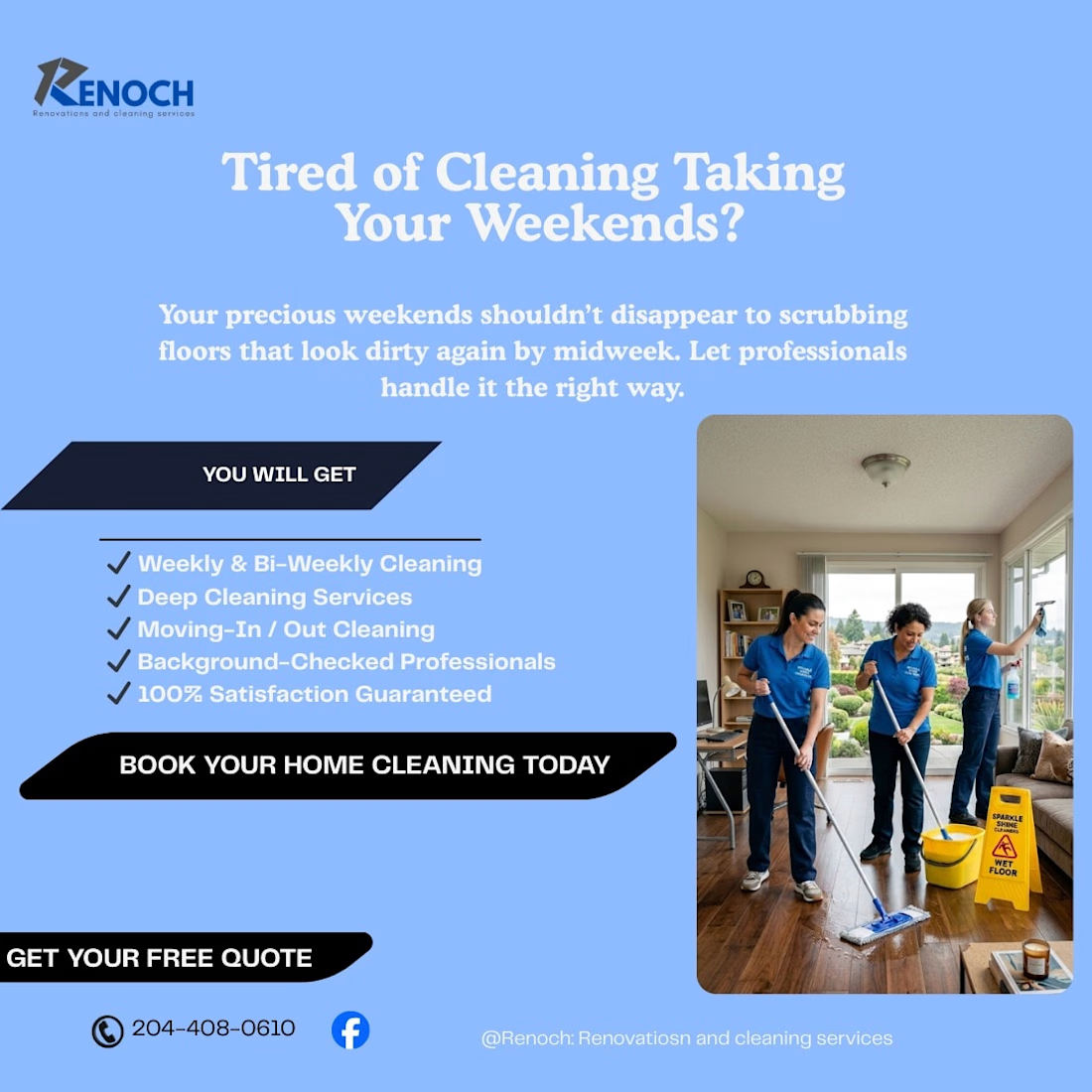
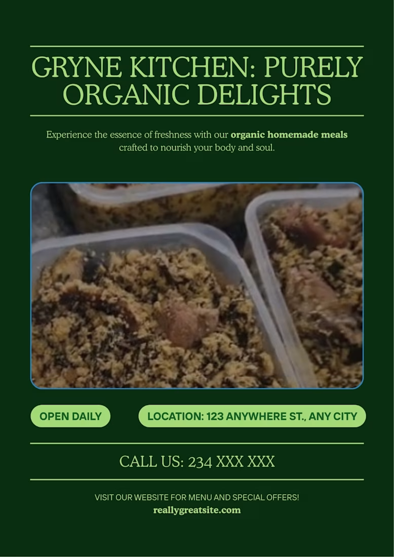
Some recent sales generating Posters Designed accross different fieleds

The network for creativity
Join 1.25M professional creatives like you
Connect with clients, get discovered, and run your business 100% commission-free
Creatives on Contra have earned over $150M and we are just getting started

Challenges
View all


Related posts


The layered collage and oversized type make this feel more like an editorial opener than a standard portfolio—great use of movement to build curiosity.

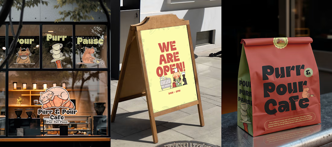
Purr & Pour Café 🐈☕
Purr & Pour is a playful branding concept for a cat-themed café, created around the idea of bringing together two things that make people ridiculously happy — coffee and cats.
For Purr & Pour, I developed a warm and playful visual language designed to feel welcoming, quirky, and a little bit whimsical.
The project explored how illustration can extend beyond a single artwork and become a complete brand experience — from the visual identity and illustrated elements to packaging, menus, social media creatives, and other customer touchpoints.
I wanted the brand to feel like a place where you could grab a coffee, hang out with cats, and forget about everything else for a little while. 🐾


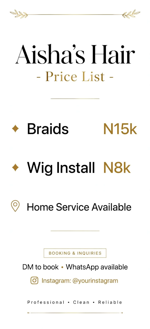
Aisha's Hair - Price List Flyer
I created a minimal and luxury price list flyer for a hair stylist brand.
Goal: Show prices clearly and make the brand look premium.
What I did:
Used elegant black and gold colors for luxury feel
Simple layout: Braids N15k, Wig Install N8k
Added Home Service Available for more bookings
Clean call to action: DM to book + WhatsApp
Tools: Canva
Result: A classy, easy-to-read price list that helps the client get bookings on Instagram and WhatsApp.

Putting the prices in gold rather than the service names is the choice doing the real work — the number becomes the accent instead of the thing you soften, which is the reverse of how most rate cards handle it. Hard numbers do date a flyer fast though; did she get an editable file so she can reprice without coming back to you?