The network for creativity
Join 1.25M professional creatives like you
Connect with clients, get discovered, and run your business 100% commission-free
Creatives on Contra have earned over $150M and we are just getting started
Back to feedPost

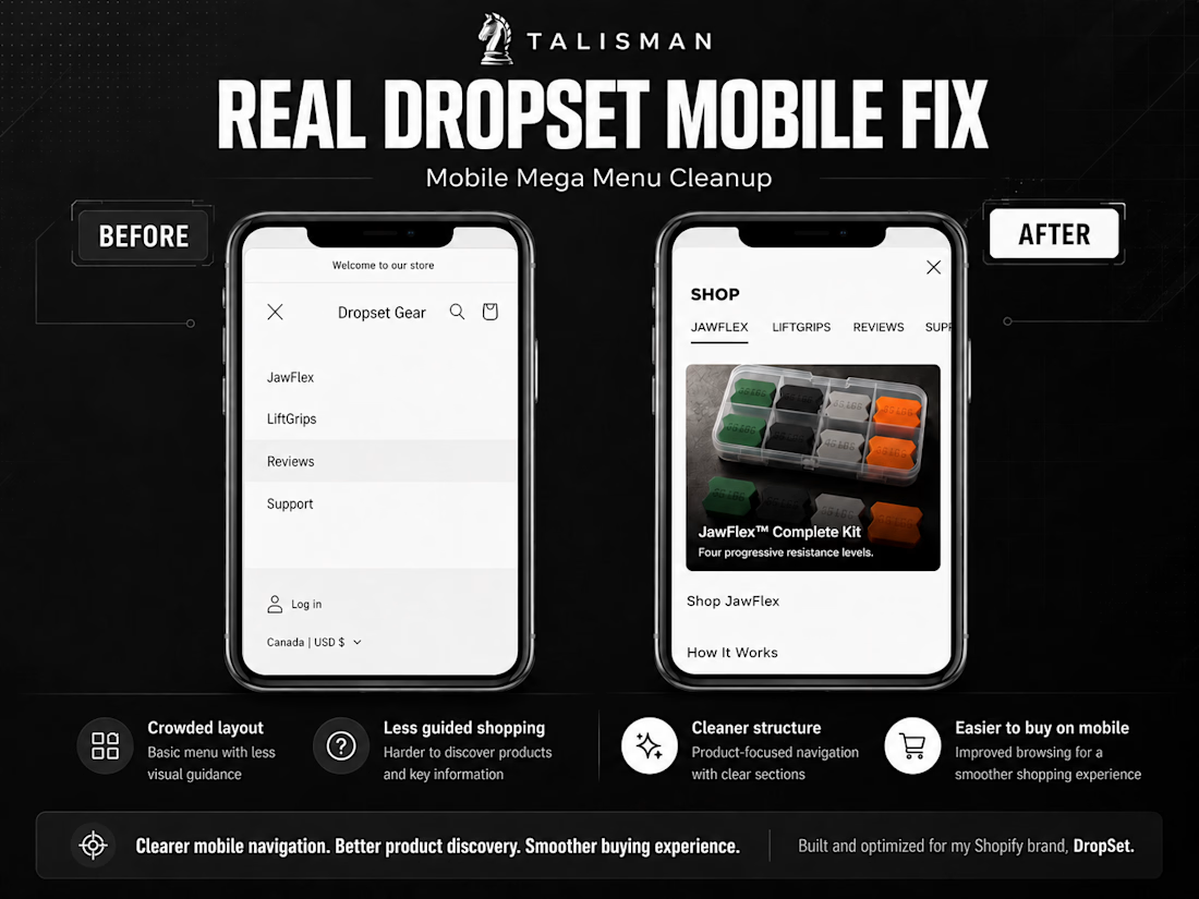
This project focused on improving the responsive behavior of the DropSet Shopify storefront across mobile, tablet, and desktop.
The problem
Several storefront elements required better behavior across screen sizes, including spacing, alignment, overflow, sizing, and overall layout consistency.
What I improved
• Mobile spacing and alignment
• Responsive section behavior
• Horizontal overflow issues
• Element sizing and positioning
• Desktop-to-mobile consistency
• Header and content spacing
• Layout behavior across multiple viewport sizes
Process
I inspected the affected sections across different screen sizes, identified the relevant theme and CSS behavior, implemented targeted fixes, and retested each change across mobile and desktop.
Result
A cleaner, more consistent responsive storefront that maintains the intended design across major screen sizes.
Completed for DropSet, my independently operated Shopify e-commerce brand.


The network for creativity
Join 1.25M professional creatives like you
Connect with clients, get discovered, and run your business 100% commission-free
Creatives on Contra have earned over $150M and we are just getting started
Trending
retrofuturism
Share your favorite designs from the past exploring the distant future. Or your own take on the aesthetic 🚀
halftone
Dots. Texture. Grain. Let's see your designs using the halftone technique.

Midjourney
Creatives are showing off what they're making with Midjourney.
colorgrade
Video editors sound off: How do you enhance the mood of your video in color grading?
Related posts


Hi! 👋 I’m looking for someone to help with a time-sensitive Shopify shop launch for one of my clients.
The UI/design is pretty much done — I’m mainly looking for someone who can help take it from “designed” → fully set up, tested, and live on the client’s Shopify site.
Ideally, you:
Have strong Shopify experience, particularly with theme transitions / migrations
Understand how to move from an old theme to a new one without negatively impacting SEO, URLs, redirects, metadata, etc.
Are comfortable troubleshooting the little technical things that come up during a launch
Have a good eye for design, so you can make sure the final implementation stays true to the approved UI
Can work fairly quickly, as this one is time-sensitive
It’s technically a “small” project, but I’d also love to connect with someone who could become part of my Shopify/design roster for future projects.
I’m intentionally looking to delegate more of the hands-on Shopify execution so I can stay focused on creative direction, design, and client strategy — so if we work well together, there could definitely be more work down the road. ✨
If this sounds like you, drop a comment or DM me with a little bit about your Shopify experience + portfolio/examples of launches you’ve worked on, and I’ll reach out!
I’m also posting this as a gig, but figured it’d be easier to start here through the community. 💛

Bump up!

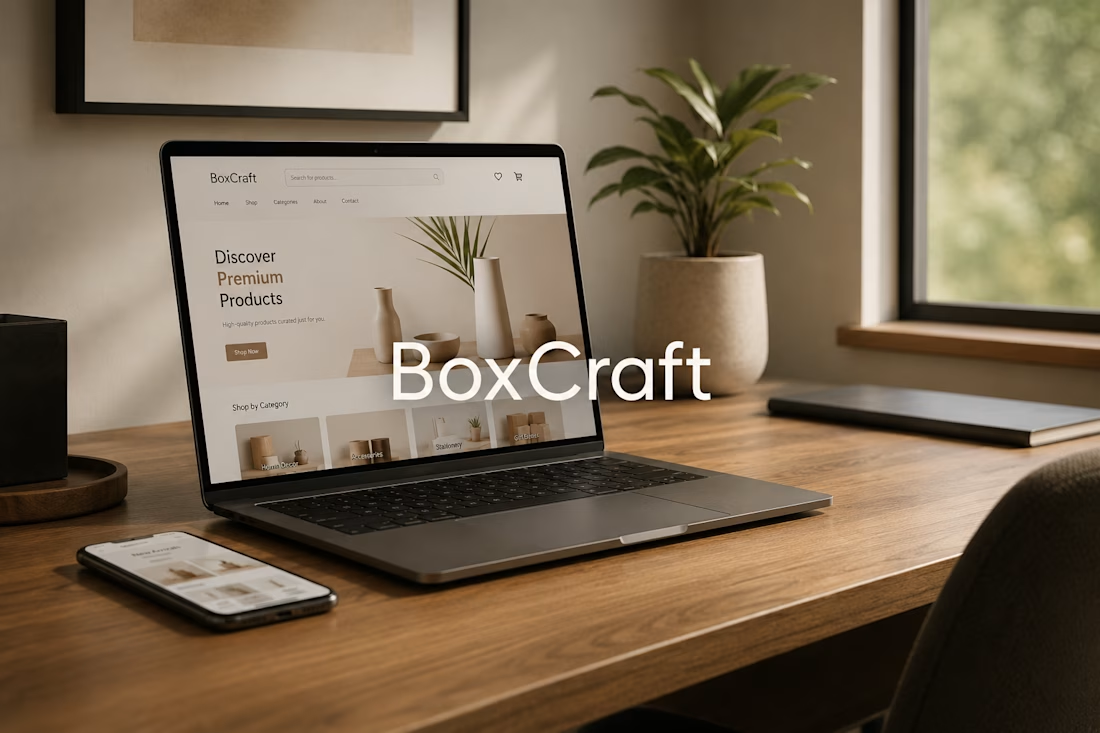
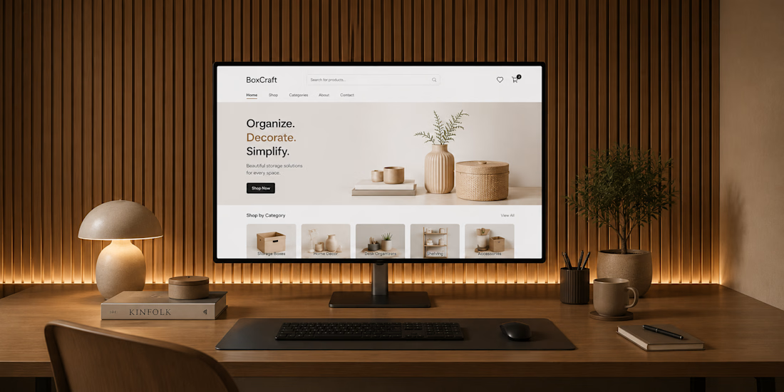
🎁 Just shipped: BoxCraft a custom gift box configurator for Shopify
Built this to solve a problem most static bundle products don't handle well letting customers actually build their own box instead of picking from a fixed set.
How it works:
→ Customers select items within a set slot limit (e.g. "choose any 5")
→ Live price and slot counter update in real time as they pick
→ Checkout stays locked until the slot requirement is met
→ Selected items bundle into the cart via Shopify's Cart AJAX API no page reloads, no third-party bundling app needed
Built entirely with Liquid + JavaScript on the Shopify side.
If you're running a gift sets, curated bundles, or subscription-style product line and want something more interactive than a standard variant picker this is exactly the kind of custom logic I build.



Creative work


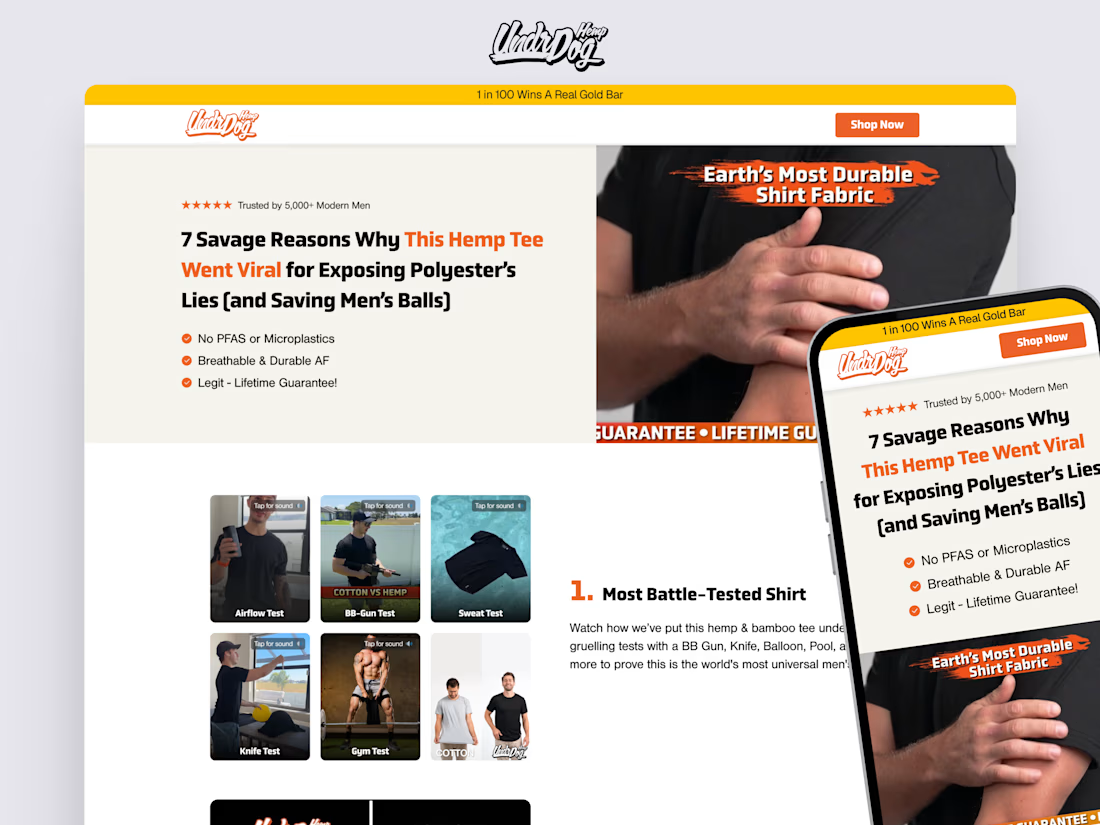
"7 Reasons Why" listicle I designed for UndrDog Hemp, created as a paid-traffic landing page to test different messaging angles and drive visitors toward the product page.
The page uses curiosity to introduce the seven reasons, with stress tests, product comparisons, and customer reviews helping visitors understand what makes the t-shirt different.
The design also uses supporting images, GIFs, and a clear final CTA to keep the experience engaging and guide visitors toward the next step.


Amazing work