The network for creativity
Join 1.25M professional creatives like you
Connect with clients, get discovered, and run your business 100% commission-free
Creatives on Contra have earned over $150M and we are just getting started
Back to feedPost

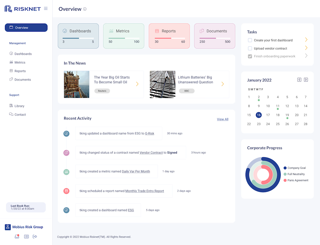
Risknet Analytics Dashboard


The network for creativity
Join 1.25M professional creatives like you
Connect with clients, get discovered, and run your business 100% commission-free
Creatives on Contra have earned over $150M and we are just getting started




Related posts

Which color direction feels right for this digital payment app?
While designing a full digital payment app experience, from bills overview to payment confirmation, I explored two different color systems for the entire flow. Same screens, same functionality, just a different accent palette and personality.
Option 1 - Neon Green. Bold, high-energy, and gives a sharp, fintech-forward feel throughout the journey.
Option 2 - Cyan/Blue. Cool, modern, and leans more premium and trustworthy across the whole app.
Would love your honest UX/UI take, which direction feels more trustworthy, engaging, and appropriate for a digital payment app, and why? 👇
3 voted
38%
5 voted
62%
8 votes
Closed

Cyan/Blue

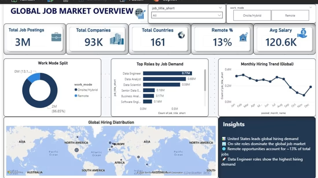
I analyzed 3M+ job postings across 161 countries and 93K companies to identify hiring trends, in-demand roles, work-mode patterns, and salary insights.
I used Python for data cleaning and preprocessing, SQL for analysis, and Power BI to build an interactive dashboard.
Key areas analyzed:
• Global hiring demand
• Top job roles by demand
• Remote vs. onsite/hybrid work patterns
• Average salary trends
• Monthly hiring trends
This project helped me turn a large dataset into clear, actionable insights for understanding the global job market.