The network for creativity
Join 1.25M professional creatives like you
Connect with clients, get discovered, and run your business 100% commission-free
Creatives on Contra have earned over $150M and we are just getting started
Back to feedPost
How I structure a B2B landing page that actually converts
Most B2B landing pages make the same mistake: they lead with features instead of the problem. Here's the framework I used designing a mobile-first landing page for an AI-powered career advisory platform.
- Structured product storytelling Instead of dumping every feature into a grid, I broke the product into a narrative: what it does, how it works, who it's for. Each section answers one question and moves the visitor closer to the CTA. No section exists just to fill space.
- Social proof placed where doubt lives Logos and testimonials don't go in a random strip at the bottom. They sit right after the sections where a buyer is most likely to think "does this actually work?" Proof goes where skepticism peaks.
- One clear conversion path The entire page funnels toward one action: booking a demo. Not "sign up," not "learn more," not three competing CTAs. One path, repeated at natural scroll breakpoints.
- Mobile-first, always B2B buyers check things on their phones more than most founders think. Every layout decision started at mobile and scaled up, not the other way around.
The result: a clean, conversion-focused page that guides enterprise buyers from problem to demo request without friction.
The network for creativity
Join 1.25M professional creatives like you
Connect with clients, get discovered, and run your business 100% commission-free
Creatives on Contra have earned over $150M and we are just getting started

Related posts
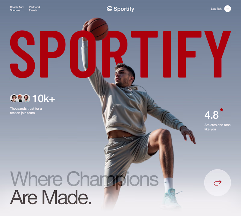
Which landing page wins in the first 3 seconds?
Same product. Same goal. Two different creative directions.
A focuses on energy, motion, and emotional impact.
B prioritizes clarity, structure, and instant readability.
If you landed on this website for the first time, which version would make you stay longer?
Vote A or B and tell me why.
Your feedback helps shape the final design.
12 voted
50%
12 voted
50%

24 votes
Closed
I really appreciate the subtle positioning of the 'Sportify' branding across both versions. Letting the player's head and the basketball layer overlapping the text in Version A gives it such great depth, while keeping it crisp and structural underneath the countdown in Version B...
I explored two color directions for this creative agency landing page.
🔵 Blue – Clean, modern, and professional.
🔴 Red – Bold, energetic, and eye-catching.
Which one would you choose for a creative agency website?
💙 Blue
❤️ Red
Vote below and let me know why! 👇
4 voted
50%
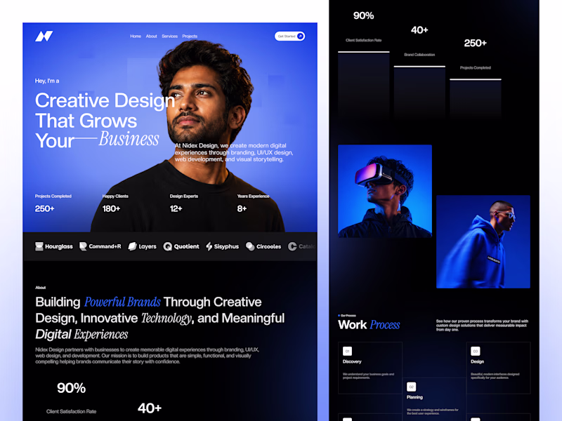
4 voted
50%
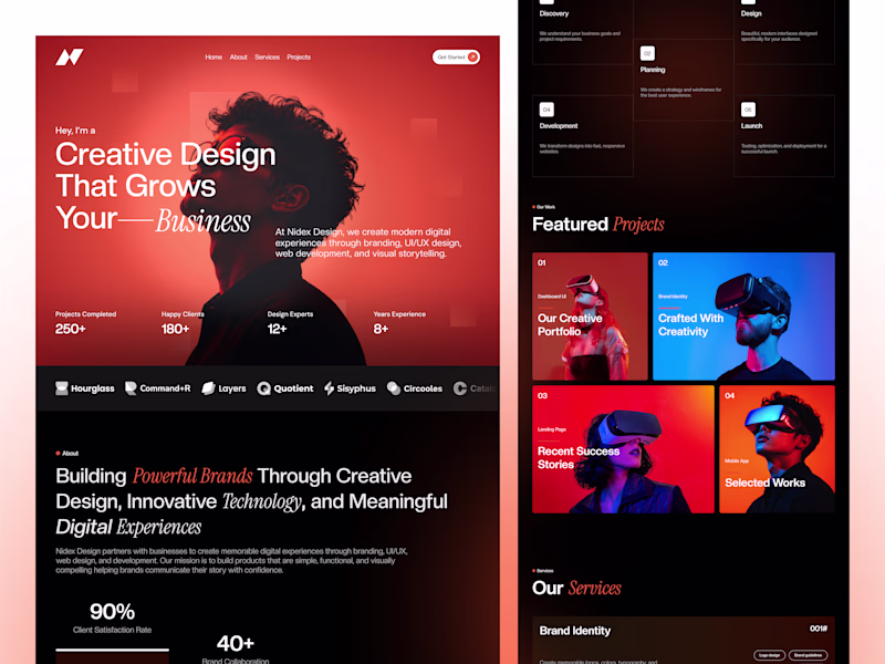
8 votes
Closed
Red one is upper cool😍
Electric vehicles are often associated with innovation, so I wanted the landing page to reflect that feeling too. A clean layout, bold typography, and plenty of whitespace let the product stay at the center of the experience
Wow😍 🙌
Trending
Claude
Claude has entered the design space. How are you using Claude Design?
Contra University
Learn from expert creatives how to earn more using next-gen AI tools.
fifaworldcup2026
The World Cup is here and the whole world's watching. How are you designing for the world stage?
creativeaiflow
Creative AI workflows are evolving. What tools do you use, and what are their strengths and weaknesses?
freelancerlife
Freelancer life is wins, pivots, and everything in between. What’s yours right now?