The network for creativity
Join 1.25M professional creatives like you
Connect with clients, get discovered, and run your business 100% commission-free
Creatives on Contra have earned over $150M and we are just getting started
Back to feedPost

Here is a quick breakdown of my recent homepage redesign for Contra, focused on optimizing screen real estate and reducing visual noise:
Decluttered Visual Hierarchy: Removed the oversized right-hand challenge panel and countdown banners to allow user posts to occupy primary screen real estate.
Streamlined Navigation: Relocated and grouped secondary menu items down to the left sidebar, creating a unified workspace layout.
Eliminated Redundancies: Resolved overlapping UI elements—such as duplicate chat buttons—to create a cleaner, more intuitive user journey.
Feedback and thoughts are always welcome! 🎉
#UIDesign #UXDesign #UserInterface #UserExperience #ProductDesign #UIUX #figma


The network for creativity
Join 1.25M professional creatives like you
Connect with clients, get discovered, and run your business 100% commission-free
Creatives on Contra have earned over $150M and we are just getting started






Related posts

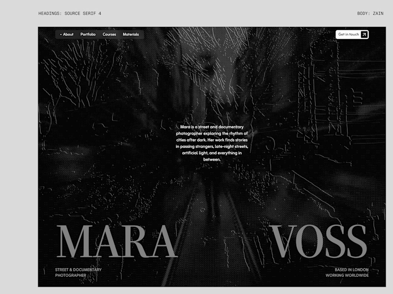
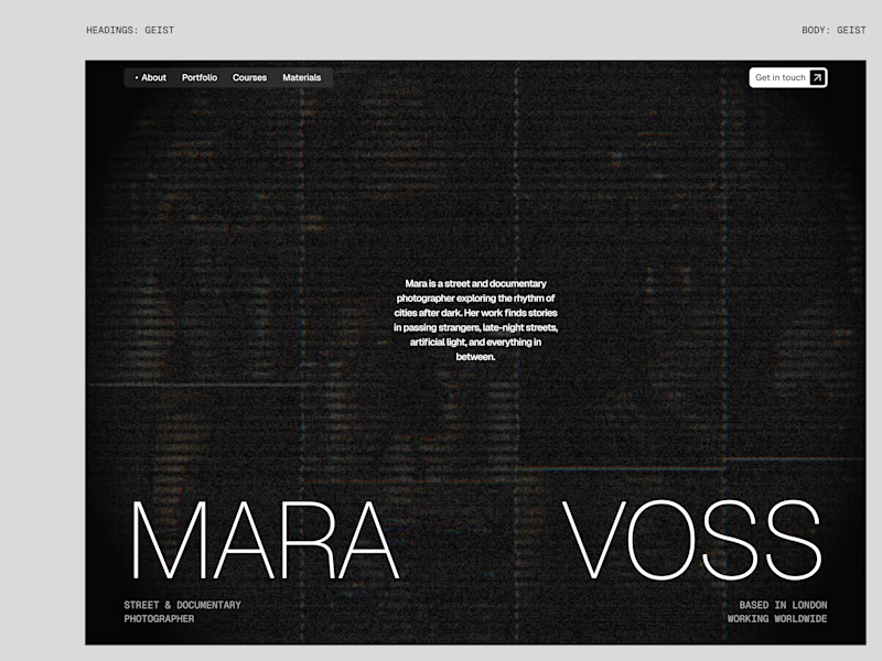
I tried experimenting a little with my previous design. I changed the fonts and background a bit. Which version do you like better?
22 voted
73%
8 voted
27%
30 votes
Closed

New design for sure. The distressed texture in the type makes it feel like actual street photography lives inside the letters. The previous version is clean but this one has grit.

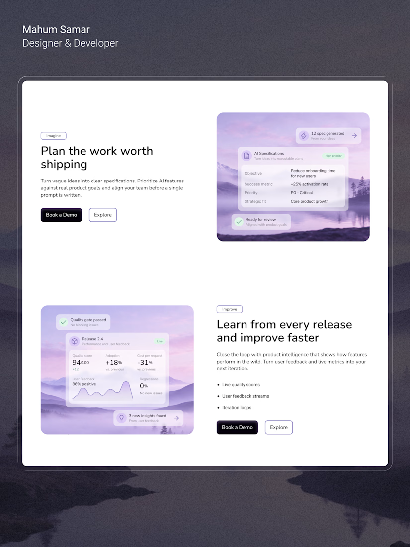

Nice to see the feature section taking shape. Curious how it will connect to the rest of the template.

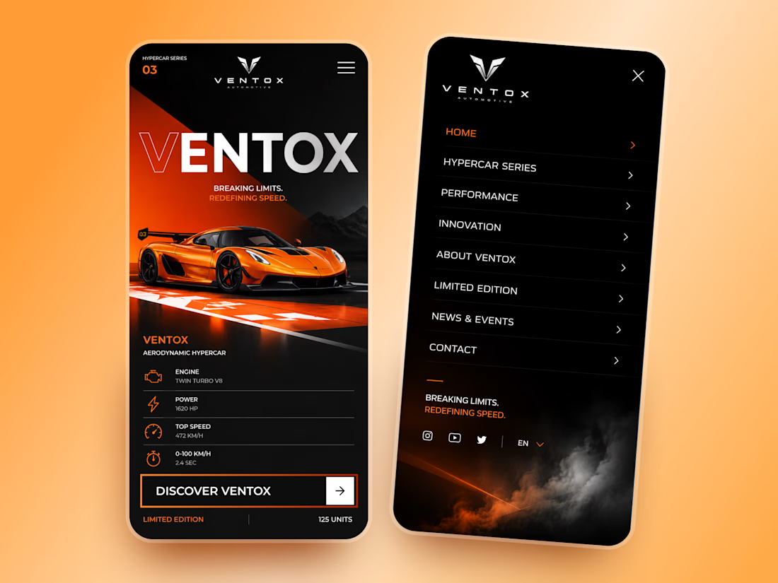
Ventox — Hypercar Landing Page 🏎️🔥
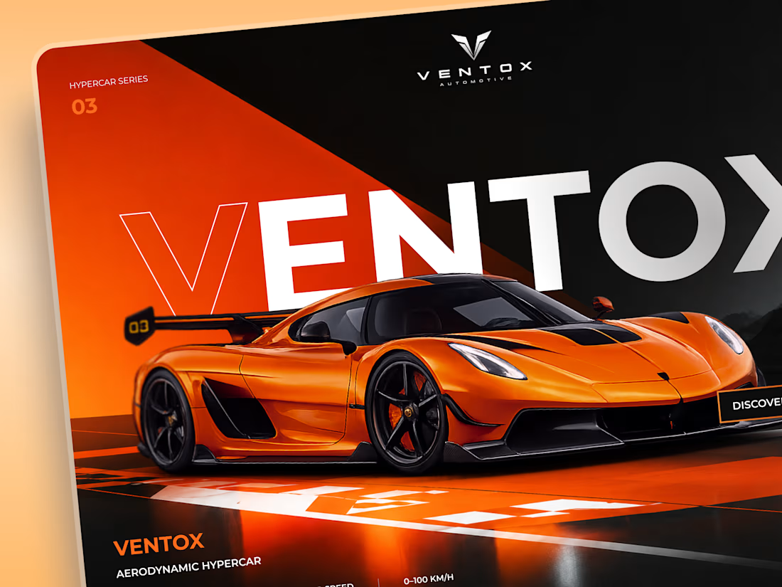
Ventox is a high-performance automotive landing page concept built around speed, exclusivity, and bold visual storytelling.
The design combines a striking orange hypercar, oversized typography, and a dramatic black-and-orange palette to create an immersive digital experience.
Special attention was given to:
A cinematic hero composition that puts the hypercar in the spotlight.
Oversized typography that reinforces the brand's identity.
Sharp geometric shapes and high-contrast colors inspired by speed.
Performance specifications presented in a clean, structured layout.
A prominent CTA that directs attention to the vehicle.
Responsive mobile layouts with simplified content and intuitive navigation.
The result is a bold automotive experience that brings together premium aesthetics, performance-focused storytelling, and clear navigation.
Looking to create a distinctive website for your automotive or luxury brand? Let's build something extraordinary. ⚡