The network for creativity
Join 1.25M professional creatives like you
Connect with clients, get discovered, and run your business 100% commission-free
Creatives on Contra have earned over $150M and we are just getting started
Back to feedPost


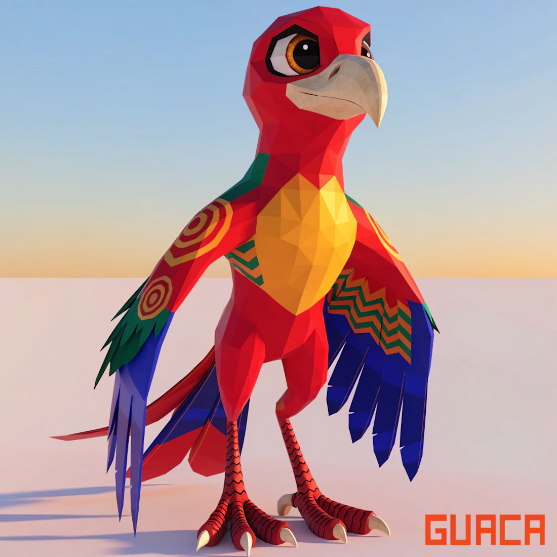
GUACA is a mascot system I developed for the #recraftchallenge, designed around the idea of building a consistent character identity across multiple visual contexts.
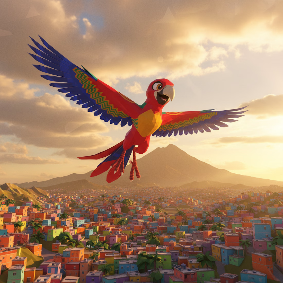
The mascot exists within a fictional world called Auránia, a mountain city shaped by light, elevation, and symbolic storytelling. GUACA is a scarlet macaw who functions as a guide and cultural symbol tied to memory, resilience, and observation.
I designed GUACA to remain consistent across multiple applications:
- a standing hero pose
- a flying pose
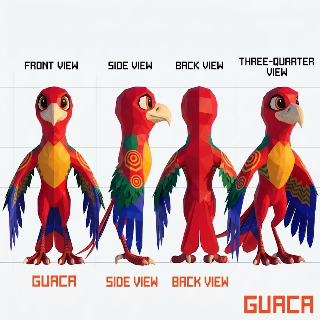
- an expression sheet
- a full 360 turnaround
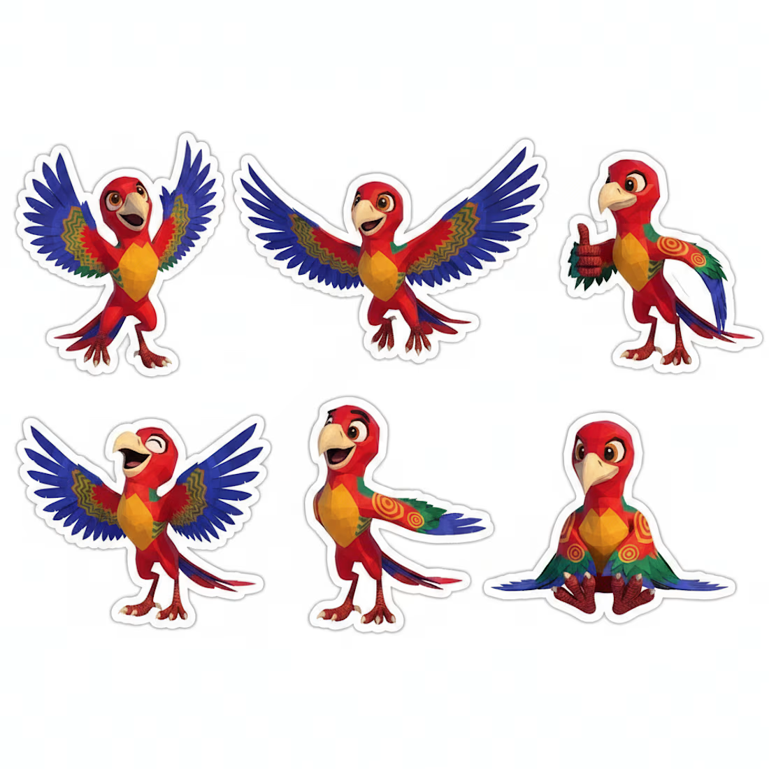
- a sticker system
- and a logo/wordmark
Each piece was built to reinforce the same visual language: strong silhouette, simple geometry, limited but intentional color palette, and a stylized early-2000s-inspired 3D aesthetic.
The goal was to test how far a single character can be pushed as a cohesive identity system without losing recognizability across different formats. Rather than treating each image as an isolated illustration, I approached it like a small fictional game world where every asset has to feel like it belongs together.
https://www.recraft.ai/project/3471e3e4-68b0-4158-9ac9-a189f95e7be4

The network for creativity
Join 1.25M professional creatives like you
Connect with clients, get discovered, and run your business 100% commission-free
Creatives on Contra have earned over $150M and we are just getting started







Related posts

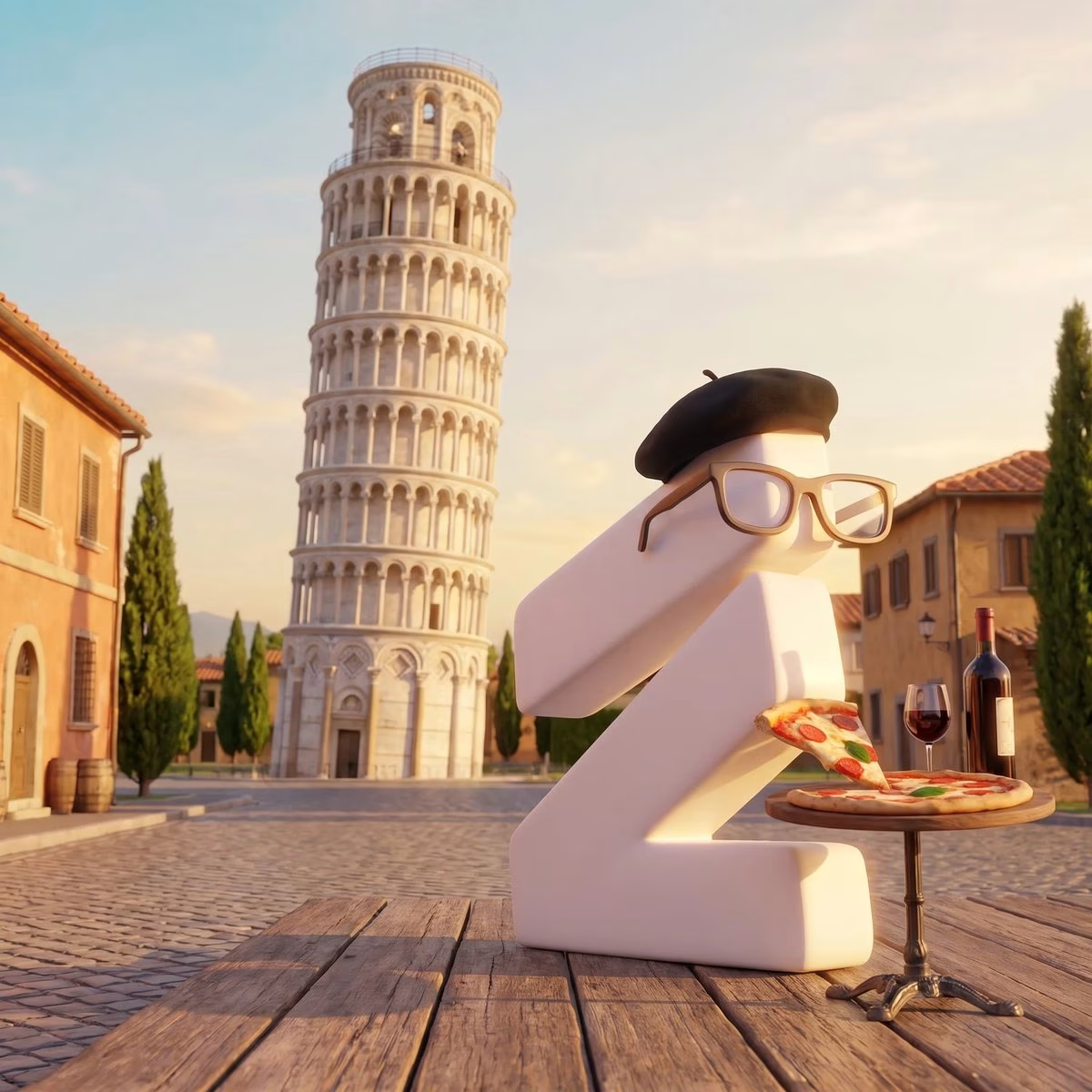
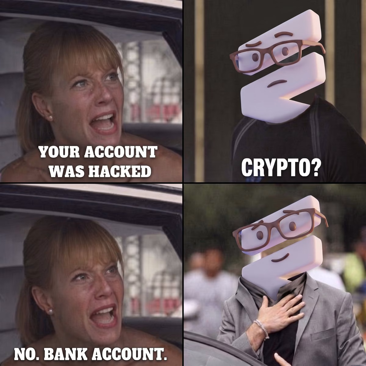
Adding personality to a DeFi tech project is always a challenge, so we came up with the idea of using a mascot.
Meet: The Everything Intern.
It lets the client talk about less “serious” stuff, have fun interactions with the community, and educate them with visuals that don’t take days to make.
Which is almost as important as building great technology! An important but overlooked part of building an online brand.


Nice

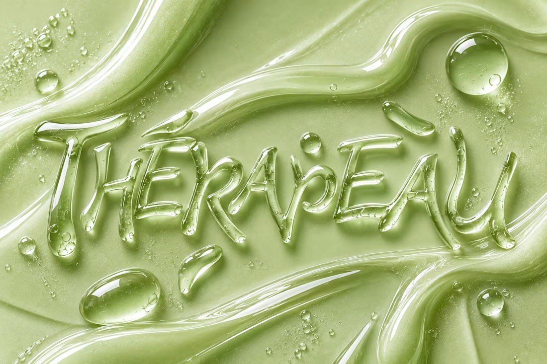
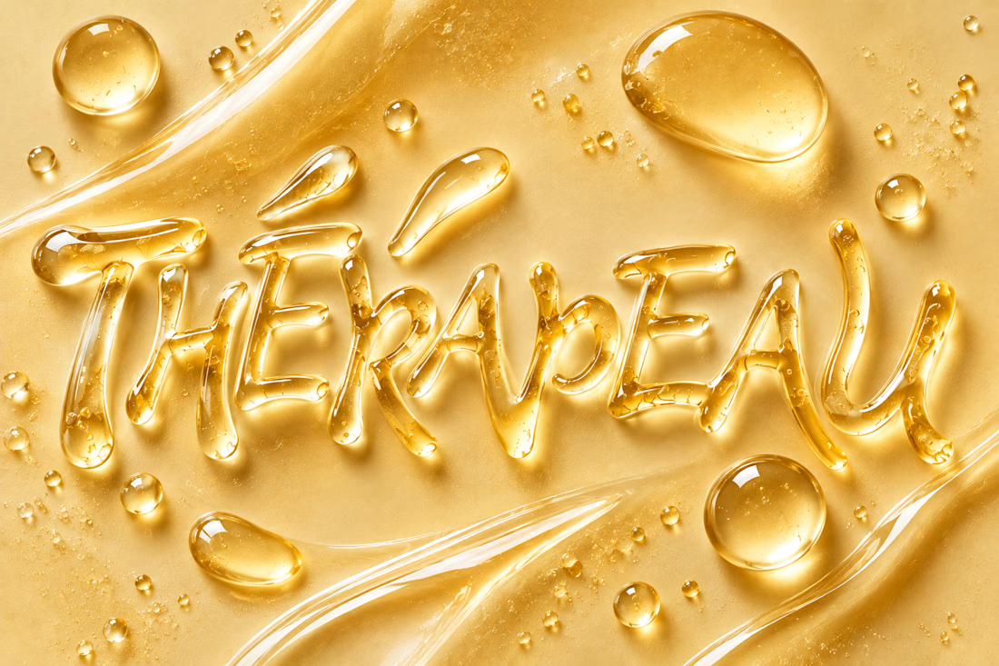
Exploring imagination through texture, typography and skincare. ✨
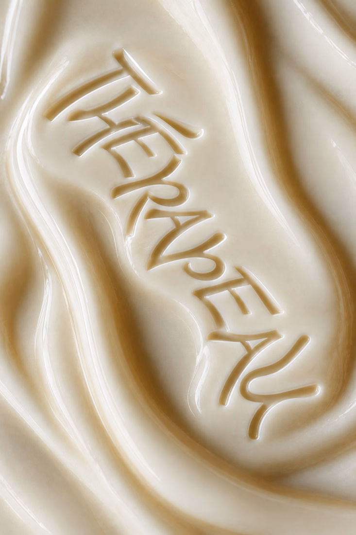
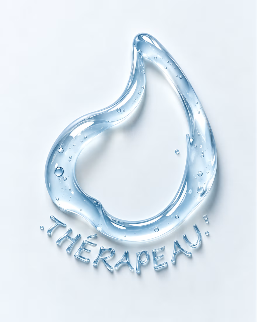
For THÉRAPEAU, I wanted to push the visual identity beyond packaging and explore how serum, gel and cream could become part of the brand language itself.
Using the core wordmark as a starting point, I experimented with different materials, colours and tactile expressions — turning skincare textures into typography and visual studies.
These explorations were created together with ChatGPT as part of the creative process, helping me test ideas quickly while keeping the final brand direction grounded in my own identity system and design decisions.
A small study in how texture can become communication. 💧
#ChatGPT #AIinDesign #Branding #VisualIdentity #SkincareBranding


Letting the wordmark turn into the material itself is a strong idea. Did you set a limit for how far a texture can distort the letters before it stops reading as THÉRAPEAU?

🍂 The Little Things We Leave Behind
A quiet, painterly story about forgotten treasures, small acts of kindness, and the things we leave behind.
I wanted this film to feel like a traditional impressionist oil painting slowly coming to life. Every scene carries a little nostalgia, with a story told entirely through visuals and narration.
To bring it together, I used invideo Editor’s AI agent to add subtle, painterly transitions between scenes. Instead of manually adjusting every transition, I described the look I wanted and let the agent handle the editing, refining the result to preserve the artwork's texture and the story's gentle mood.
The goal was simple: make every scene flow naturally without taking attention away from the story.
Sometimes, the smallest things leave the biggest impressions. ✨
invideo Editor is free to try.
@Invideo @invideo.creators #invideoeditor


I like the character design