The network for creativity
Join 1.25M professional creatives like you
Connect with clients, get discovered, and run your business 100% commission-free
Creatives on Contra have earned over $150M and we are just getting started
Back to feedPost
I’m currently designing a modern gaming mobile app focused on creating a smooth, engaging, and intuitive experience for gamers.
The design explores game discovery, featured games, game details, personal library, downloads, player profiles, and community-focused interactions, using a clean combination of deep navy, blue, cyan, and white.


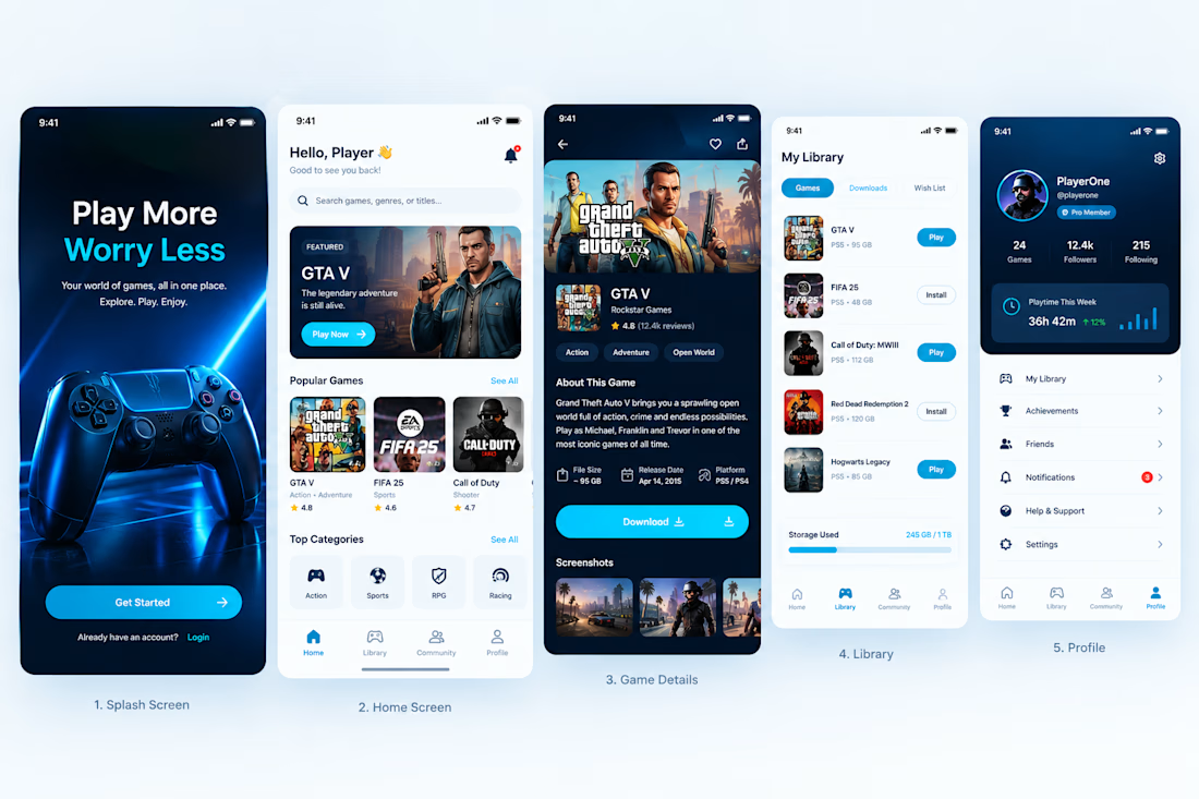


the community focused flow feels really clear.

Thanks so much 👍 😊

Wow amazing design
Thanks so much🥰🙏
The network for creativity
Join 1.25M professional creatives like you
Connect with clients, get discovered, and run your business 100% commission-free
Creatives on Contra have earned over $150M and we are just getting started
Related posts


Rug Pad Wizard: a Figma design for a premium rug pad brand.
One site for two buyers, trade dealers and homeowners.
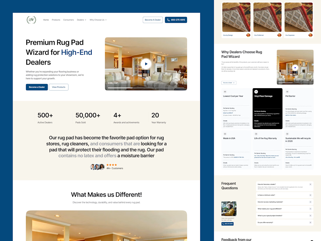

Smart to split dealers and homeowners on one site. The stats row under the hero is clean.


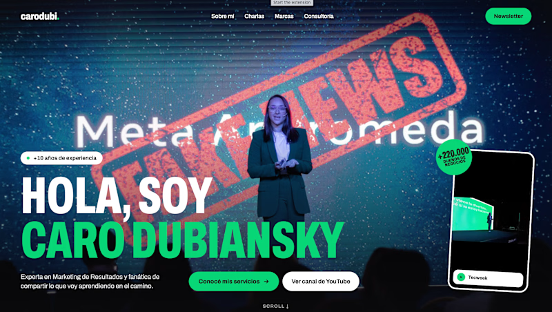
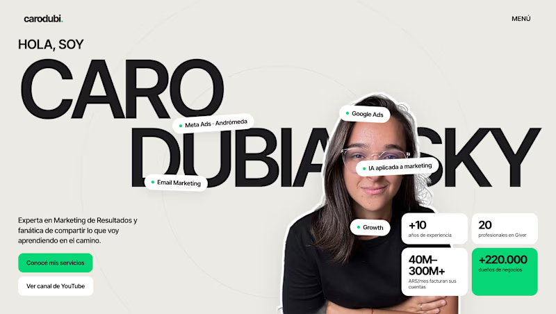

Option B is modern


We’re choosing the motion for an AI analytics product demo, and I can’t decide.
Both clips show the same flow. Someone asks a question in plain English. The agent checks permissions, plans the query, runs it past guardrails and builds the dashboard.
1. A walks you through each step as it happens.
2. B skips the steps and drops you straight onto the result.
A shows the work. B shows the speed. For a landing page I keep going back and forth.
Which one would make you trust the product more? Comment A or B, and tell me why.
3 voted
100%
0 voted
0%
3 votes
Closed

I think according to your query the output should consist on a list of clients with late invoices rather then showing charts etc,