The network for creativity
Join 1.25M professional creatives like you
Connect with clients, get discovered, and run your business 100% commission-free
Creatives on Contra have earned over $150M and we are just getting started
Back to feedPost

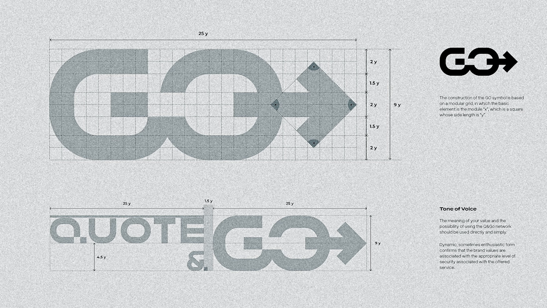
i used to think a good logo just needed to look clean.
then i started asking why.
why this shape.
why this color.
why here, not there.
most logos have no idea why.
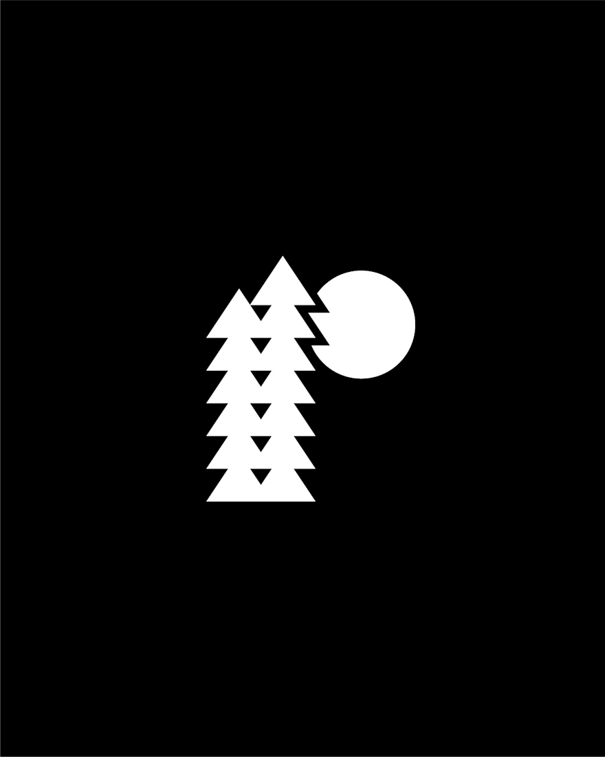
so when i had two versions of a lettermark for Ridgeline,
i didn't pick the one that looked nicer.
i picked the one that more legible.
the taller version won.
the compact one was tighter as a standalone shape.
it had its own kind of balance.
the taller version gives the negative space room to breathe.
the R just shows up.
a mark that needs explaining isn't done.

The network for creativity
Join 1.25M professional creatives like you
Connect with clients, get discovered, and run your business 100% commission-free
Creatives on Contra have earned over $150M and we are just getting started
Trending

Claude
Claude has entered the design space. How are you using it?

Contra University
Learn from expert creatives how to earn more using next-gen AI tools.
Brand Design
The best brand designers are on Contra. Scroll to see what's trending in brand design. What are you building?
creativeaiflow
Creative AI workflows are evolving. What tools do you use, and what are their strengths and weaknesses?
freelancerlife
Freelancer life is wins, pivots, and everything in between. What’s yours right now?






Related posts


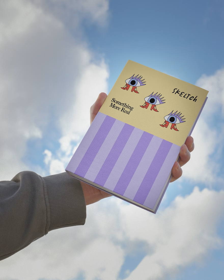
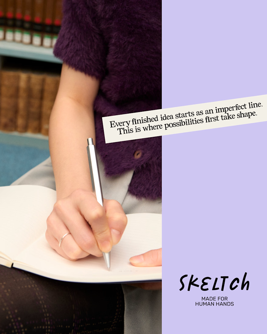
Skeltch - Contemporary Stationery Brand
Skeltch believes in the power of pen on paper and strictly commit to human artistry.
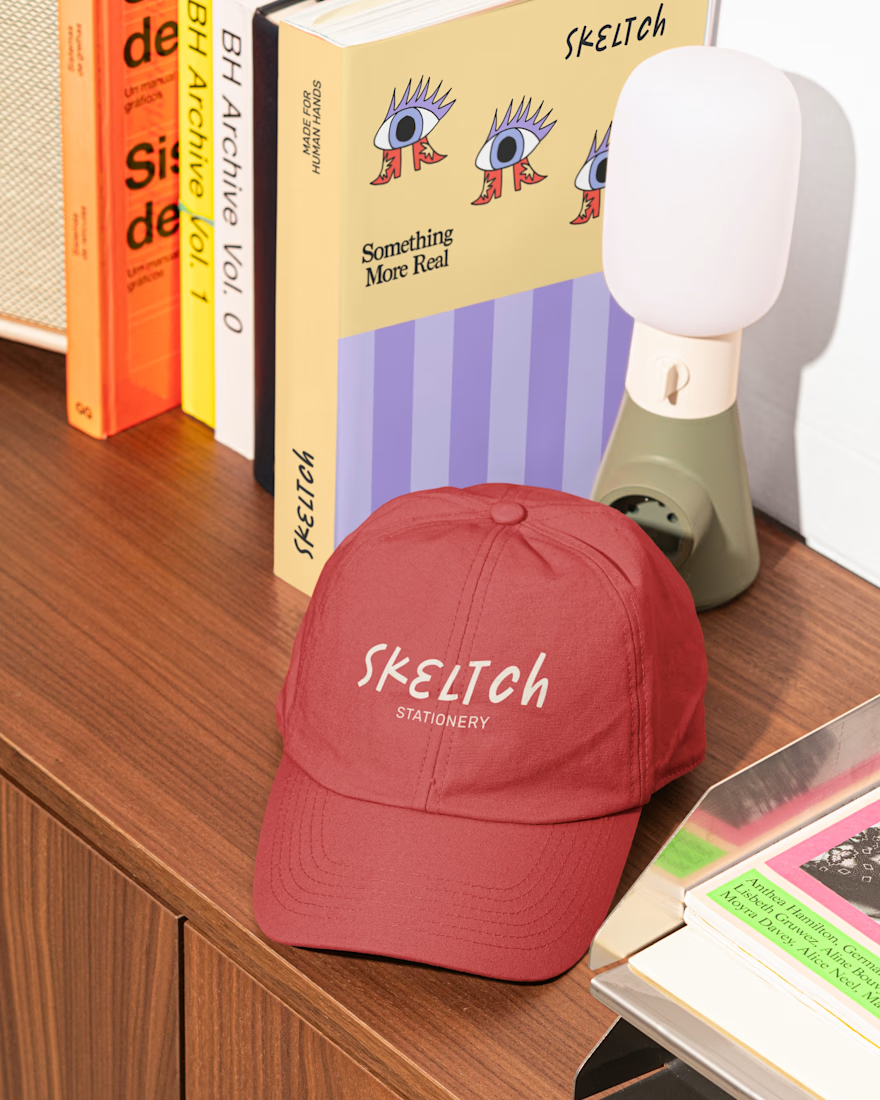
The wordmark logo reflects the spontaneity and expressive nature of analog creativity. The secondary typeface is a typewriter font, which adds a touch of nostalgia.
The notebook covers are designed to each celebrate a different aspect of the artistic process. Here, notebooks are not categorized by function, but as an object is inspiration to creators.
Let me know if you guys like it! 👇🏼

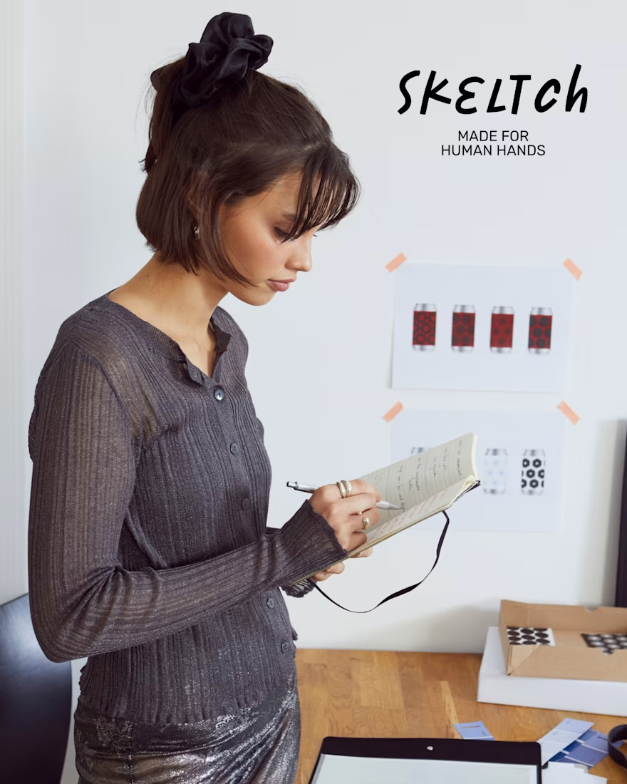

Categorizing the notebooks by what inspires the creator instead of by function is a smart reframe, it changes how someone actually shops for them. The typewriter secondary type pairs well with that analog, handmade feel too.



Awesome 🔥

Latin tradition, reimagined.
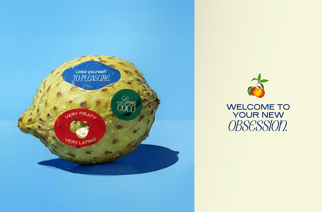
Love, Coco brings Latin-inspired desserts to the Canadian market through a contemporary visual identity.
The challenge was to build a brand that communicated the quality of its ingredients and its Latin roots without relying on familiar visual clichés. Instead of recreating a traditional aesthetic, the identity needed to feel current and distinctive for a Canadian audience.
The process began by analyzing the visual codes commonly used by dessert and Latin food brands, identifying what to keep and what to avoid. This research informed a visual system built around contrasting typography, a vibrant yet refined color palette, and compositions inspired by classical still lifes.
These design decisions place the fruits at the center of the identity, highlighting the quality and origin of the ingredients while giving the brand a distinctive visual language.


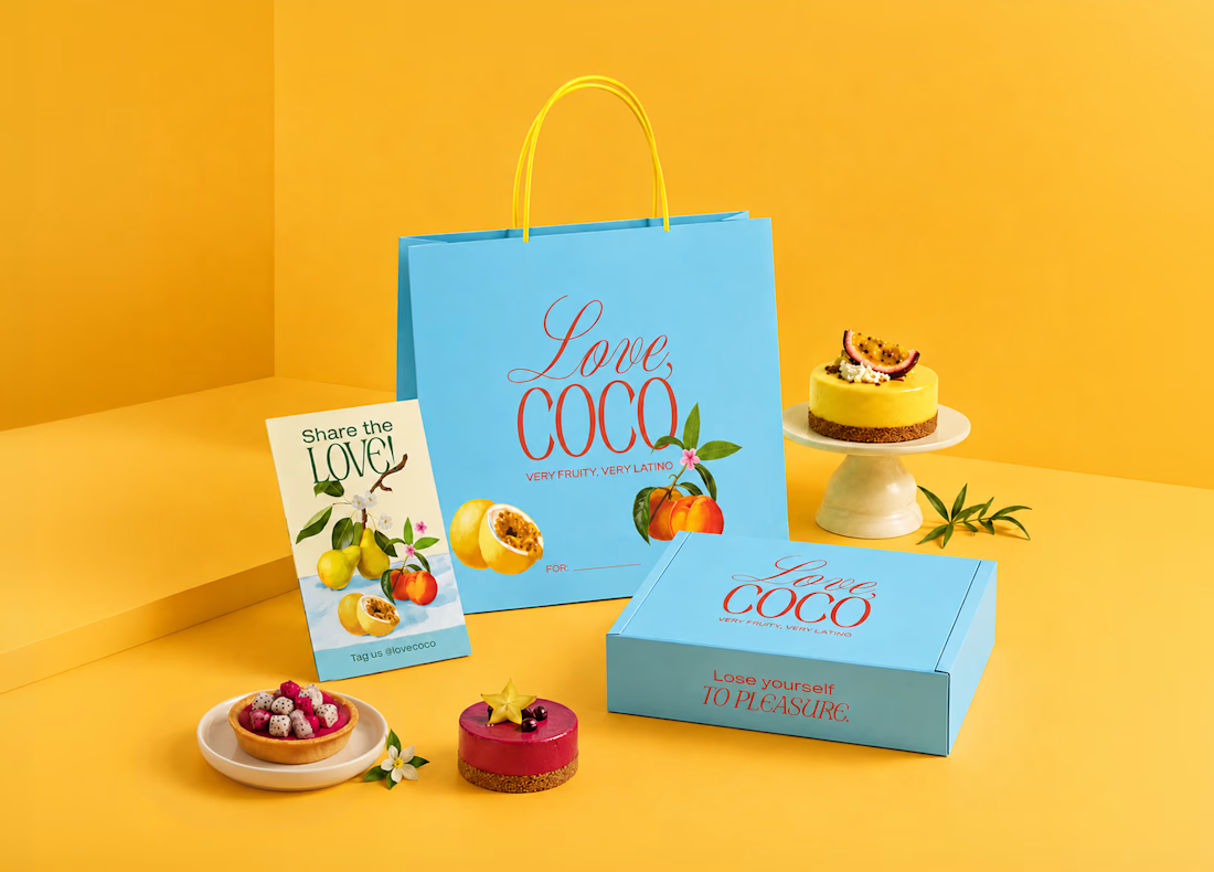
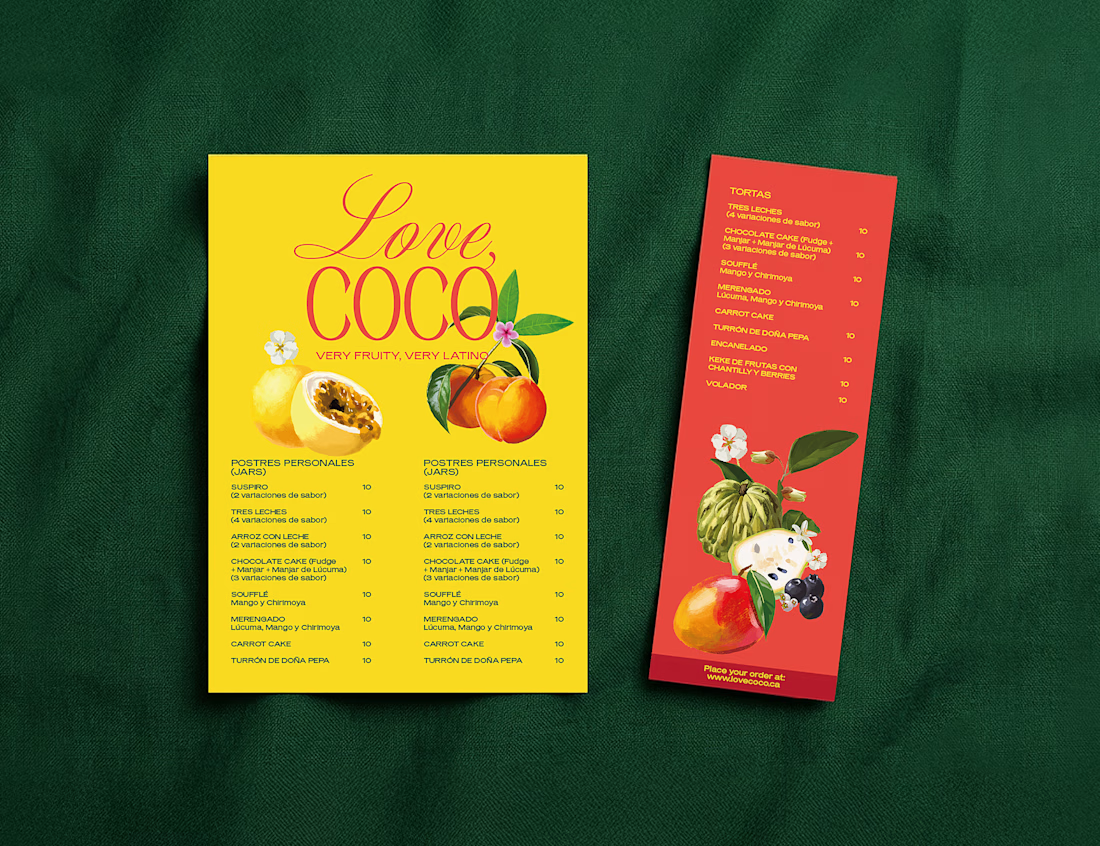

That peach and melon color story feels specific to the brand's actual story, doesn't read like generic tropical at all. What was the trickiest part of translating Latin visual cues without falling back on the usual cliches?