The network for creativity
Join 1.25M professional creatives like you
Connect with clients, get discovered, and run your business 100% commission-free
Creatives on Contra have earned over $150M and we are just getting started
Back to feedPost

Most small business sites lose people at the booking step.
For OOTB Pottery in Toronto, we put the week's open class spots right on the homepage, pulled live from their booking calendar. See a free spot, book it. Two studios, one Shopify store, and I still look after it every week.
If booking on your site takes more than a few clicks, send me the link and I'll tell you what I'd change. Free, no pitch.
The network for creativity
Join 1.25M professional creatives like you
Connect with clients, get discovered, and run your business 100% commission-free
Creatives on Contra have earned over $150M and we are just getting started



Related posts

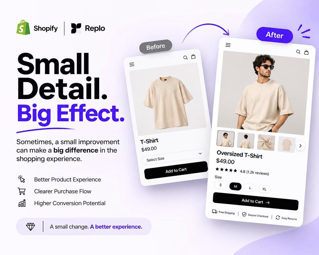
Small Detail. Big Effect. 🚀
Sometimes, a better shopping experience doesn't require a complete website redesign.
It's the small details that matter.
Think about:
Clearer product image galleries.
Better product variant selection.
Easy-to-use size options.
More visible Add to Cart buttons.
A smoother product page experience.
When building with Shopify + Replo, I focus on these details to create cleaner, more intuitive e-commerce experiences.
Because great e-commerce design isn't just about how a page looks. It's about how easily customers can use it.
Small improvements. Thoughtful design. Better experiences.
Working on a Shopify store or planning a Replo landing page?
Let's connect!



Agreed, small product page fixes often beat a full redesign. Clear variant selection and size options remove hesitation right at the point of buying.

What should a beekeeping website explain before asking someone to choose a hive?
For Bee Girl, I designed and built a complete Shopify website around a clear journey: meet the colony, understand what’s inside a nucleus hive, compare the options, and connect with the beekeeper.
Honey yellow, hive black, warm cream, and bold typography bring the same visual language across desktop and mobile layouts.
One design decision that ties it together: the page explains the colony and its five frames before introducing the hive-quantity choices. Education gives the product selection context.
I handled the complete website project for the client through Fiverr, using Shopify. This video walks through the homepage.
Which would you explore first—the hive options, field classes, or the beekeeper’s story?
Explore the full Bee Girl case study: https://contra.com/p/WqNFR67b-bee-girl-shopify-website-design-for-beekeeping
If you’re building a Shopify website for a specialist business, I’m available for website design and development projects.

I'd open the hive options first, but only because the colony section already told me what I'm buying. Explaining the five frames before the quantity choice is a smart order. Teaching before asking someone to choose is so underrated in Shopify stores.


A simple Kajabi funnel that works
You don't need a complicated funnel in Kajabi. Start with four pieces:
Opt-in page: one promise, one form, nothing else
Thank-you page: deliver the freebie and point to the next step
Email sequence: 3–5 emails that teach first, then invite
Sales page: the offer, proof, FAQ, and one button repeated
Build it with a Kajabi Pipeline, then style each page to match your brand, so it doesn't look like every other Kajabi site.
Building in Kajabi right now? Tell me which step you're stuck on.
#Kajabi #SalesFunnel #OnlineCourse #KajabiWebsite #CourseCreator


I’d add one test before sending traffic: submit the opt-in with a fresh email, check the freebie delivery, then follow the sales-page CTA through checkout. The pages can look finished while a tag, email or access rule still breaks the journey.

