The network for creativity
Join 1.25M professional creatives like you
Connect with clients, get discovered, and run your business 100% commission-free
Creatives on Contra have earned over $150M and we are just getting started
Back to feedPost
Taste Test
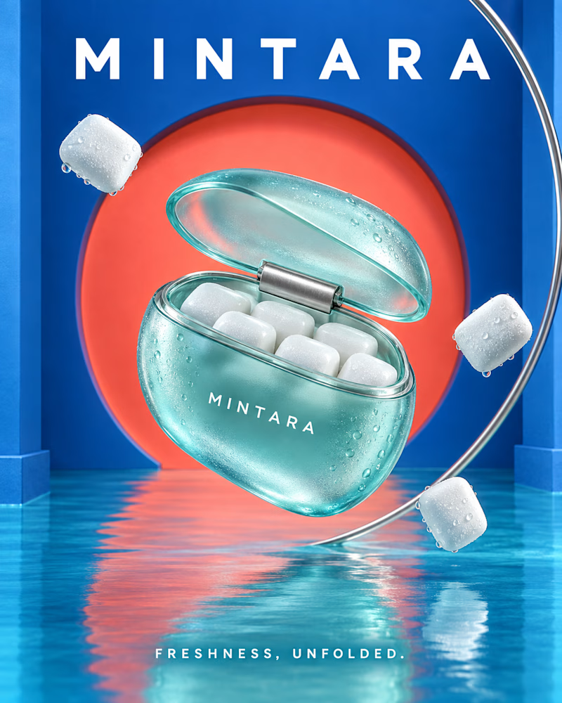
Which pack would you reach for? One is cool and wet: a frosted mint case with a steel hinge, blue walls and a coral circle behind it, water underfoot and pellets drifting past a chrome ring.
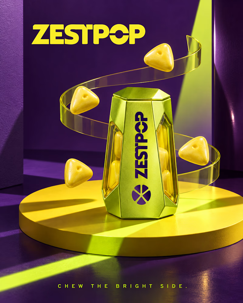
The other is loud and angular: a faceted chartreuse tin on a yellow disc, purple set with a hard diagonal of light, triangular pieces orbiting on a clear spiral.
One is refreshing. The other is electric. 👇 #brandconcept #packagingdesign #artdirection
4 voted
44%
5 voted
56%
9 votes
Closed

Mintara is awsome.👍
The network for creativity
Join 1.25M professional creatives like you
Connect with clients, get discovered, and run your business 100% commission-free
Creatives on Contra have earned over $150M and we are just getting started

Challenges
View all


Related posts


Which pack would you grab at the till?
One is cool and precise: brushed steel tin on a blue plinth, a lit circle behind it, white pellets suspended in a slow arc under one hard beam.
The other is loud and playful: translucent pink case shaped like the fruit, lime green set with an arched recess, seeded cubes tumbling around it in flat bright light.
One sells control. The other sells fun. 👇
#brandconcept #packagingdesign #artdirection
11 voted
39%

17 voted
61%

28 votes
Closed

Would have preferred frost having the melts casing




Lovely design !

For this project, the Contra community chose these colors and the concept featured in this post: https://on.contra.com/ppTKmT
Now we’re moving forward. In one of the two animations, we’re thinking of showing the frames more clearly and adding a methane gas effect, but the client disagreed with us, so we decided to let the Contra community decide.

21 voted
78%
6 voted
22%
27 votes
Closed

Option 1 For me