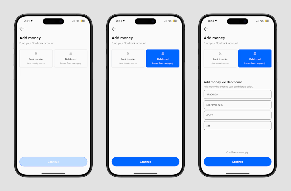
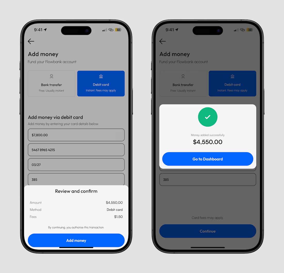
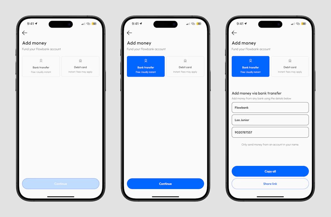
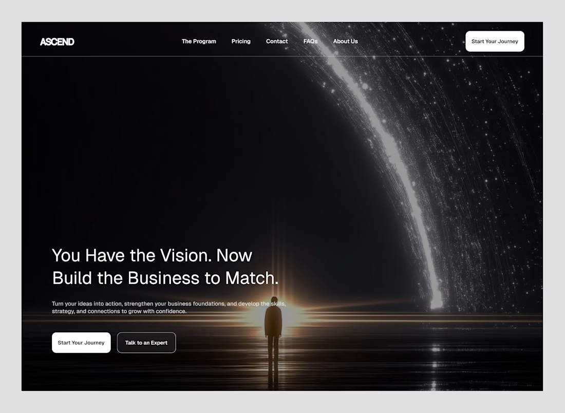
Your payment platform deserves a website that feels as trustworthy as the product itself.
A modern fintech payment platform focused on making complex payment infrastructure feel simple, secure, and easy to understand.
For this concept, I focused on:
→ Clear messaging that communicates value quickly
→ Strong visual hierarchy for better conversion
→ Trust-focused fintech UI
→ Clean product visualization
→ Strategic CTA placement
→ A premium, modern brand experience
Good web design isn’t just about making a website look good.
It should help visitors understand your product, trust your business, and take the next step.
If you're building a SaaS, fintech, startup, or digital product and your website isn't communicating your value clearly, I'd love to help redesign it.
This is a really strong piece of design. I especially like how the typography, spacing, and visual hierarchy work together to make the whole interface feel clean and easy to understand.
You spend it.
You save it.
You send it.
You grow it.
And that became the thinking behind SPENNY — a contemporary fintech brand built around a simple idea:
Money should move as freely as people do.
From everyday spending and payments to saving, transfers and financial growth, Spenny is designed to make managing money feel simpler, faster and more intuitive.
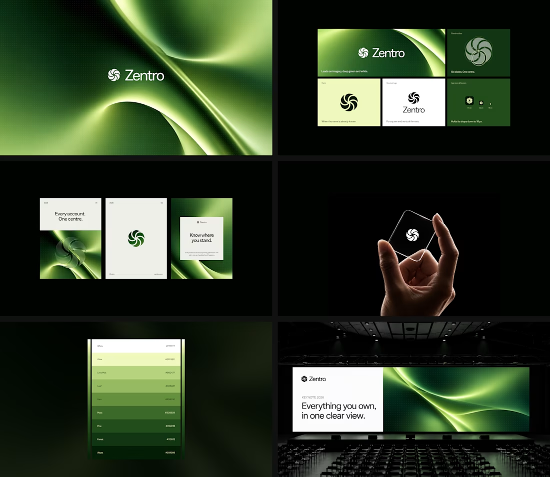
The identity
I wanted the visual identity to reflect that sense of movement.
Not a rigid financial institution.
Not another generic fintech brand.
Something that feels fluid, energetic and modern — while still carrying the clarity and trust people expect when money is involved.
The identity was developed around the idea of money in motion, translating movement into a visual language that feels distinctive without becoming complicated.
Because when you're dealing with money, the experience can be complex.
The brand shouldn't be.
More than making it look good
My approach to every project is simple: understand the idea first, then build the visuals around it.
Fresh energy.
A sharp eye.
And a genuine commitment to getting the details right.
The goal is always to create a brand that doesn't just look the part, but feels like it belongs exactly where it's placed.
Building something worth moving?
If you're serious about your next brand, product or visual identity, I'd love to be part of the process.
Let's turn the idea into something people can see, feel and remember.
The part I'd be curious about is where the motion idea lives outside the stills — does it carry into the app's transitions, or does the mark have to do all of it? Fluid marks usually get tested hardest at app-icon size, where the movement flattens out.