The network for creativity
Join 1.25M professional creatives like you
Connect with clients, get discovered, and run your business 100% commission-free
Creatives on Contra have earned over $150M and we are just getting started
Back to feedPost
Taste Test

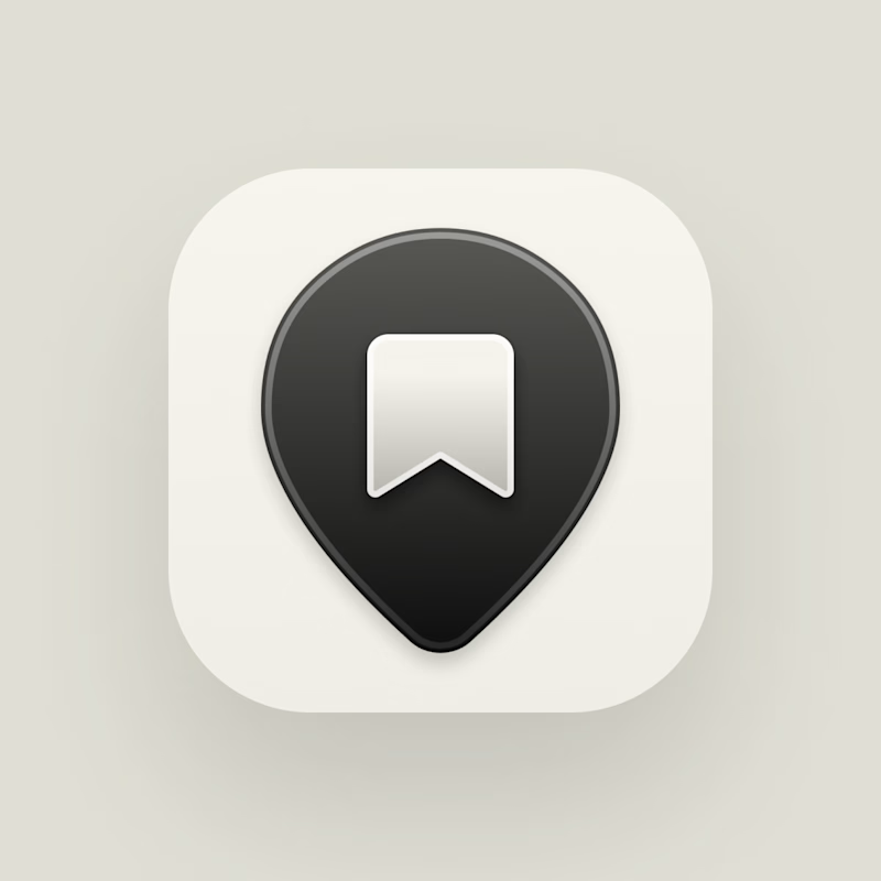
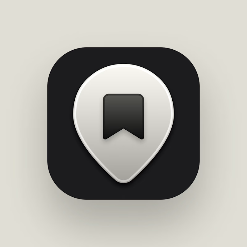
Which icon works better – light or dark?
57 voted
46%
67 voted
54%
124 votes
Closed

Light as the default with dark as the fallback for tinted and dark modes is the right call, since iOS desaturates those variants and the dark tile keeps the pin's contrast on unpredictable wallpapers. The pin silhouette is strong enough to carry either way.

Dark reads stronger to me, the pin keeps its contrast either way the background flexes. Is this going into a system that supports both light and dark mode, or are you locking into just one for launch?
Light one is the default, dark one is a fallback option for all other modes (dark, clear, tinted).

When you save a post on Instagram, it turns black, so we expect the same behavior for the same reason.
I think it's a bit different here because it's an app icon, not part of the UI.

Love light..

Dark feels more solid to me, and the pin stays legible whether the background goes light or dark. Are we supporting both modes here, or picking just one for the launch?
My choice was light as the default, and dark one as a fallback option for all other modes (dark, clear, tinted).


Light

Dark

Voted dark. The pin has more depth against the black tile and it matches how most utility apps default their icon tray these days.

My eyes gravitate to the left one naturally. Great design nonetheless.

i go for the dark

I will go with the dark one

Dark for sure.

I guess the darker one...

Dark

The light version works better for me. The location icon stands out much more, which feels important since the app is centered around travel. In the dark version, the location icon blends into the UI a bit too much and loses some of its visual emphasis.
The network for creativity
Join 1.25M professional creatives like you
Connect with clients, get discovered, and run your business 100% commission-free
Creatives on Contra have earned over $150M and we are just getting started
Trending

Claude
Claude has entered the design space. How are you using it?

Contra University
Learn from expert creatives how to earn more using next-gen AI tools.
Brand Design
The best brand designers are on Contra. Scroll to see what's trending in brand design. What are you building?
creativeaiflow
Creative AI workflows are evolving. What tools do you use, and what are their strengths and weaknesses?
freelancerlife
Freelancer life is wins, pivots, and everything in between. What’s yours right now?



Related posts

🚀 Design Challenge — Which Concept Wins? 👀
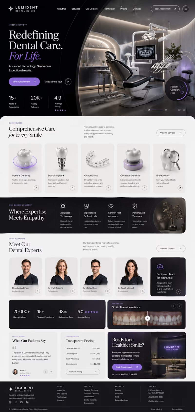
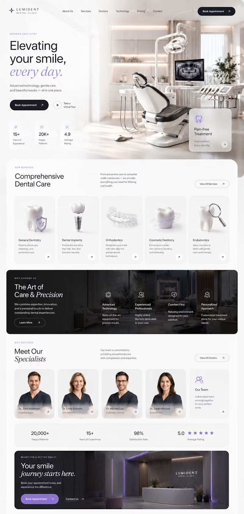
I've been exploring two different directions for a premium dental clinic website, both designed from scratch with a focus on modern UI, clean UX, and strong visual storytelling.
🦷 Concept A
✨ Bold editorial layout
✨ Minimal luxury aesthetic
✨ Large typography
✨ Premium 3D visuals
✨ High contrast & cinematic feel
VS.
🦷 Concept B
🌿 Bright and elegant
✨ Spacious composition
✨ Softer premium look
✨ Modern cards & subtle glass effects
✨ Clean, approachable experience
Both concepts are aimed at creating trust while feeling distinctive—not like another generic medical website.
👇 Which one would you choose and why?
A or B?
Your feedback will help shape the final direction. 💜


4 voted
27%
11 voted
73%
15 votes
Closed
Concept A's dark cinematic mode feels premium but might read as a little intimidating for a dental site, patients usually want reassurance over drama. Was this tested with actual patient personas or is it more of a portfolio exploration?


need your eyes on this one :)
two hero options for a private tutoring platform we're working on at @effekt_design
left or right?
4 voted
15%
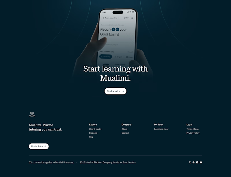
23 voted
85%
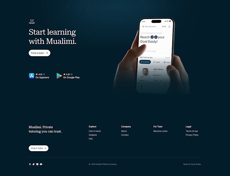
27 votes
Closed
Went with the right aligned version. Left aligned text is easier to scan first and the CTA doesn't have to compete with the phone mockup for attention like it does in the centered one.

Meridial — Wealth Management Platform
For Meridial, I designed a system where the one thing that matters — portfolio drift — always surfaces first, no matter how many clients an advisor is tracking.
Signal over noise, even at 200+ portfolios. ⚪
The challenge:
Advisors managing dozens of portfolios need to instantly spot what's drifted from target — without digging through spreadsheets or noisy dashboards that bury the signal in data.
A dark, grain-textured UI gives Meridial a private-banking feel instead of typical fintech blue. The landing page proves the product directly in the hero with live allocation and drift cards, while the dashboard extends the same card system into radar charts, composition breakdowns, and a weekly digest — built so advisors can scan hundreds of portfolios at a glance.
A case in making complex portfolio data resolve into one clear signal.

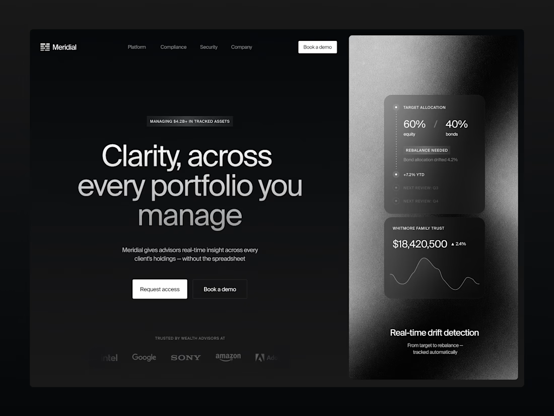
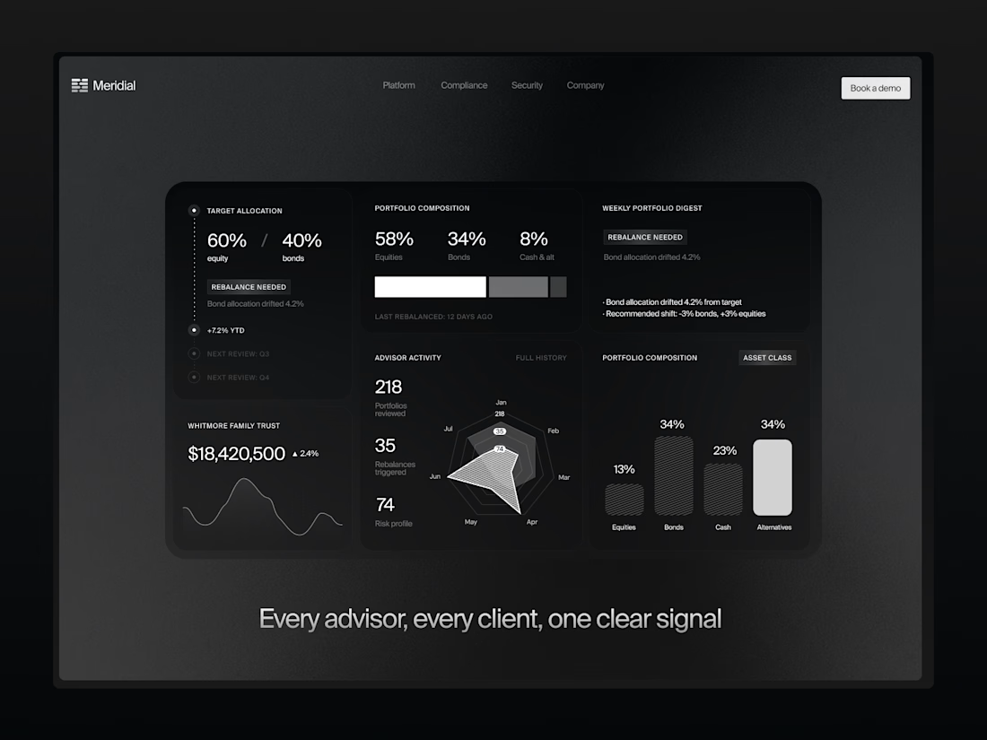

The dark grain-textured UI gives this a truly exclusive private-banking feel. Did you animate the allocation drift cards and radar charts using Jitter or native Figma prototypes?