The network for creativity
Join 1.25M professional creatives like you
Connect with clients, get discovered, and run your business 100% commission-free
Creatives on Contra have earned over $150M and we are just getting started
Back to feedPost

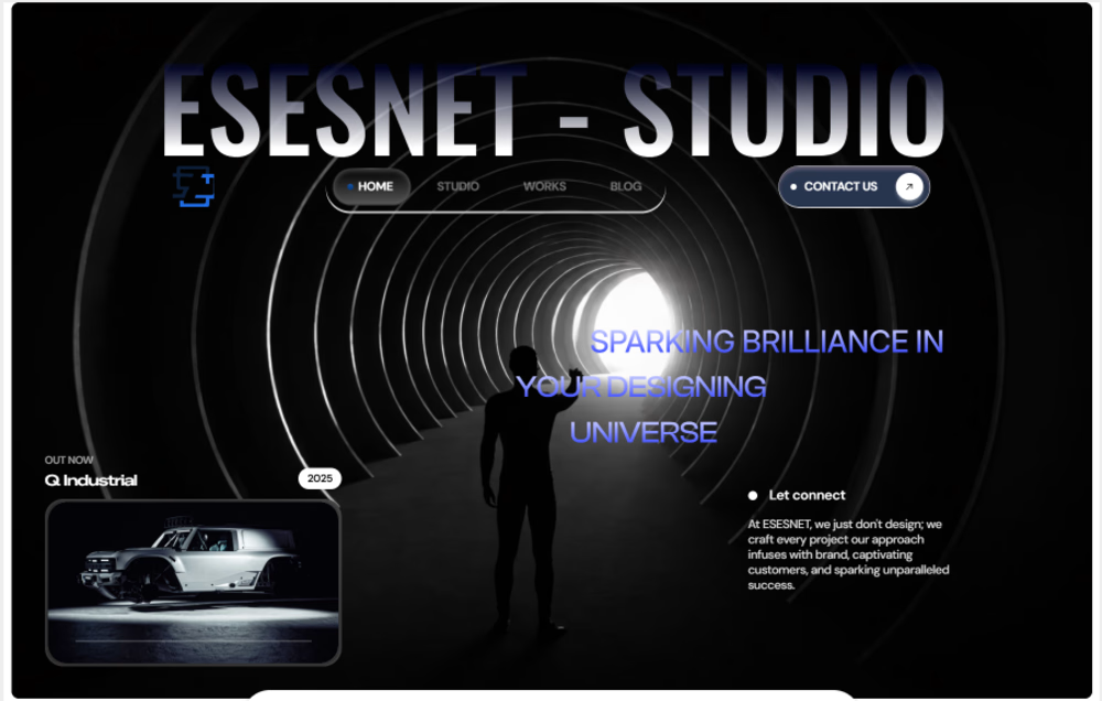
Exploring contrast, depth, and minimal structure.
This framer hero for ESESNET Studio is built to feel immersive, sharp, and intentional. Every element is reduced to what matters, letting typography, spacing, and subtle motion carry the experience.
The focus here wasn’t decoration, but control. Creating a clear visual entry point, guiding attention, and setting the tone instantly without overwhelming the user.
A balance between precision and restraint, where the layout feels considered, the hierarchy is clear, and the overall presence feels confident from the first interaction.
#designprocess #webdesign #uiux #framerdesign #creative #branding #interactiondesign #minimaldesign #webinspiration

The network for creativity
Join 1.25M professional creatives like you
Connect with clients, get discovered, and run your business 100% commission-free
Creatives on Contra have earned over $150M and we are just getting started







Related posts


Proud to be an Official Framer Expert Agency for 2026!
Explore our work:
https://artonest.design/
https://www.framer.com/@artonest-design-studio/



Startfrom 2.0 is live. It's our template library: finished websites designed at Apollo Studio, available as a Framer project, an Astro theme or a Next.js app.
Each template page shows what you get and runs the live demo in the page. Some templates are free.


Keeping content separate from layout would make the Astro and Next.js versions easier to customise. Do they share a content schema, or does each template have its own setup?

Contact page done with claude from my phone
What a time to be a designer

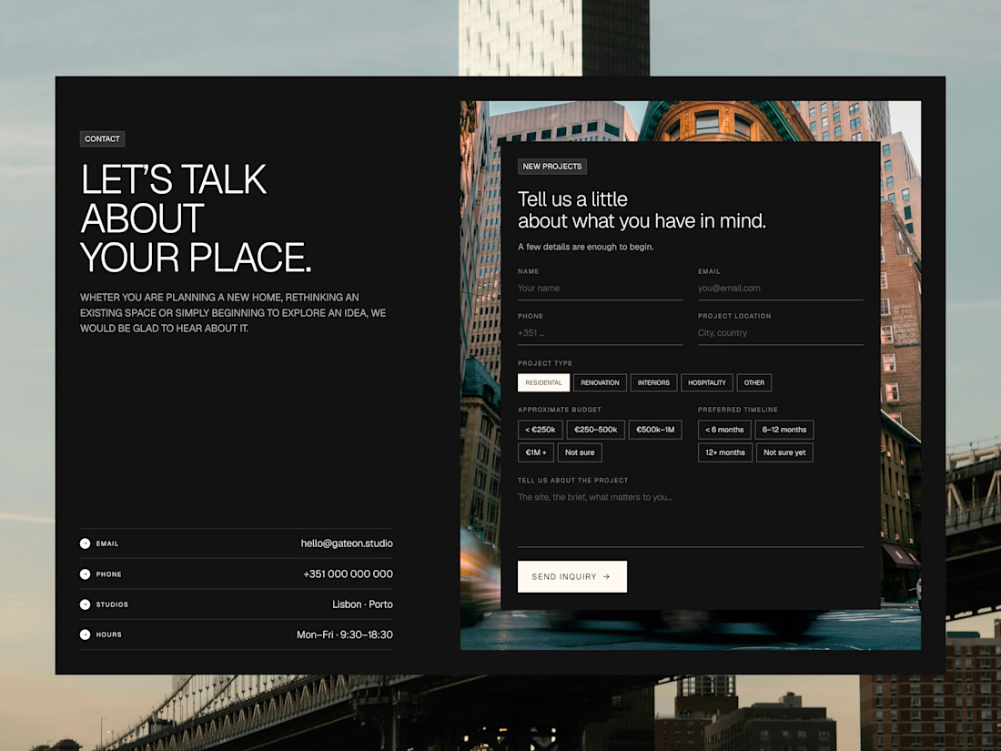

That is amazing and the contact page design looks great.