The network for creativity
Join 1.25M professional creatives like you
Connect with clients, get discovered, and run your business 100% commission-free
Creatives on Contra have earned over $150M and we are just getting started
Back to feedPost

Need a reliable creative for your next project? I'm currently accepting new clients on Contra!
I offer:
Professional Logo Design
Photo Editing & Retouching
Content Writing
Copywriting
I'm excited to connect with businesses, startups, and creators looking for quality work without breaking the budget.
✨ Limited-time offer: Services starting from just $10.
I believe in clear communication, quick turnaround, and delivering work that helps your brand stand out.
If you've been searching for someone to bring your ideas to life, comment interested below. Let's work together and support my journey! Here are a few samples of my recent work. I'd love to create something just as unique for your brand! 👇


The network for creativity
Join 1.25M professional creatives like you
Connect with clients, get discovered, and run your business 100% commission-free
Creatives on Contra have earned over $150M and we are just getting started






Related posts

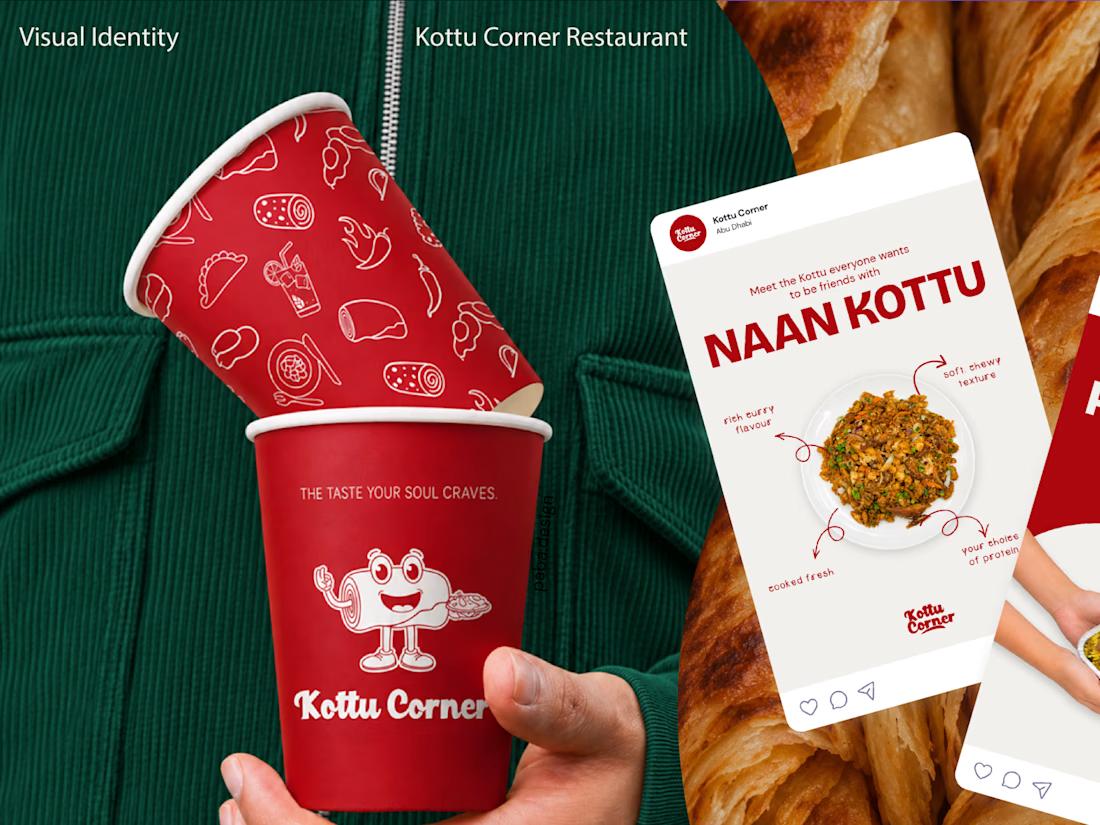
What if your business already has a logo, but nothing else that makes it recognizable as a brand?
That was the starting point for my recent branding project for Kottu Corner, a restaurant in the UAE.
They came to me with an existing logo, but without a complete visual identity to support it.
Redesigning the logo simply for the sake of change wouldn't have been a smart business decision. With the brand preparing for a major transformation, the existing logo was the one familiar element customers could still recognize. Changing it alongside everything else would risk losing that connection and making the brand feel unfamiliar to the very people who already knew and trusted it.
Instead, I focused on developing a cohesive brand identity around it, guided by the restaurant's audience, business goals, and plans for future franchise growth.
From brand strategy and visual direction to packaging, merchandise, and other brand touchpoints, the goal was to create an identity that feels recognizable, consistent, and true to the business.
Because sometimes, good branding isn't about changing what already exists. It's about building on it.
Explore the full case study! ❤️


Cool work!!

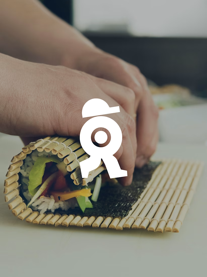
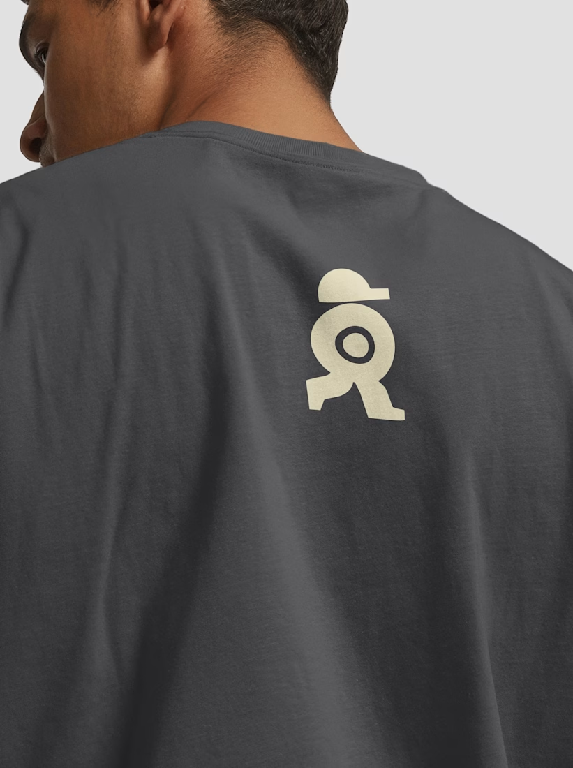
A sushi roll with a life of its own.
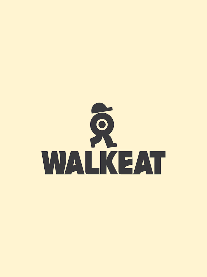
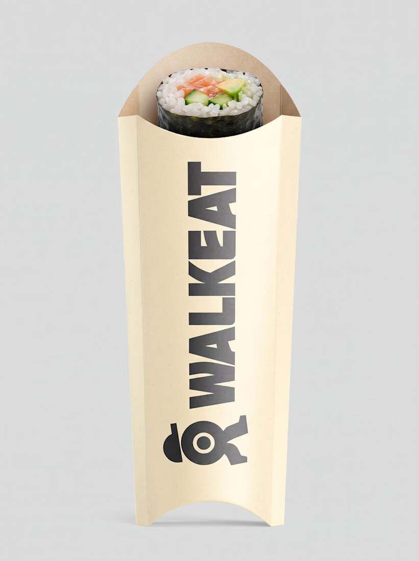
The WALKEAT identity transforms the shape of a sushi roll into a walking character. Its circular center references the cross-section of the roll, while the cap and legs bring movement and personality to the figure.
The custom-designed wordmark reinforces this concept through subtle modifications to the W, A, and E, creating a visual connection between typography and symbol.
A simple, playful and contemporary identity that communicates the product without relying on literal Japanese imagery or an overly cartoonish character.

Great work!!


The sharp V pops against that vivid gradient.