The network for creativity
Join 1.25M professional creatives like you
Connect with clients, get discovered, and run your business 100% commission-free
Creatives on Contra have earned over $150M and we are just getting started
Back to feedPost

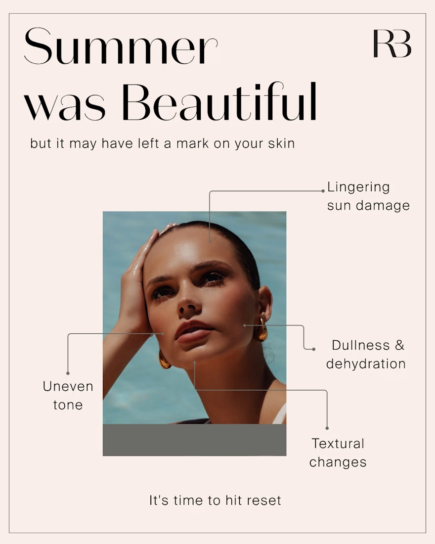
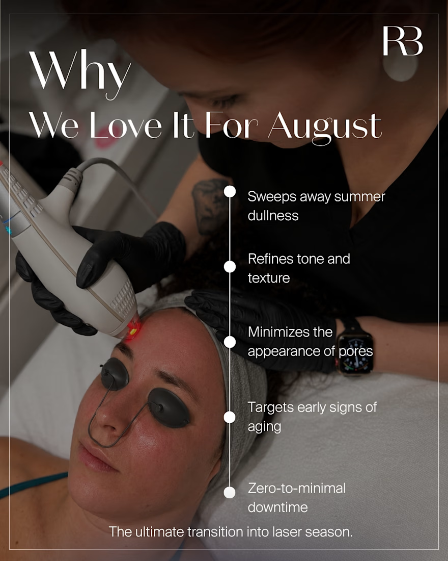
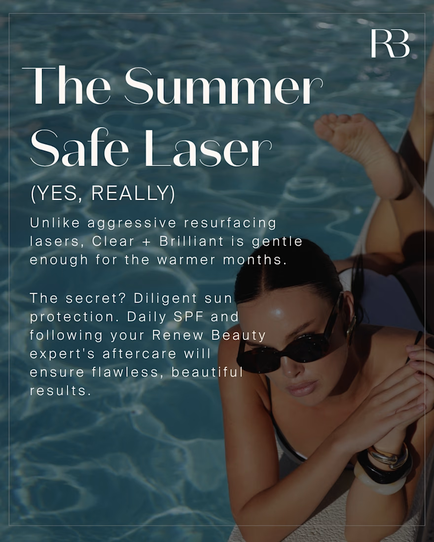
New carousel concept for a med-spa client's Clear + Brilliant® laser treatment. Contrasting dark-to-light backgrounds to move the viewer from "the science" to "the glow" — serif type, minimal layout, letting the typography do the work.
#GraphicDesign #SocialMediaDesign #InstagramCarousel #BrandDesign
#SkincareMarketing #AestheticsBranding #MedSpaMarketing #EditorialDesign
#TypographyDesign #DesignProcess #FreelanceDesigner #DesignPortfolio

The network for creativity
Join 1.25M professional creatives like you
Connect with clients, get discovered, and run your business 100% commission-free
Creatives on Contra have earned over $150M and we are just getting started




Related posts

This is such a clever way to turn familiar client feedback into a visual language. The concept and typography make the message really memorable. 👏


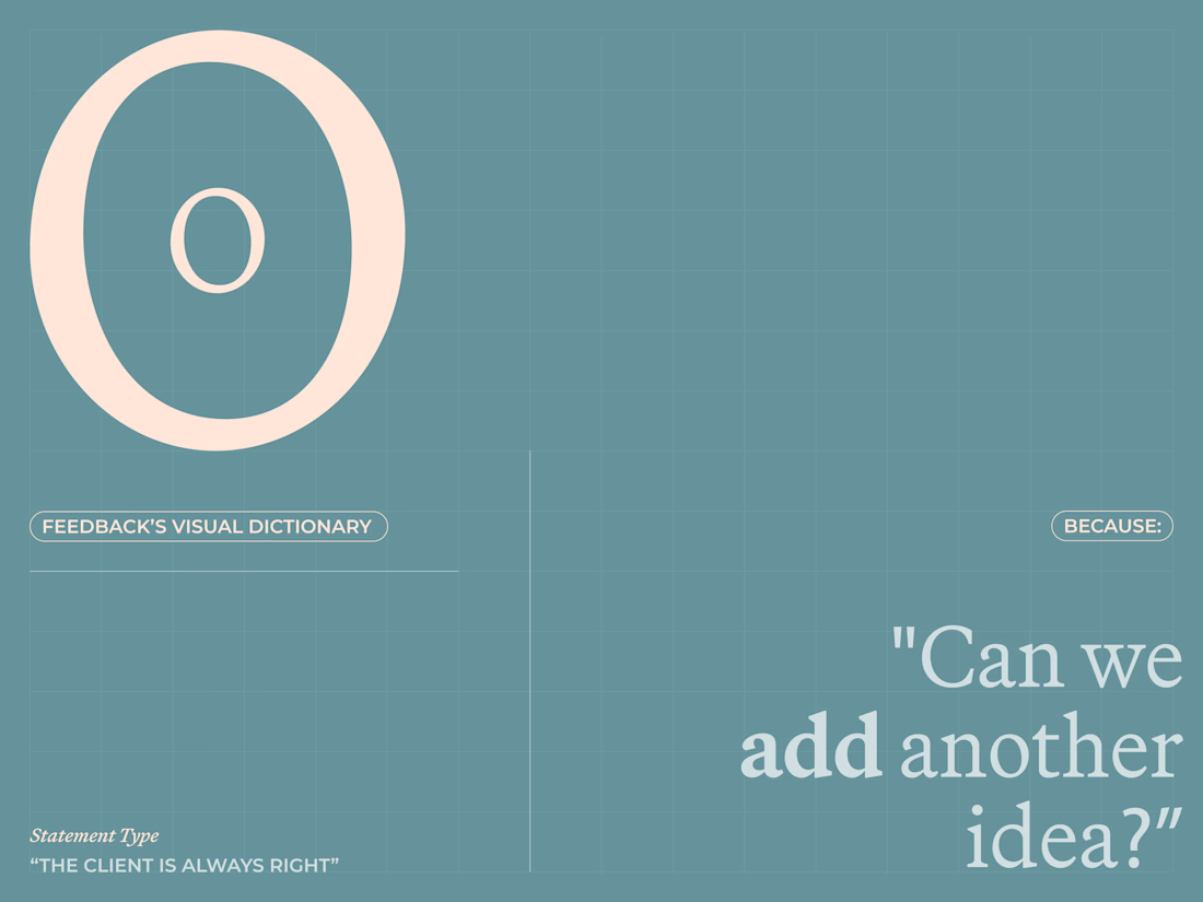
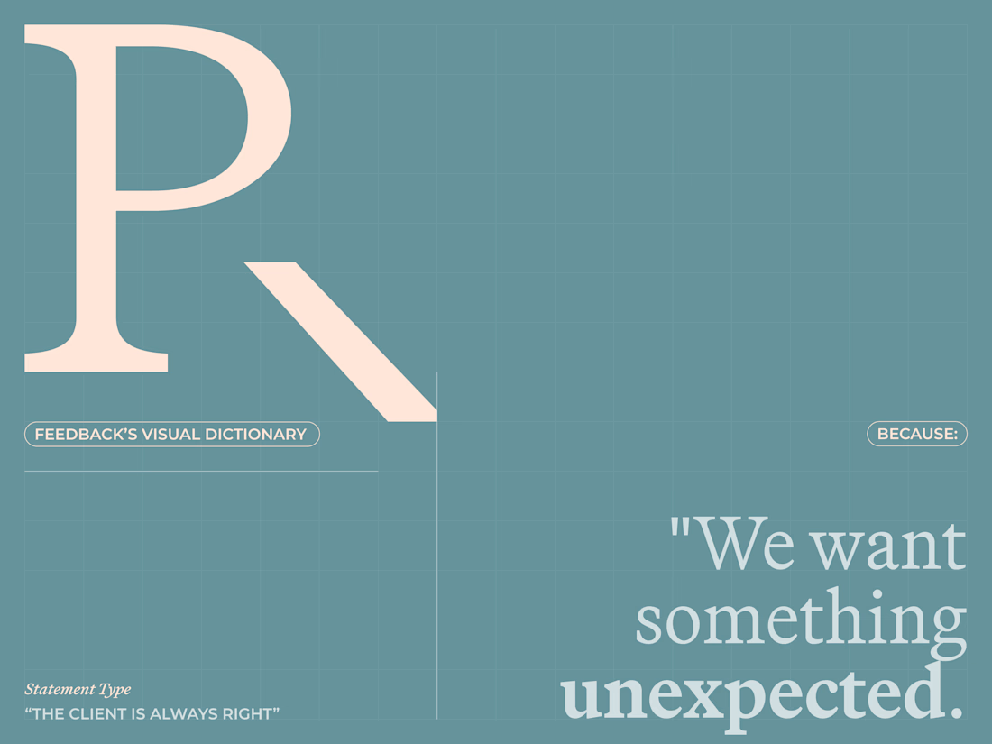
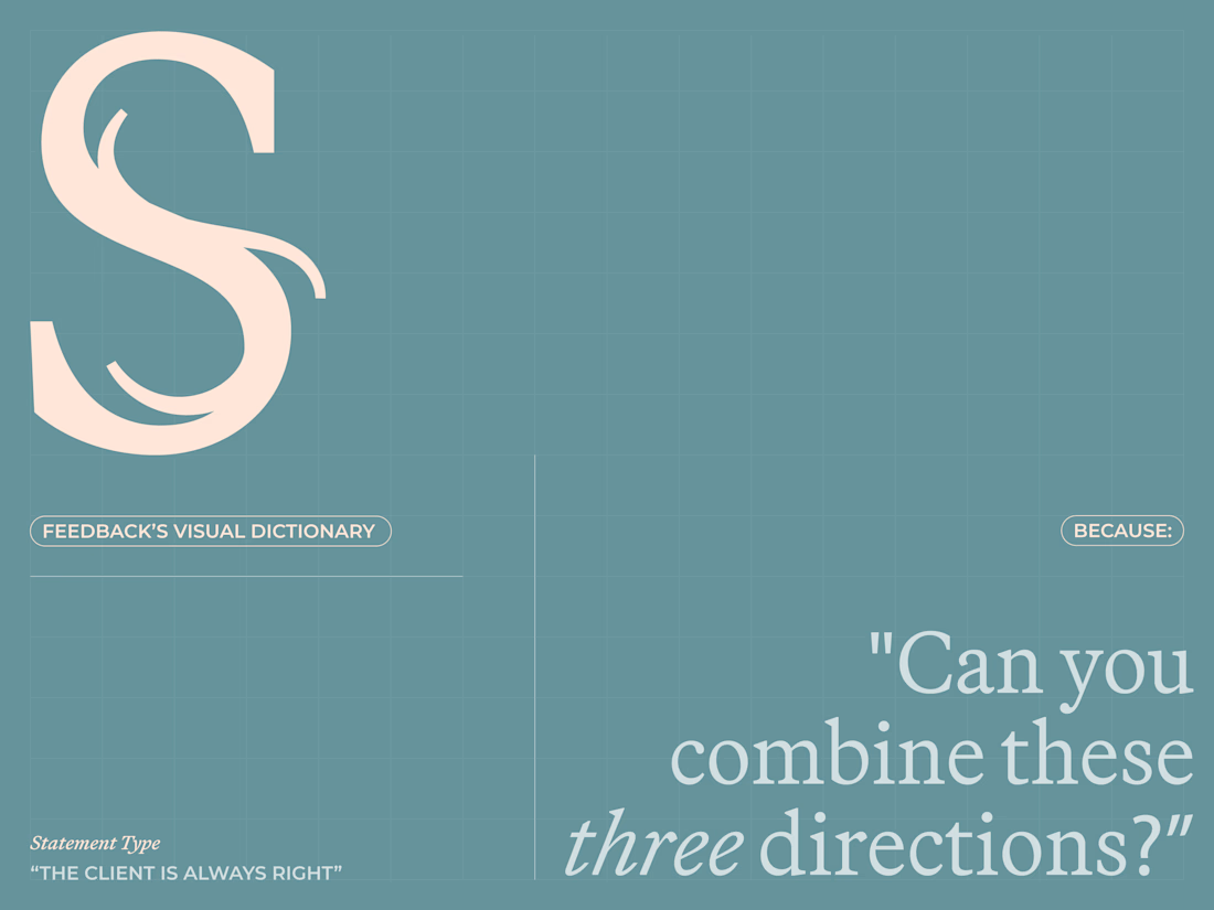
Are clients always right? 😀
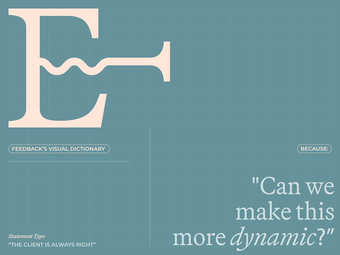
I created a lettering system where every letterform represents one of the things designers routinely hear from clients.
The typeface becomes a visual dictionary of bad creative feedback, that proves the statement wrong.
Give me your worst client...

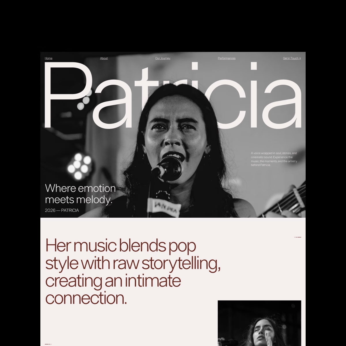
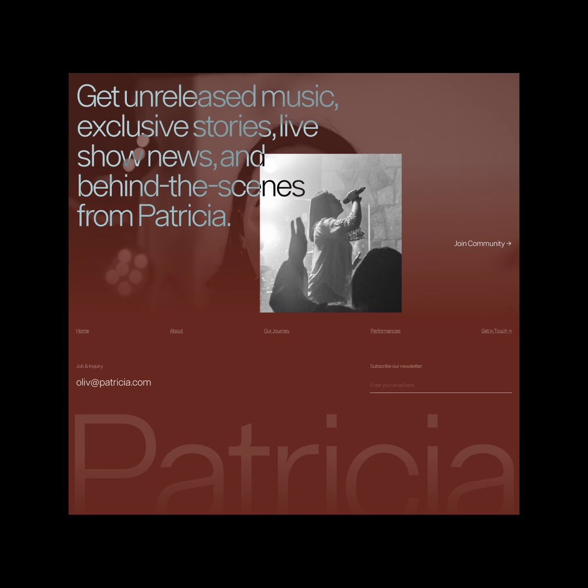
Patricia — Personal Singer Website. Bold, personal, and a little dramatic.
I played with oversized typography, monochrome photography, and an editorial layout to create a space where the artist’s personality feels just as important as the music.
COVERA — Business Insurance Landing Page. The full page, now in motion. Bringing the whole concept to life made the bold typography and modular sections feel even stronger, with motion adding just enough energy without making the experience feel too busy.