The network for creativity
Join 1.25M professional creatives like you
Connect with clients, get discovered, and run your business 100% commission-free
Creatives on Contra have earned over $150M and we are just getting started
Back to feedPost
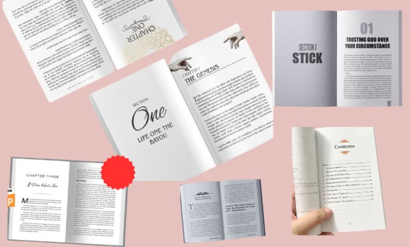
Publishing your first book on Amazon KDP is exciting, but even a great manuscript can face challenges if it's not formatted correctly.
Here are five common mistakes I often see:
1_Inconsistent chapter headings
2_Missing or broken table of contents
3_Incorrect page margins and trim sizes
4_Poor image placement and formatting
5_Uploading files that don't meet KDP requirements
Professional formatting isn't just about making a book look good, it's about creating a smooth reading experience and ensuring your book meets Amazon's publishing standards.
Whether you're publishing a self-help book, Christian devotional, children's book, recipe book, or business guide, proper formatting can make a significant difference in the final product.
As an Amazon KDP Publishing Specialist, I help authors transform their manuscripts into professionally formatted Kindle, paperback, and hardcover books ready for publication.
If you're preparing to publish your book and want to avoid costly formatting mistakes, I'd be happy to help.



Are you currently working on a book or planning to publish one on Amazon KDP?
I'd love to know: What's been the biggest challenge in your publishing journey so far? Writing, editing, formatting, cover design, or marketing?
The network for creativity
Join 1.25M professional creatives like you
Connect with clients, get discovered, and run your business 100% commission-free
Creatives on Contra have earned over $150M and we are just getting started

Challenges
View all


Related posts



That's great its really creative 🎉🎉

A modern pasta advertising poster designed with a warm, minimal color palette and bold typography. I combined a pasta dish photograph with oversized text, layered shapes, and promotional elements like 50% OFF and ORDER NOW to create an eye-catching food campaign.
I focused on typography, composition, contrast, and visual hierarchy while keeping the overall design clean and commercial.
Skills: Graphic Design · Food Advertising · Typography · Poster Design · Photo Composition · Promotional Design
#GraphicDesign #PastaDesign #FoodAdvertising #PosterDesign #Typography #FoodBranding #SocialMediaDesign #AdvertisingDesign #VisualDesign #CreativeDesign
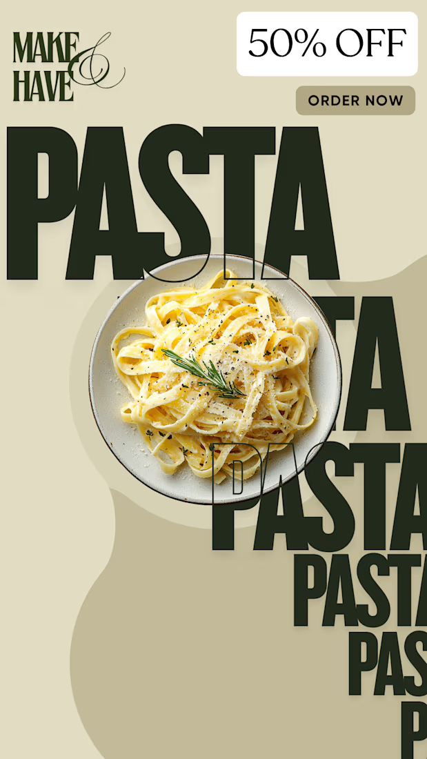

I noticed the oversized typography overlaying the pasta shot really pulls the visual hierarchy, letting the 50% OFF badge stand out without overwhelming the image

Halloween is about to arrive 🎃
So, I decided to make my next project on theme 'SPOOKY SEASON'.
Designing brand identity for halloween digital products business . PART-1
Name - HAUNTIX
Niche - Halloween digital products
Tagline - 'Printable Curiosities for your Haunted Home'
Check below and tell me how is it ?

The tagline does a lot of the work here, "printable" tells me the product before the logo does. How are you planning to handle the wordmark against the busy cobweb corners in the other applications? A bit of clear space around HAUNTIX could keep it readable at small sizes.