The network for creativity
Join 1.25M professional creatives like you
Connect with clients, get discovered, and run your business 100% commission-free
Creatives on Contra have earned over $150M and we are just getting started
Back to feedPost

New promo video dropped 🎬
I do more than just video editing. Here's what I offer:
🎬 VIDEO EDITING
Gameplay (Minecraft, FPS & all games) · Motion graphics · Thumbnails · Subtitles
🤖 AI SETUP
Local AI models (Ollama, LM Studio) + Hermes AI Agent on Windows
💻 IT SUPPORT
Remote troubleshooting, monthly plans for small businesses, data entry
Fast · Professional · Affordable


The network for creativity
Join 1.25M professional creatives like you
Connect with clients, get discovered, and run your business 100% commission-free
Creatives on Contra have earned over $150M and we are just getting started

Challenges
View all


Related posts

Neon - Cyberpunk Kinetic Highlight Trails
The Visual Aesthetic: Think Wong Kar-wai's Chungking Express mixed with Blade Runner 2049. Light sources—street lamps, neon signs, headlights, and glowing storefronts—leave soft, directional light streaks across the dark backdrop as the camera moves.
I started with five separate night-time clips and used invideo Editor's AI editing agent to transform them into one connected cinematic sequence. I wanted the bright practical lights in each shot to feel like they had a physical presence in the scene, leaving atmospheric trails as the camera and subjects moved.
The agent generated two versions of the effect, including an editable directional streak-and-glow approximation. I chose the editable version and set the source footage to 720p before generating the effect.
After seeing the initial result, I prompted the agent to make further changes, refining the highlight response, glow, intensity, and direction of the trails. I wanted the effect to feel less like a generic digital filter and more like photographic light persistence.
The final sequence gradually builds from subtle streaks into a stronger visual climax around the passing car and running shots, while keeping the original footage visible underneath.
Built and refined in invideo Editor using its AI editing agents.
@invideo.io @invideo.creators

That's great its so interesting ❤️❤️

I co-directed this music video and edited the final cut. I worked on the visual direction and shot flow, then cut the footage together to match the song's rhythm and mood. I handled color, pacing, and the final export, so the video was ready to release.💯


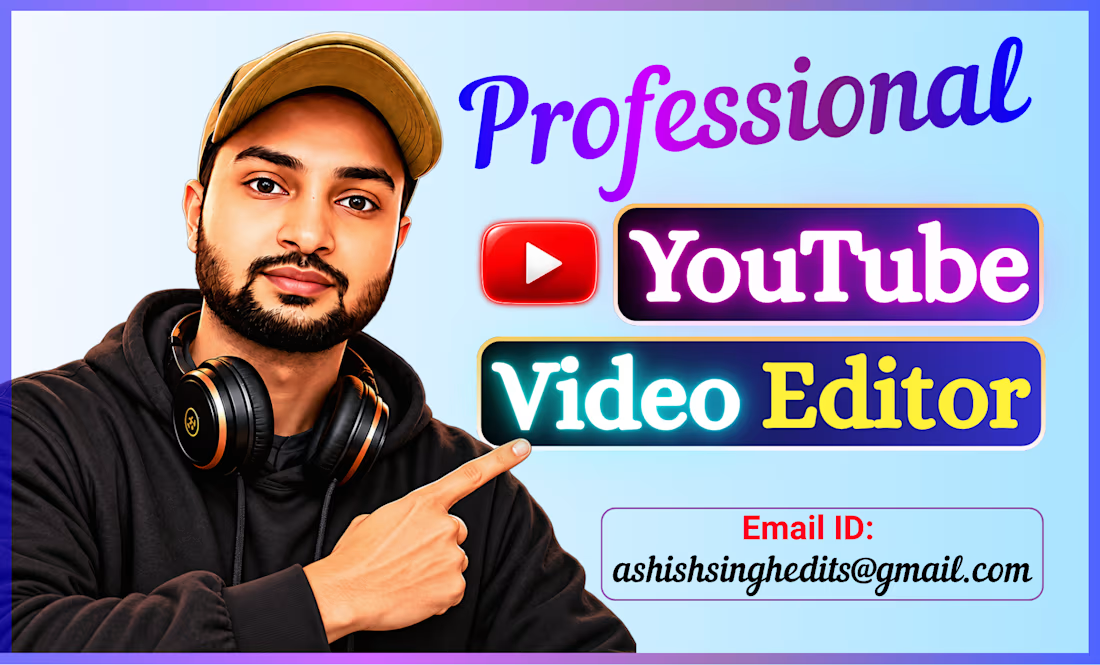
“People don’t skip bad videos. They skip boring ones.”
--- A good video should grab attention, keep viewers watching, and communicate the message clearly...
That’s what I focus on as a YouTube Video Editor — clean cuts, engaging pacing, sound design, motion graphics, and storytelling that keeps the viewer hooked.
𝗖𝘂𝗿𝗿𝗲𝗻𝘁𝗹𝘆 𝗼𝗽𝗲𝗻 𝘁𝗼 𝘄𝗼𝗿𝗸𝗶𝗻𝗴 𝘄𝗶𝘁𝗵 𝗬𝗼𝘂𝗧𝘂𝗯𝗲𝗿𝘀, 𝗰𝗿𝗲𝗮𝘁𝗼𝗿𝘀, 𝗮𝗻𝗱 𝗯𝘂𝘀𝗶𝗻𝗲𝘀𝘀𝗲𝘀.
📩 Need a YouTube Video Editor? Let’s connect.