The network for creativity
Join 1.25M professional creatives like you
Connect with clients, get discovered, and run your business 100% commission-free
Creatives on Contra have earned over $150M and we are just getting started
Back to feedPost
Turning messy Excel data into an interactive dashboard 📊
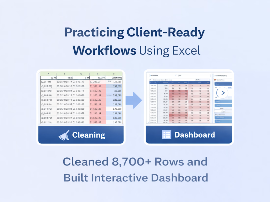
In my latest Excel case study, I worked with a raw, unstructured dataset (8,700+ rows) and focused on doing the fundamentals right:
• Cleaned inconsistent time, date, and text values
• Structured the data for accurate analysis
• Built pivot tables with day, month, and time logic
• Added slicers and conditional formatting for interactivity
No fancy tools — just solid Excel workflows that make data reliable and easy to explore.
This is exactly how I approach real client data:
clean first → structure next → visualize last.
👉 Full case study is live on my profile.




Thank you 😊

Good keep it up like that..
Thank you for the support😊

Thank you😊
The network for creativity
Join 1.25M professional creatives like you
Connect with clients, get discovered, and run your business 100% commission-free
Creatives on Contra have earned over $150M and we are just getting started











Related posts

Exploring a clean, modern SaaS dashboard UI. Focused on simple layouts, smooth interactions, and a better user experience 🚀


i had to like this, it got my attention, very nice build mate.

🚀 𝐁𝟐𝐁 𝐋𝐞𝐚𝐝 𝐆𝐞𝐧𝐞𝐫𝐚𝐭𝐢𝐨𝐧 𝐢𝐧 𝟐𝟎𝟐𝟔: 𝐓𝐡𝐞 𝐑𝐢𝐠𝐡𝐭 𝐓𝐨𝐨𝐥𝐬 𝐌𝐚𝐤𝐞 𝐚 𝐃𝐢𝐟𝐟𝐞𝐫𝐞𝐧𝐜𝐞!
B2B lead generation has evolved. Today, it's not just about finding contact details - it's about identifying the right prospects, building targeted lead lists, and creating meaningful connections. 🎯
As a B2B Lead Generation & List Building Specialist, I use the right tools and strategies to help businesses connect with their ideal customers.
🔍 𝐌𝐲 𝐂𝐨𝐫𝐞 𝐒𝐞𝐫𝐯𝐢𝐜𝐞𝐬:
✅ Targeted B2B Lead Generation
✅ LinkedIn Sales Navigator Research
✅ Verified Email & Contact List Building
✅ LinkedIn Outreach & Prospecting
✅ Cold Email Outreach & Campaign Management
✅ Data Research & Enrichment
✅ Appointment Setting Support
🛠️ 𝐓𝐨𝐨𝐥𝐬 𝐈 𝐖𝐨𝐫𝐤 𝐖𝐢𝐭𝐡:
Apollo.io | LinkedIn Sales Navigator | Google Sheets | Excel | Smartlead | Gmail | ChatGPT
💡 The goal is simple: better targeting, organized data, personalized outreach, and more opportunities to grow your business.
Are you looking for reliable B2B lead generation support for your business?
Let's connect! 🤝

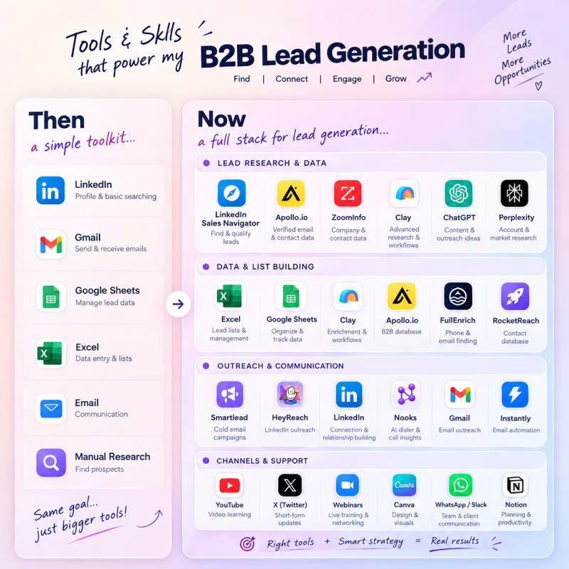

The Then vs Now toolkit graphic is a fun way to show the stack evolution, Masroor. Better targeting, organized data and personalized outreach is exactly the right formula. Clean presentation.

Imagining you book your flight while experiencing
Meet Contrail.
Complex data into beautiful visuals in 3d.
Demo: https://flights-gr8r.vercel.app


Booking a flight with a 3D plane in the search is a fun idea. The dark UI makes the model stand out well.