The network for creativity
Join 1.25M professional creatives like you
Connect with clients, get discovered, and run your business 100% commission-free
Creatives on Contra have earned over $150M and we are just getting started
Back to feedPost
Design President
@Covey_desi... •2d
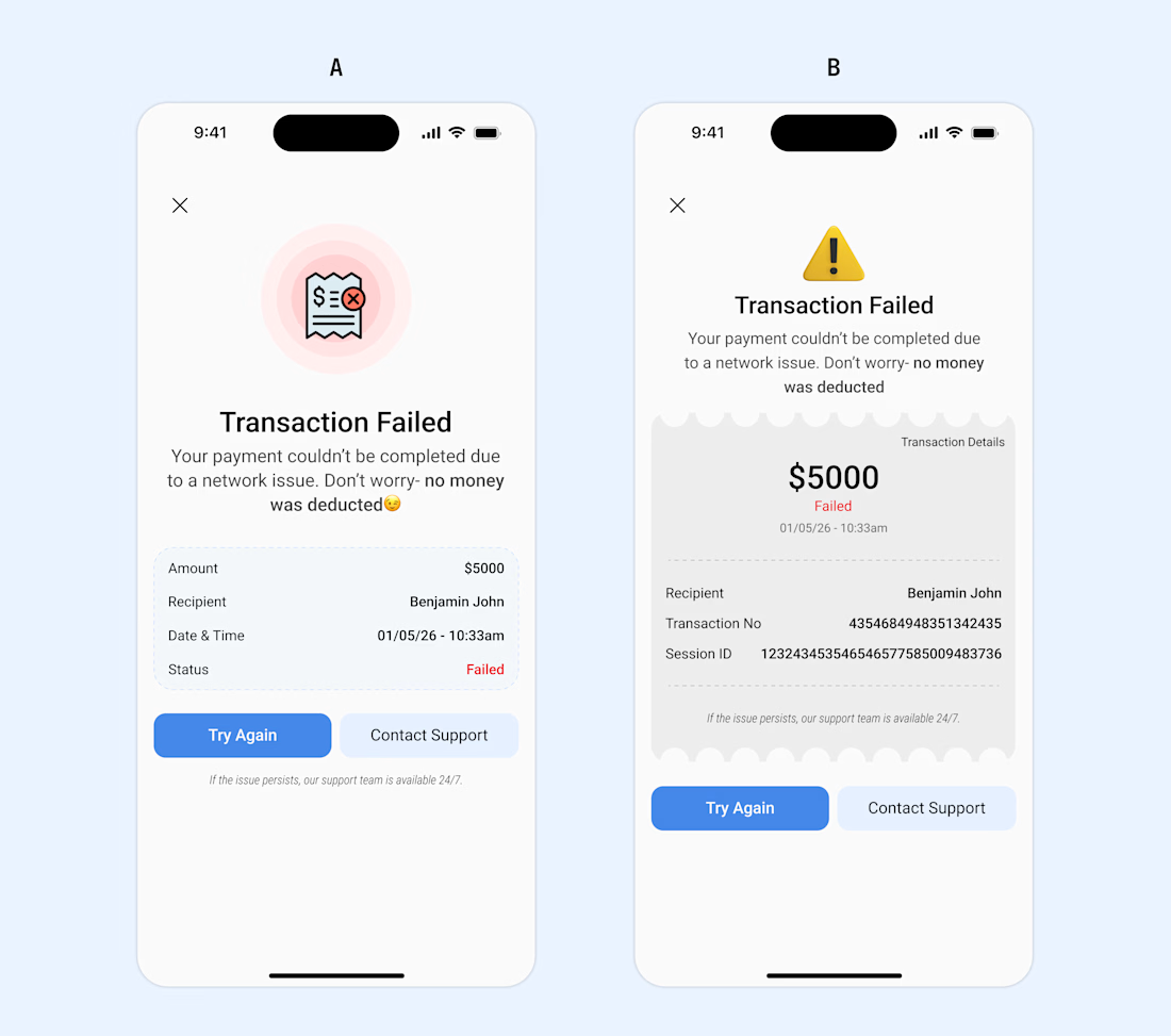
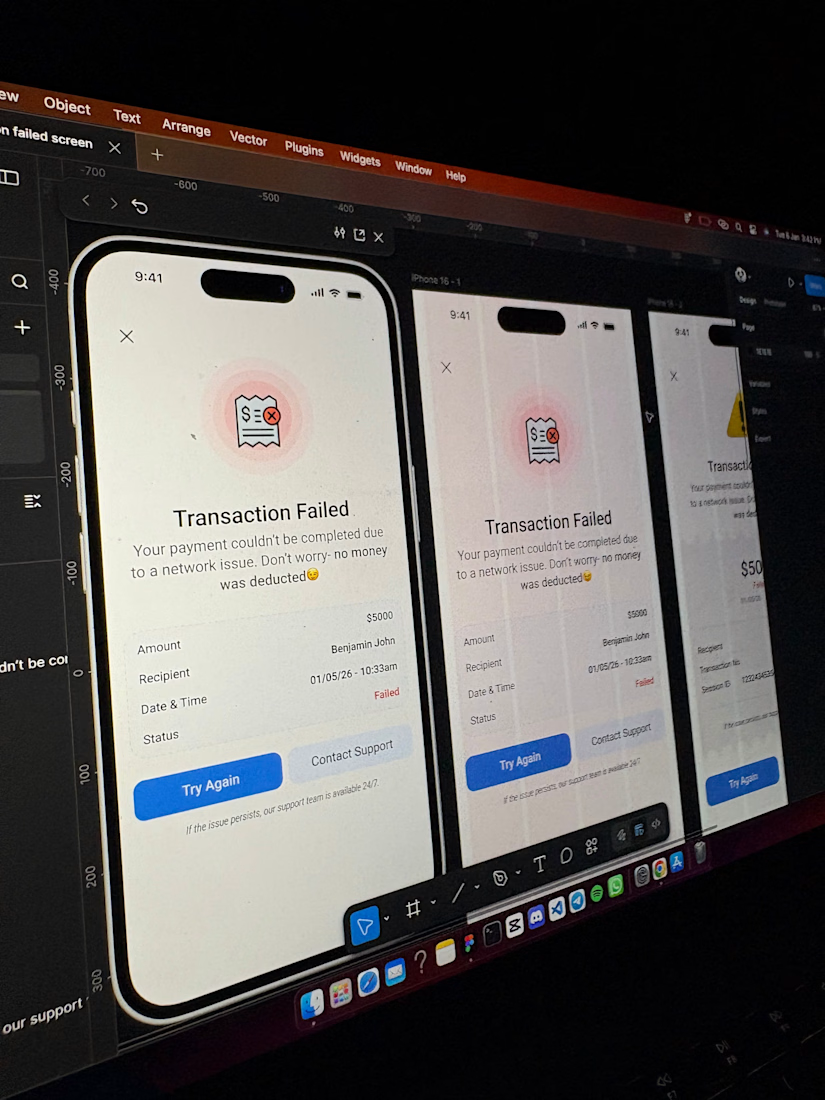
🚨FIRST DESIGN OF THE YEAR🚨
Most fintech apps treat failed transactions like a dead end. As a user, that moment is stressful-you don't know what happened, if your money is gone, or what to do next.
I designed 2 different 'transaction failed' screens for mobile view to focus on clarity, reassurance, and next steps.
- Good UX doesn't just celebrate success, it also supports users when things go wrong.
A or B, which do you prefer and why? Please let me know what you think.
The network for creativity
Join 1.25M professional creatives like you
Connect with clients, get discovered, and run your business 100% commission-free
Creatives on Contra have earned over $150M and we are just getting started
Related posts
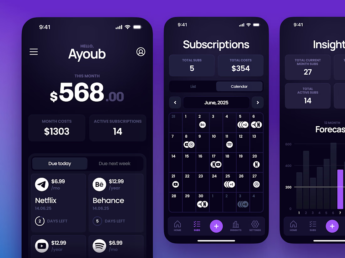
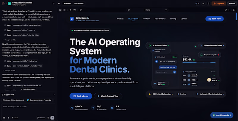
Day 3 — Premium Improvements ✨
Spent today polishing the UI to make the experience feel cleaner, more premium, and more refined.
Would you rather use:
☀️ Light Mode
🌙 Dark Mode
Vote below 👇
12 voted
60%
8 voted
40%
20 votes
Closed
make it double in your web , the website will give choice people about it
How do you turn a brand mascot into a visual system people actually remember?
🐆 Our lynx represents sharp thinking, curiosity, and attention to detail.
For this motion experiment, we pushed the mark into a softer, unexpected direction - rebuilding it with different textures.
Same identity, different emotion.
Which texture fits the Lynksen identity best - flowers, grass, or something else? 👇✨
I personally love the soft blue and white version the most. Nice to scale it into the brand campaign or ad video 😃
Thats clean and understandble i wish a bank app like this. Good work!
Challenges
View allTrending
Claude
Claude has entered the design space. How are you using Claude Design?
Contra University
Learn from expert creatives how to earn more using next-gen AI tools.
fifaworldcup2026
The World Cup is here and the whole world's watching. How are you designing for the world stage?
creativeaiflow
Creative AI workflows are evolving. What tools do you use, and what are their strengths and weaknesses?
freelancerlife
Freelancer life is wins, pivots, and everything in between. What’s yours right now?