The network for creativity
Join 1.25M professional creatives like you
Connect with clients, get discovered, and run your business 100% commission-free
Creatives on Contra have earned over $150M and we are just getting started
Back to feedPost

A brand concept for Square Apps, built around a simple idea: being the missing piece a store needs to feel complete.
The mark features a modular shape with a cutout slot, illustrating how the final piece fits perfectly into place.

The network for creativity
Join 1.25M professional creatives like you
Connect with clients, get discovered, and run your business 100% commission-free
Creatives on Contra have earned over $150M and we are just getting started

Challenges
View all


Related posts

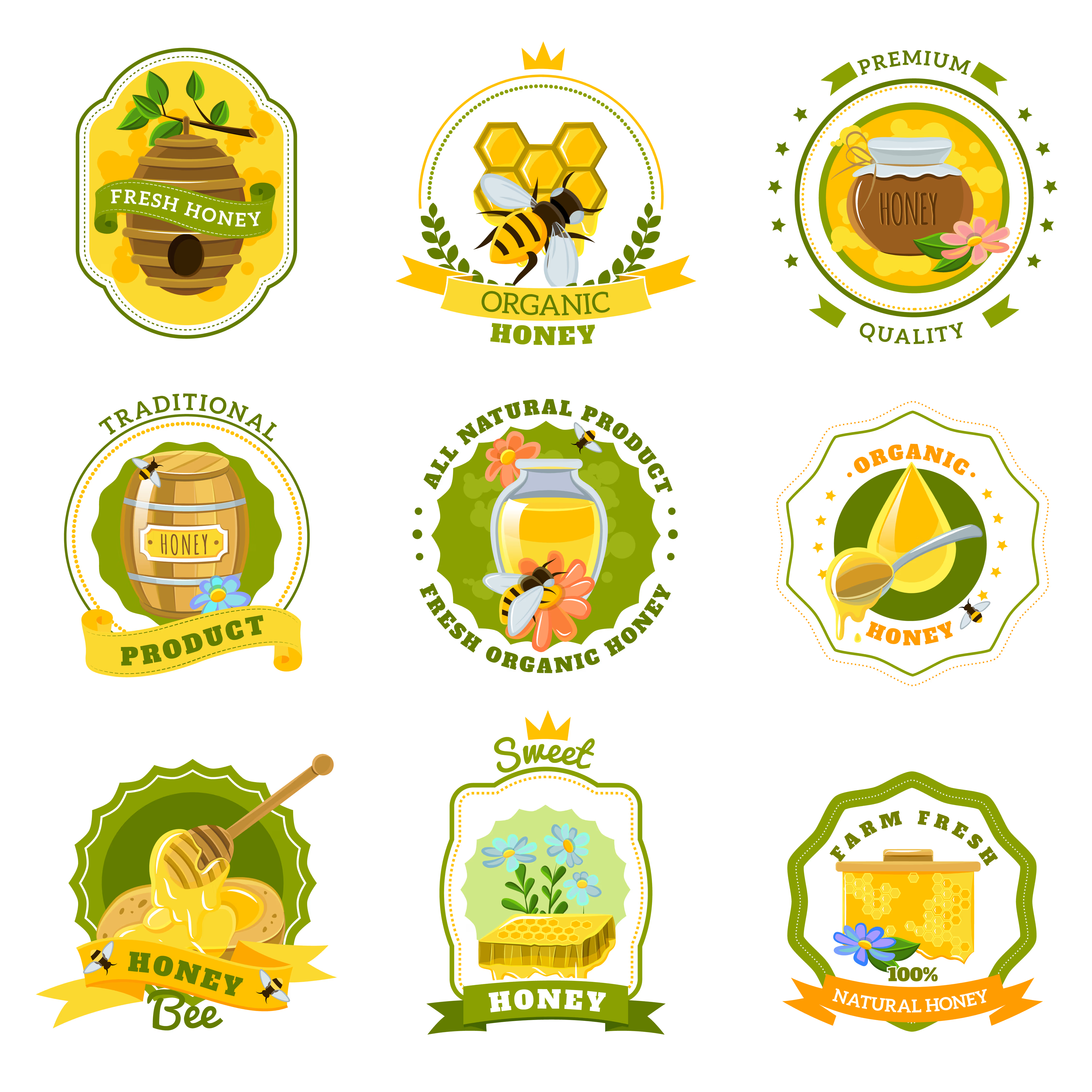
A collection of logo concepts created for a honey brand, exploring different visual styles and directions for a warm, natural identity.😍


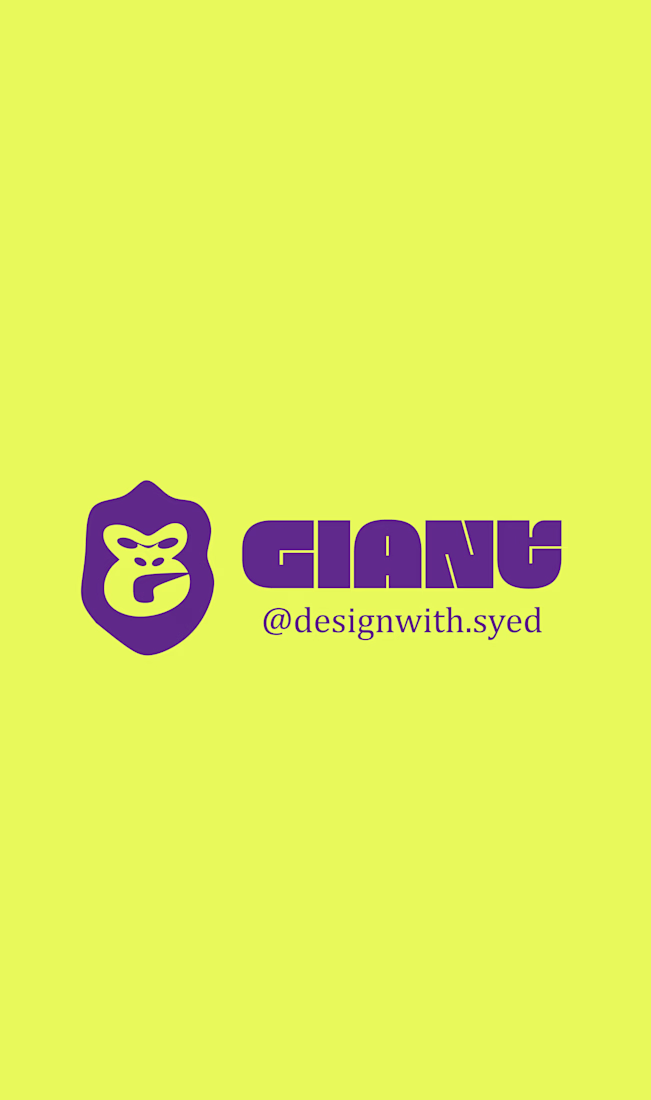
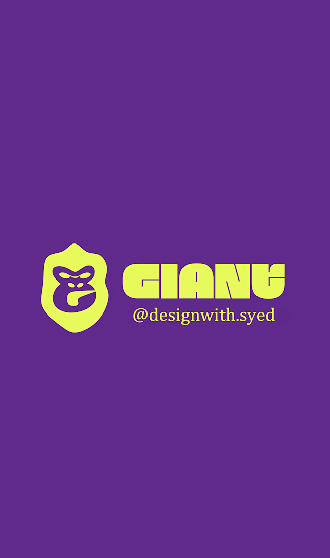
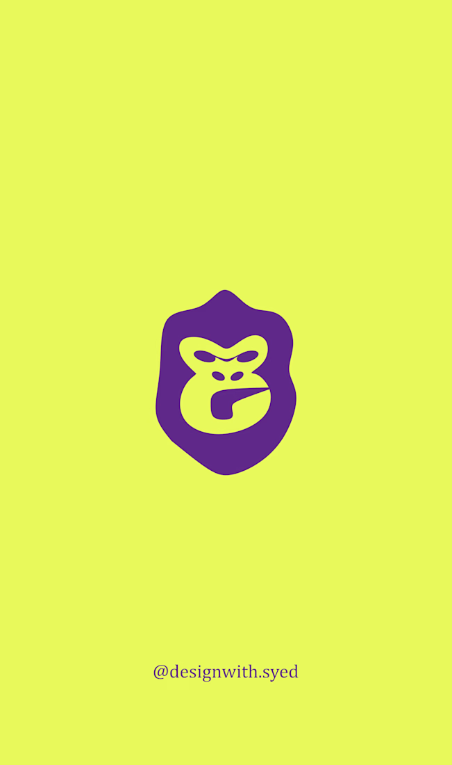
A self-initiated logo project based on a fictional design brief for Giant.
The brief was for a pre-construction apartment brand offering solar-powered homes, targeting millennials. The identity needed to feel delightful and affordable, with a purple pictorial mark that could also work on vehicles.
For my concept, I wanted to move away from the usual house or building symbols. I explored an animal-inspired mark combined with a hook shape to create something bold, playful, and easy to recognize.
I kept the shapes simple and strong so the mark could work well even when printed on the side of a vehicle.
This was a self-initiated practice project where I explored how to turn a given brief into a visual identity concept.



WUP — Modern Logo & Brand Identity Concept ↗️
WUP is a contemporary brand identity concept built around one simple idea: turn movement into a memorable visual identity.
At the center of the identity is a custom geometric symbol that combines the letter W with an upward directional form — creating a mark that communicates progress, movement, and forward momentum while remaining simple and recognizable.
The visual direction focuses on clean geometry, strong proportions, and a flexible identity system designed to work across digital and physical brand touchpoints.
Special attention was given to:
• a distinctive W-based symbol designed to remain recognizable at different sizes;
• an upward visual cue that communicates growth, progress, and ambition;
• balanced geometry and negative space for a clean, modern appearance;
• a refined wordmark that complements the symbol without competing with it;
• a flexible color system that allows the identity to adapt across different applications;
• strong contrast and clear visual hierarchy for digital and print environments;
• scalable construction that keeps the logo effective from small icons to large-format applications;
• consistent brand applications that demonstrate how the identity can extend beyond the logo itself.
The result is a modern identity system that feels confident, scalable, and distinctive — built to give WUP a recognizable presence while leaving enough flexibility for the brand to evolve.
Looking to create a distinctive logo and identity for your startup or business?
Let’s build a brand that doesn’t just look professional — it becomes recognizable.
🌍 Available for projects worldwide

