The network for creativity
Join 1.25M professional creatives like you
Connect with clients, get discovered, and run your business 100% commission-free
Creatives on Contra have earned over $150M and we are just getting started
Back to feedPost
🚨 Designers & Creators — Don’t Miss This Opportunity!
A new creative challenge just dropped and it’s something different 🔥
The FLORA Technique Challenge is now LIVE (April 8–15)
This isn’t just about design — it’s about turning your workflow into a reusable system that anyone can run in one click.
💡 Build your own Technique
💡 Share your process
💡 Get a chance to win from a $10K prize pool
Whether you’re into thumbnails, branding, ads, or content creation — this is for you.
If you’ve ever wanted to turn your ideas into something bigger, now’s the time 🚀
👉 Join here: https://flora.ai/
👉 Start building your Technique today
Let’s see what you create 👇


great designs

@Prince Zana Thank you so much🥰

Good job
The network for creativity
Join 1.25M professional creatives like you
Connect with clients, get discovered, and run your business 100% commission-free
Creatives on Contra have earned over $150M and we are just getting started



Related posts

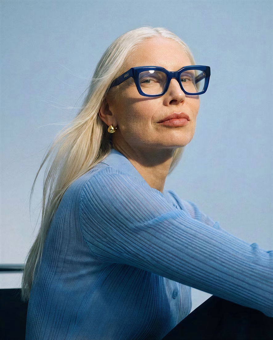
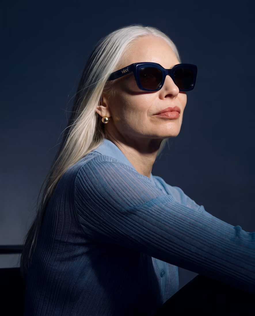
What happens when you give an old piece a dark mode and a pair of sunglasses? 🕶️
I took a piece from my portfolio and ran it through Krea 3 to see how far I could push it while keeping the original composition.
Before → light and daytime.
After → dark mode, with sunglasses.
Where it helped: quick edits that kept the composition intact, making it easy to explore a different mood.
Where I’d still go by hand: final color balance, lens reflections, and those tiny details that make everything feel intentional.
Before or after? Tell me which one you’d keep and what you’d edit next 👇


Beautiful


Follow for More Job posts!

wow Dada, Please do share for accountants as well😊
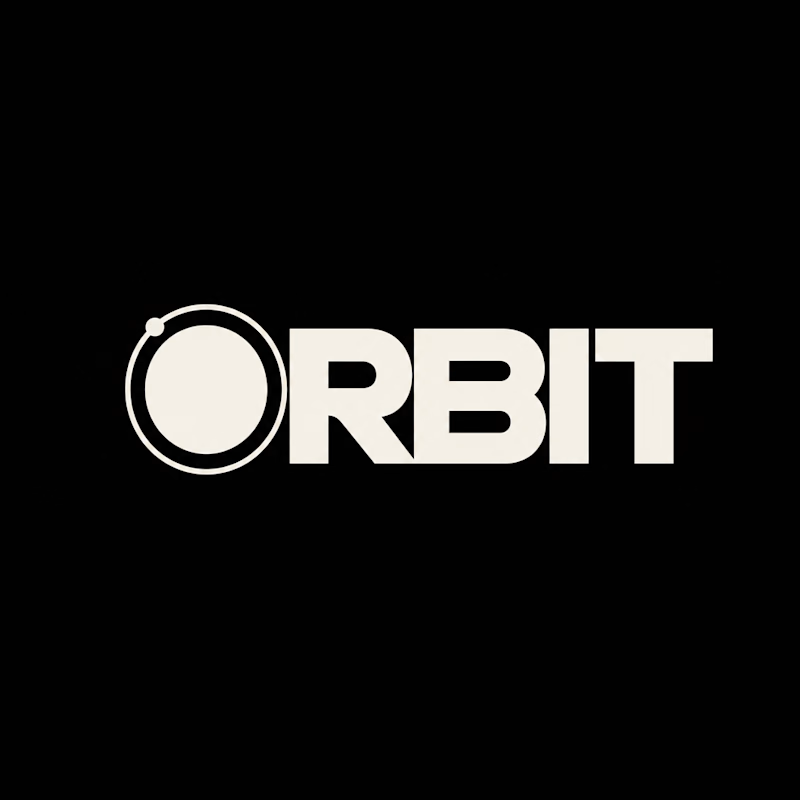
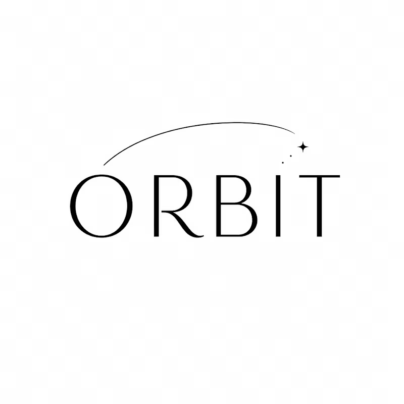
Which ORBIT pulls you in: the quiet one or the loud one? ✨
One name, two directions. Same idea, an object in motion around a center.
A → Heavy extended sans on black. The orbit is built into the O, a ring with a single satellite. Compact, graphic, impossible to ignore.
B → Light, high-contrast serif with a hairline arc and a tiny spark. The orbit is a gesture, a trail you almost miss. Elegant, airy, a little mysterious.
If you ask me, I'd pick A.
36 voted
80%
9 voted
20%
45 votes
Closed


