The network for creativity
Join 1.25M professional creatives like you
Connect with clients, get discovered, and run your business 100% commission-free
Creatives on Contra have earned over $150M and we are just getting started
Back to feedPost
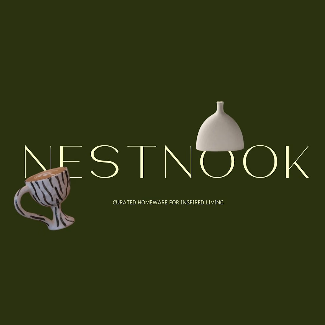
I’m so excited to finally share this project with you all! Nestnook is a premium, design-driven boutique homeware label that celebrates minimalist aesthetics and everyday luxury. But behind their beautiful products was a challenge many growing brands face: massive digital clutter and disjointed backend systems.
When I stepped in as their Automation Workflow Partner and Brand Designer, my mission wasn't just to make things look pretty. It was to build what I call "Narrative Infrastructure" a seamless system where high-end design actually drives business growth hands-free.


The earthy olive backdrop, oversized serif wordmark, and vase still life make Nestnook feel tactile and premium. The modular system looks ready to translate across packaging and digital.

Thank you, Rohan! I appreciate the feedback. Creating that tactile, premium feel was the primary goal, so it's rewarding to hear that it hits the mark.
The network for creativity
Join 1.25M professional creatives like you
Connect with clients, get discovered, and run your business 100% commission-free
Creatives on Contra have earned over $150M and we are just getting started











Related posts

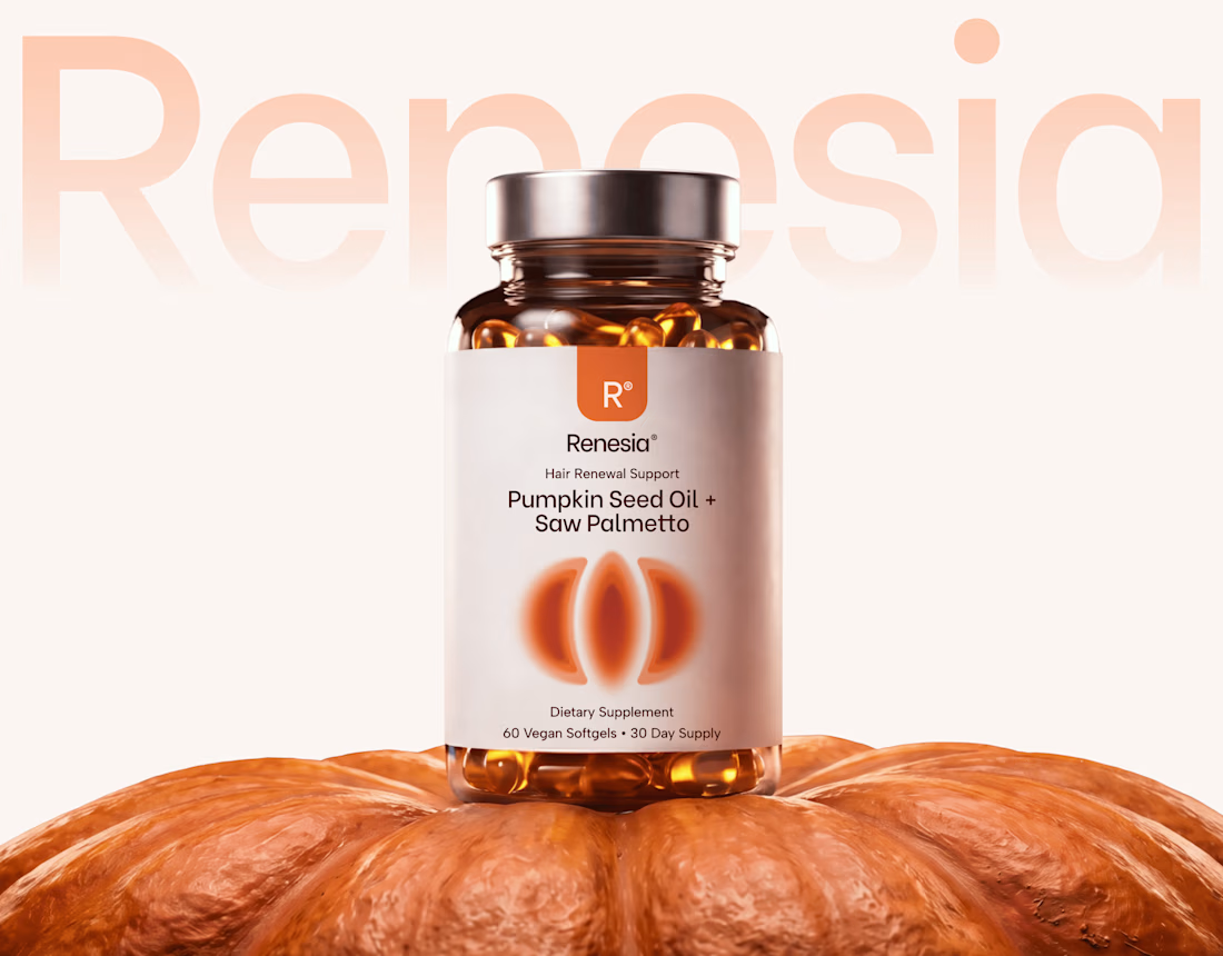
Here we go, check the full case study, I think you will love it! 🎃


Love this! 🎃 The pumpkin concept for Renesia is super creative - perfectly matches the Pumpkin Seed Oil story. Clean work in Illustrator & Figma!


Lovely cohesive work, Alex. The motion is spot on!

15 seconds of smooth UI, editorial layouts, and micro-interactions.
Kept the micro-interactions snappy, typography expressive, and transitions buttery smooth.
Rate this UI animation from 1 to 10 in the comments, or tell me what you’d improve! 😉


Solid 10/10 bro! 🔥 Micro-interactions are super snappy and transitions are buttery smooth indeed. Editorial layout game is strong. Keep it up!