The network for creativity
Join 1.25M professional creatives like you
Connect with clients, get discovered, and run your business 100% commission-free
Creatives on Contra have earned over $150M and we are just getting started
Back to feedPost
Customer Retention & Cohort Analysis Performed an advanced cohort retention analysis using sample customer data to evaluate retention patterns across acquisition cohorts. The analysis highlights customer behavior over time and helps identify retention trends and potential churn risks through data visualization.

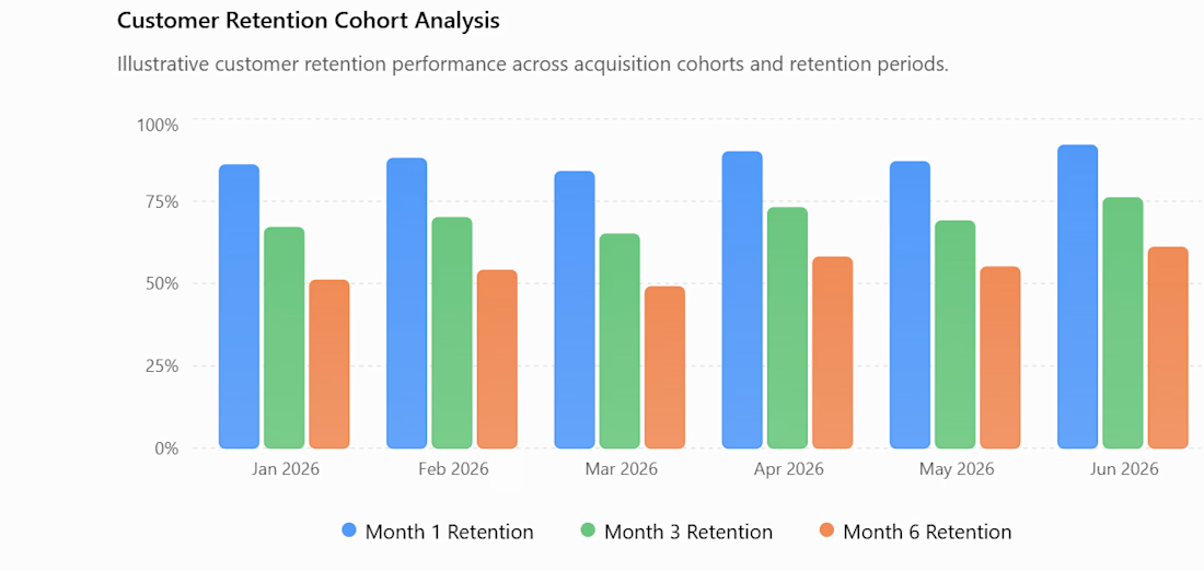

Cohorts are the right lens here. One useful guardrail is comparing cohorts at identical ages and separating acquisition-channel mix from within-cohort retention; otherwise a newer cohort can look weaker simply because it has had less time to mature. Nice foundation for making churn actionable.

Great insights, Mo. I completely agree that adjusting for acquisition channels and cohort age is crucial to avoid misleading conclusions. Appreciate the guidance!
Thanks a lot for the great insights, Mo! This approach will definitely make the retention analysis much cleaner. Excited to see where this goes too!
The network for creativity
Join 1.25M professional creatives like you
Connect with clients, get discovered, and run your business 100% commission-free
Creatives on Contra have earned over $150M and we are just getting started





Related posts

Electronic Assembly Production Dashboard
Designed a futuristic industrial dashboard for electronic assembly and manufacturing operations. The concept focuses on real-time production monitoring, assembly workflows, quality control, station efficiency, and component tracking.
The interface combines 3D visualization + data-driven UI to make complex manufacturing information easier to understand and act on.


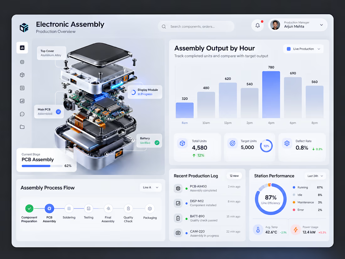

The exploded PCB next to the charts is a smart anchor for the layout. Does the 3D model rotate in the live version?

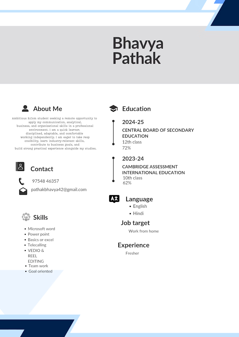
Ambitious B.Com student seeking a remote opportunity to apply my communication, analytical, business, and organizational skills in a professional environment. I am a quick learner, disciplined, adaptable, and comfortable working independently. I am eager to take responsibility, learn industry-relevant skills, contribute to business goals, and build strong practical experience alongside my studies.


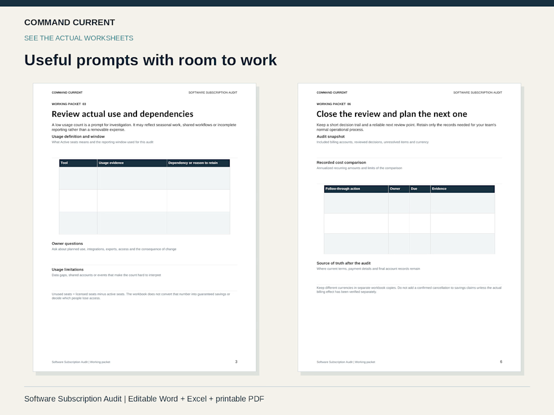
Before removing a software seat, check what work still depends on it.
A low usage count can reflect seasonal work, a shared workflow or an incomplete report. Give each account owner three questions:
• What does “active” mean in this report, and what period does it cover?
• Which projects, integrations, exports or shared access rely on this account?
• If a change is approved, who will make it and where will the actual result be recorded?
Keep the item open until the change is confirmed. A cancellation request alone doesn't establish the billing effect.
These are actual worksheets from the Software Subscription Audit Kit. It includes a six-page editable Word packet, a 40-row Excel account tracker, printable PDFs, a fictional completed example and a Quick Start.
A practical way to organize the review and follow-through. Account changes still happen through your normal vendor process.
Explore the kit: https://contra.com/products/liXyucUB-software-subscription-audit-kit