The network for creativity
Join 1.25M professional creatives like you
Connect with clients, get discovered, and run your business 100% commission-free
Creatives on Contra have earned over $150M and we are just getting started
Back to feedPost
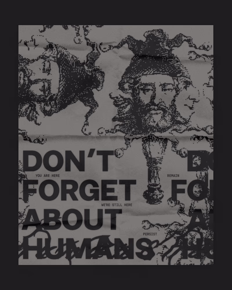
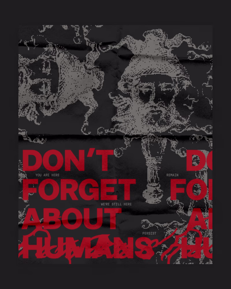
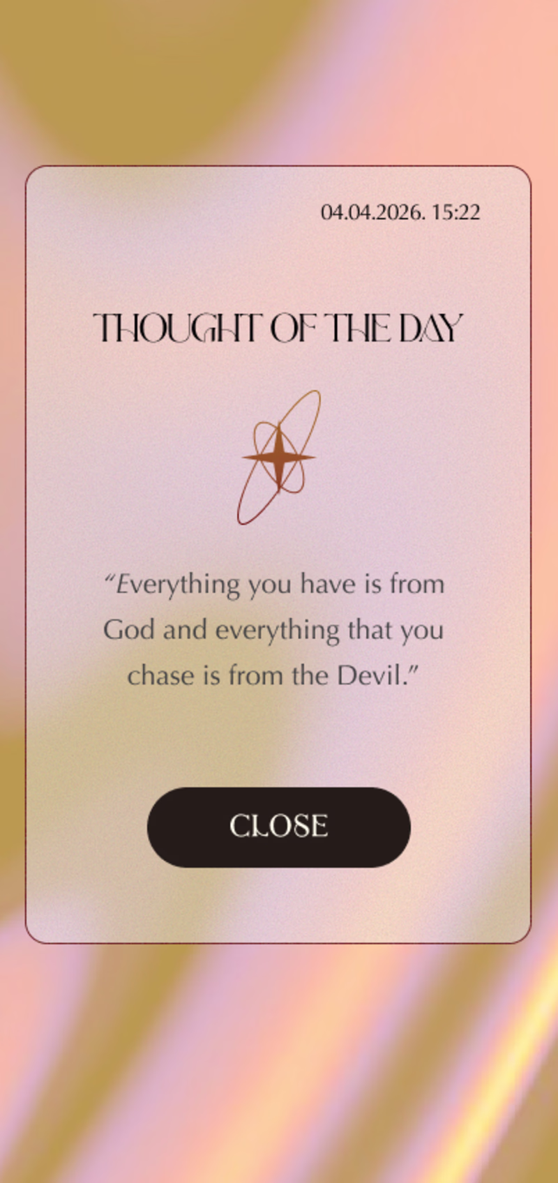
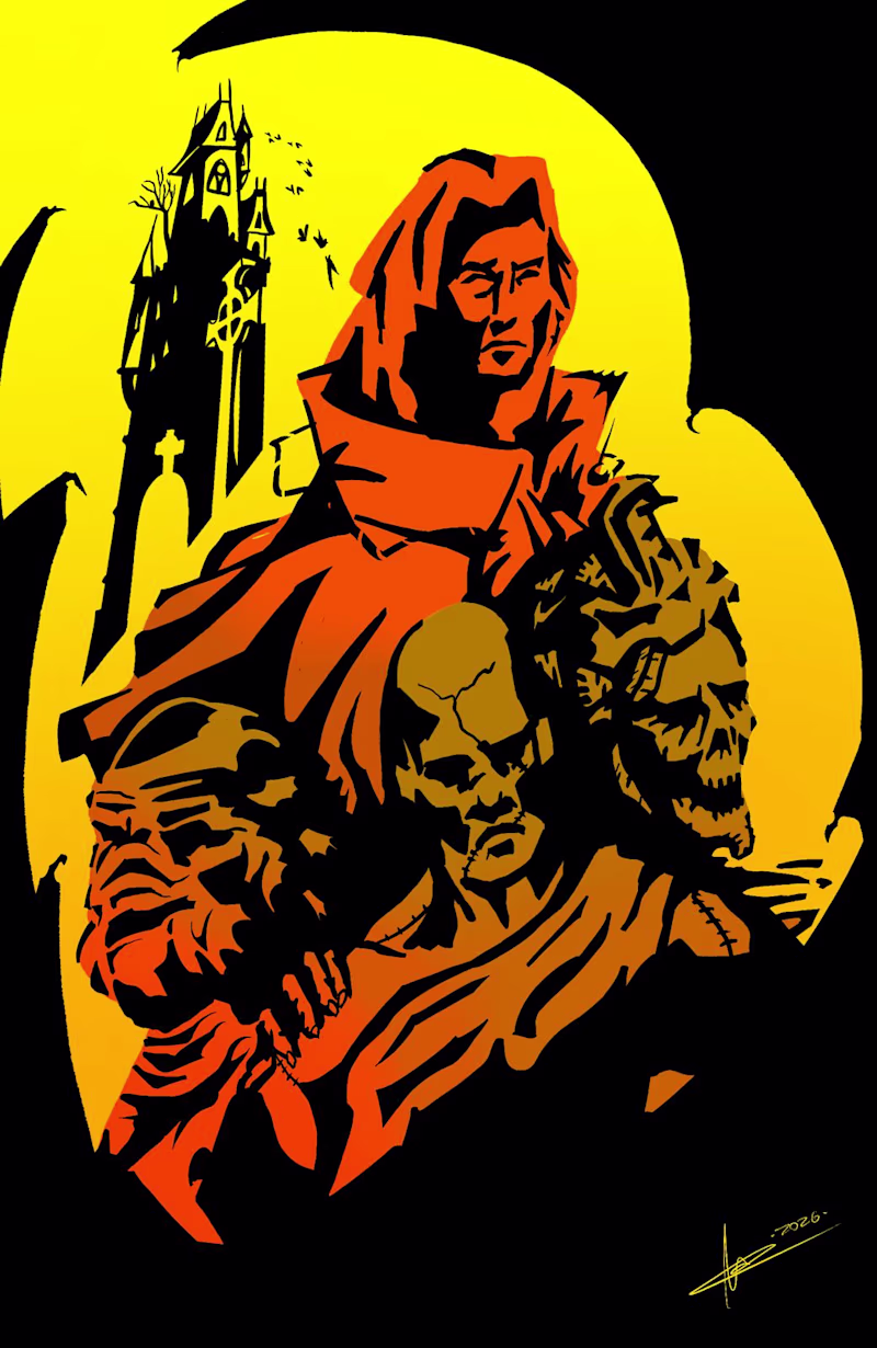
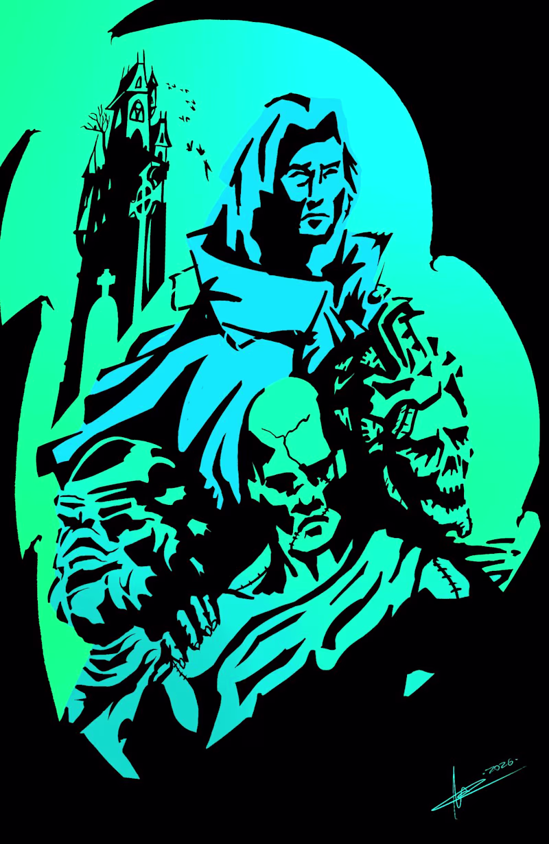
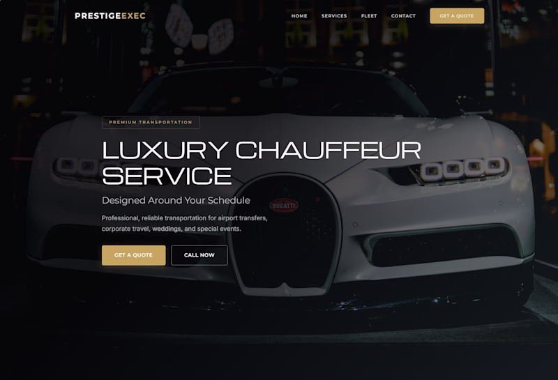
Taste Test
I made this poster for fun and I got feedback that the original version (left) was too dull because of the color palette, so I made a new version (right).
I still think the original looks better, even though the black and red iteration might draw more attention.
Would you push the attention seeking red version or the original more tone down version?
6 voted
75%
2 voted
25%
8 votes
Closed
The original has more depth and is reflective of the creator's thought process.
the left version is definitely more eye-catching.
your attention goes to it immediately
but after looking at them a bit longer, I personally came to the conclusion that the second version looks more beautiful overall
but the left version definitely does a better job of grabbing attention
I think the original is better
The network for creativity
Join 1.25M professional creatives like you
Connect with clients, get discovered, and run your business 100% commission-free
Creatives on Contra have earned over $150M and we are just getting started
Related posts
I'm playing with the design for the daily motivation app.
The vibe should be chill and elegant.
Which version you like better?
2 voted
14%
12 voted
86%
14 votes
Closed
Toxic swamp is so clean
Which Font style feels better?
Tell me in the comments🙂
3 voted
75%
1 voted
25%
4 votes
Closed
A is better
Trending
Claude
Claude has entered the design space. How are you using Claude Design?
Contra University
Learn from expert creatives how to earn more using next-gen AI tools.
creativeaiflow
Creative AI workflows are evolving. What tools do you use, and what are their strengths and weaknesses?
portfolioreview
The best portfolios tell a story, not just show a grid. Share yours for feedback.
freelancerlife
Freelancer life is wins, pivots, and everything in between. What’s yours right now?