The network for creativity
Join 1.25M professional creatives like you
Connect with clients, get discovered, and run your business 100% commission-free
Creatives on Contra have earned over $150M and we are just getting started
Back to feedPost
𝗦𝘂𝘀𝗵𝗶 𝗦𝗼𝗰𝗶𝗮𝗹 𝗠𝗲𝗱𝗶𝗮 𝗖𝗼𝗻𝘁𝗲𝗻𝘁 𝗗𝗲𝘀𝗶𝗴𝗻
I had fun with this one. 🍣
I wanted to see how far I could push a food-focused social media layout without making it feel too busy. The idea was to keep the sushi as the main attraction while using bold type, strong contrast, and simple layouts to make each post stand out on the feed.
I played around with promotional posts, combo offers, and more editorial-style layouts to give the campaign some variety while keeping everything visually connected.
Honestly, I really like how the set came together.
Tell me what you think.
#SocialMediaDesign #GraphicDesign #FoodDesign #FoodBranding #SocialMediaContent #AdvertisingDesign #VisualDesign #Typography #ContentDesign #CreativeDirection


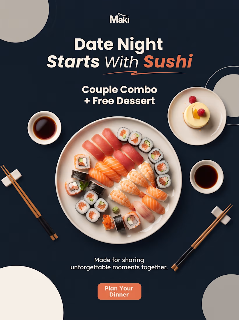
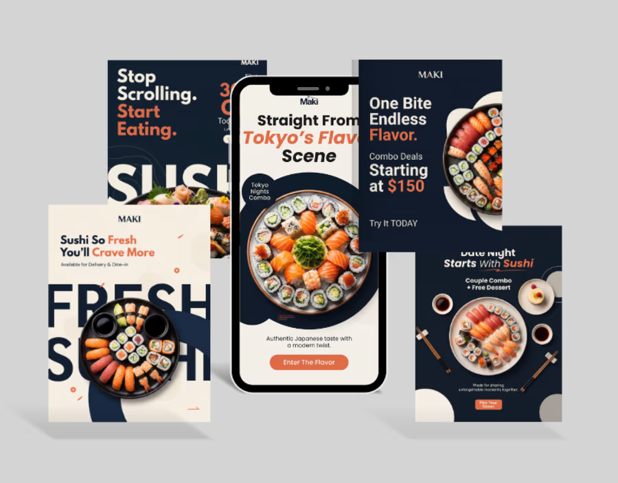
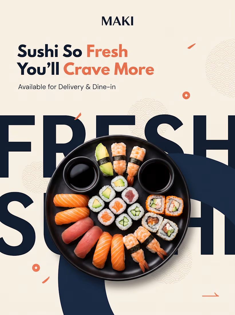
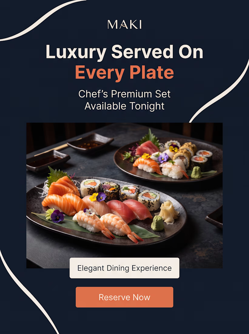

Food layouts usually tip over exactly where you flagged: the type starts competing with the appetite appeal. Letting FRESH run off the frame edge is a clever dodge - it keeps the loudness while the eye still lands on the sushi. For me the dark-plate frames hold that balance best of the set.

Great observation...thank you Artur
The network for creativity
Join 1.25M professional creatives like you
Connect with clients, get discovered, and run your business 100% commission-free
Creatives on Contra have earned over $150M and we are just getting started











Related posts

It’s been a minute since my last post here on Contra.
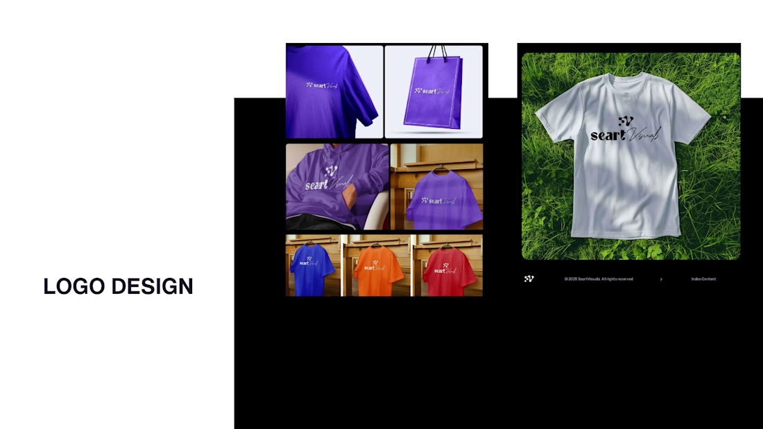
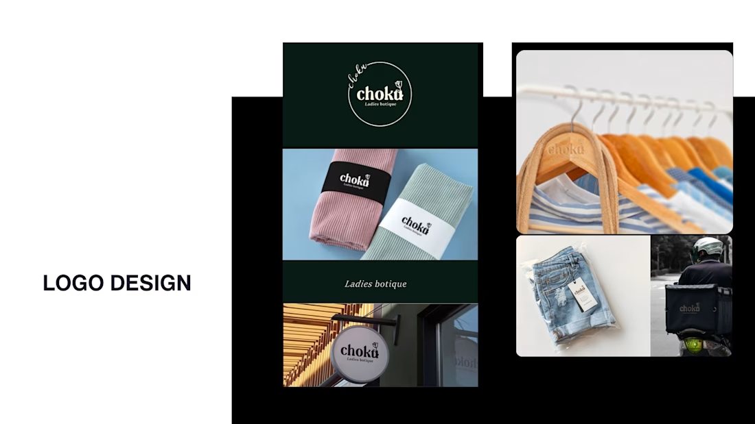
While my main focus usually lives in photo editing and digital design, I was digging through the archive recently and thought it’d be fun to share a couple of branding projects from the past:
Slide 1: Seart Visuals apparel & merchandise branding (1 year ago)
Slide 2: Choku Ladies Boutique identity and mockups (2 years ago)
Brand identity isn't my everyday lane, but tackling projects like these taught me a lot about visual consistency across different mediums. I’d love to hear your thoughts or see any feedback from fellow designers. Great to connect with the community again.



That's really great typography logo design❤️❤️

Behind the scenes of the Treal Studio brand film.
Built in one week, from creative direction to sound design.


Love the overall feel, looks amazing 👌🏼

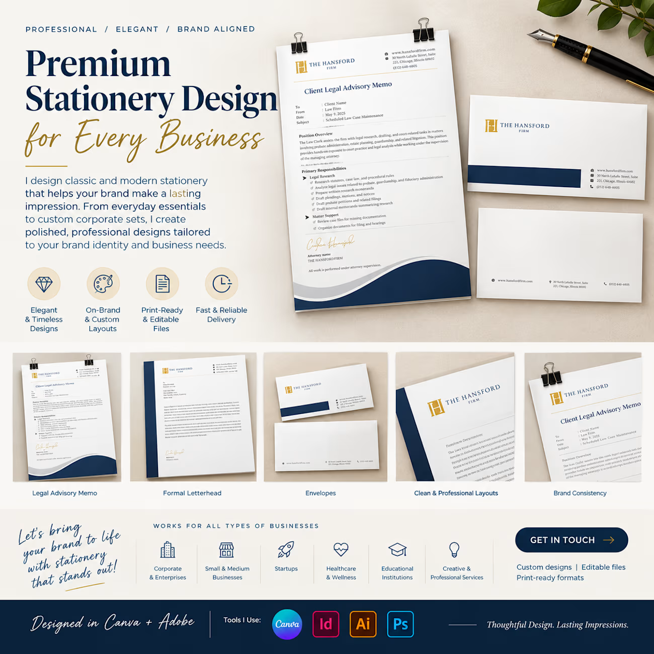
Your stationery is more than paper — it's an extension of your brand identity.
I design premium, classic, and modern stationery for businesses of all sizes, creating cohesive designs that reflect your brand's personality and professionalism.
My stationery design services include:
✦ Business cards
✦ Letterheads and envelopes
✦ Corporate folders and presentation sets
✦ Notepads and compliment slips
✦ Custom branded stationery collections
From individual stationery pieces to a complete corporate identity suite, every detail matters.
Looking to give your brand a more polished, professional appearance? Let's connect!
#StationeryDesign #BrandIdentity #GraphicDesign #BusinessBranding #CanvaDesigner #CorporateDesign #BrandDesign


Clean layouts and a very cohesive brand look across every piece. The Hansford set looks really polished. Nicely done, Sheena!