The network for creativity
Join 1.25M professional creatives like you
Connect with clients, get discovered, and run your business 100% commission-free
Creatives on Contra have earned over $150M and we are just getting started
Back to feedPost
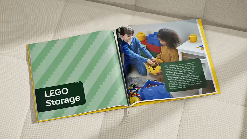
It’s always a special feeling when something you’ve been designing on screen for months finally becomes a real, printed piece.
Just shared this catalog project on Contra, created in collaboration with NHG for their LEGO®-licensed collection.
See Full Work




Thank you!
The network for creativity
Join 1.25M professional creatives like you
Connect with clients, get discovered, and run your business 100% commission-free
Creatives on Contra have earned over $150M and we are just getting started

Challenges
View all


Related posts

Brand Expressions for Munch

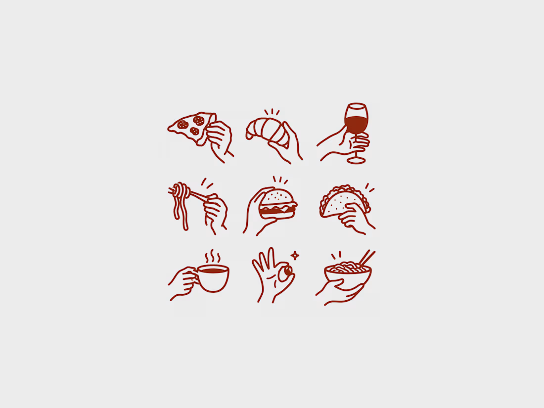
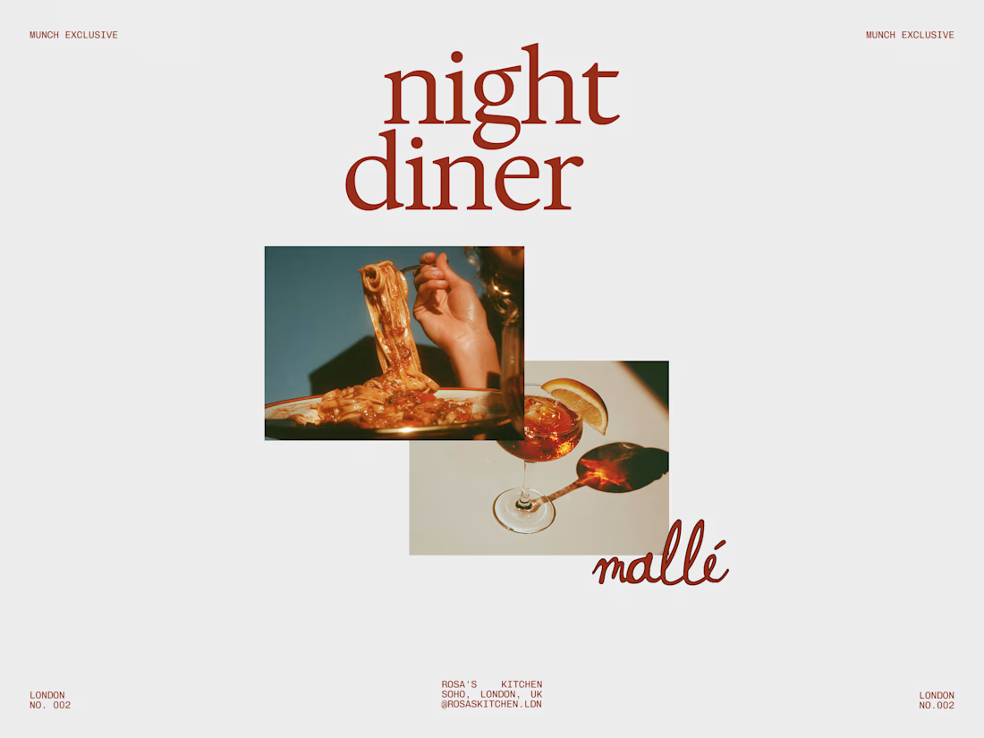
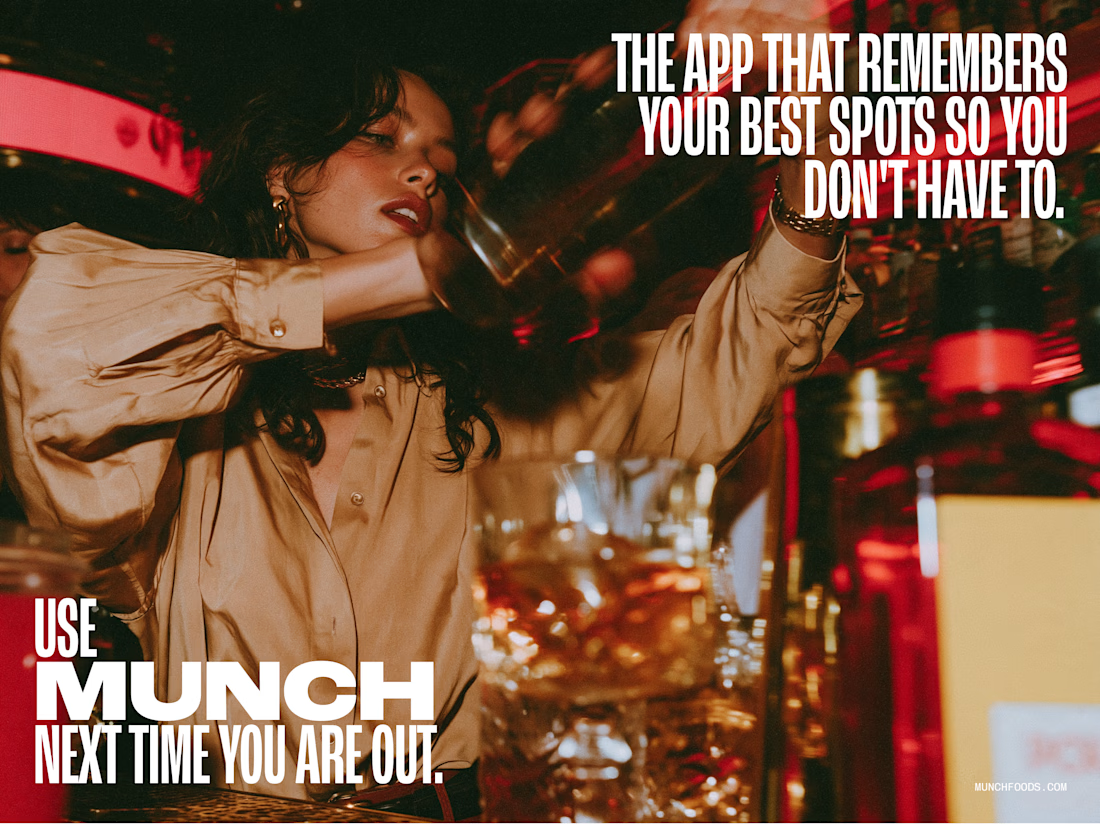
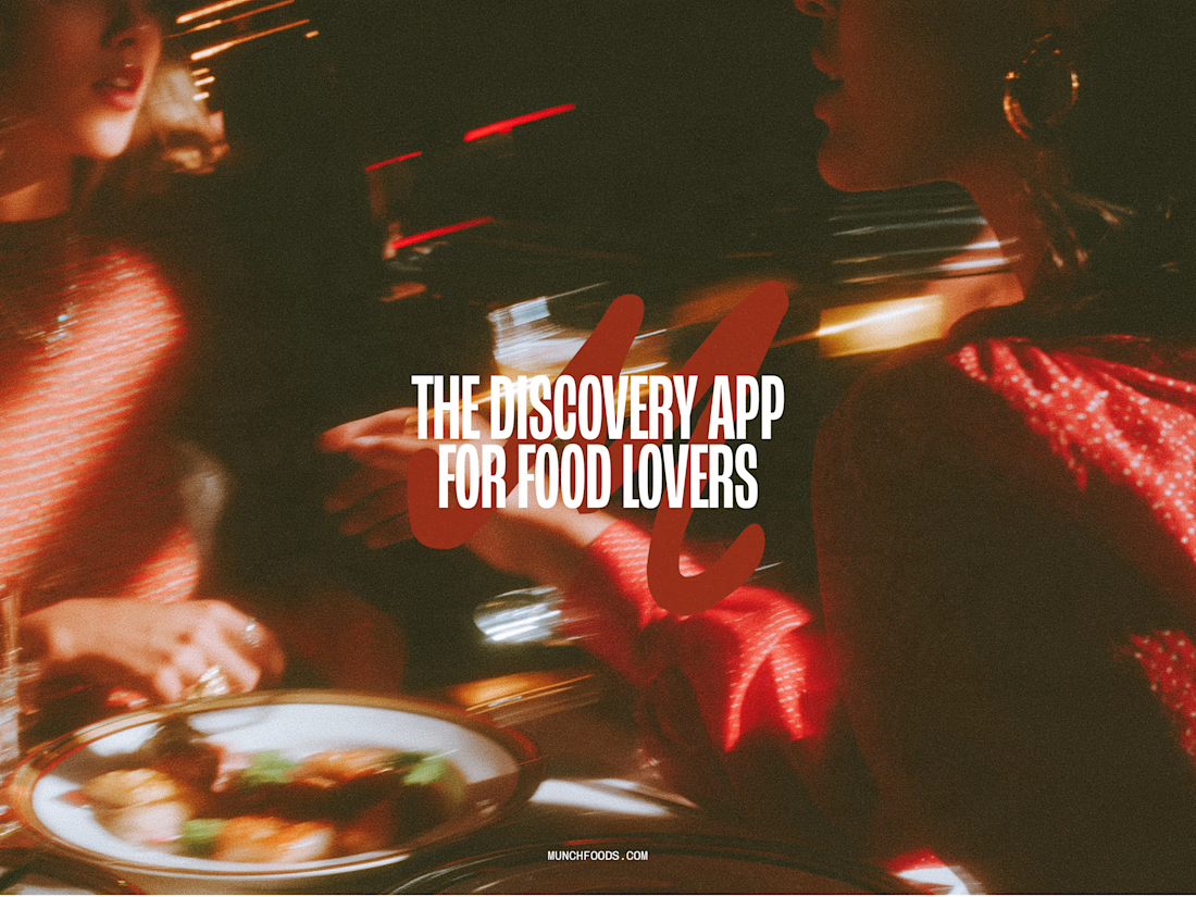

The hand-drawn gesture icons paired with that retro diner script give it real personality, feels less like a generic food app and more like something with a point of view.

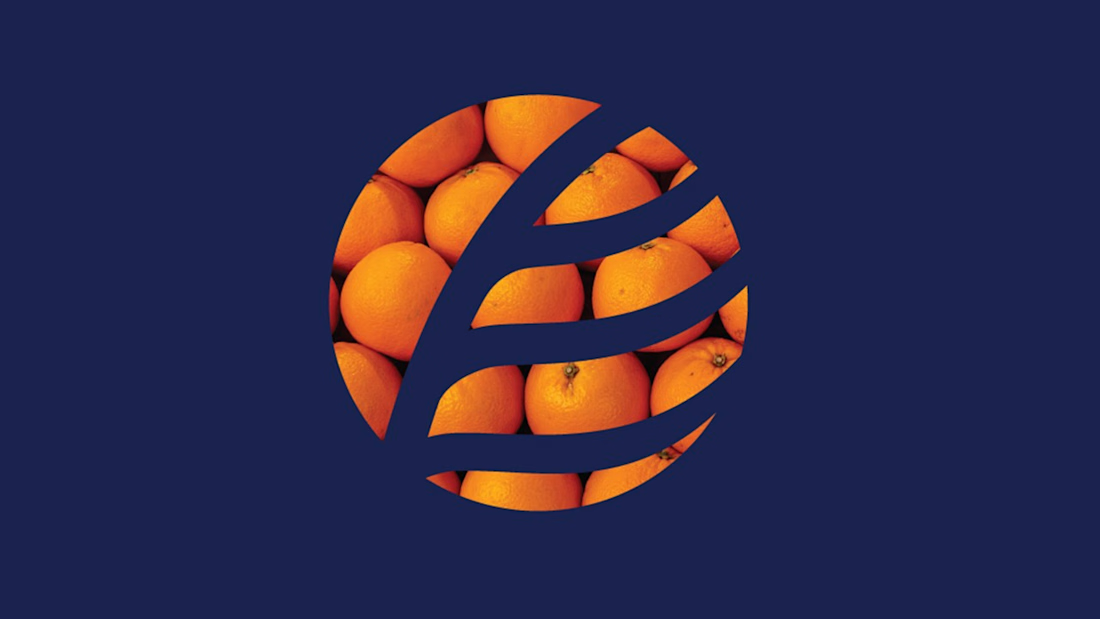
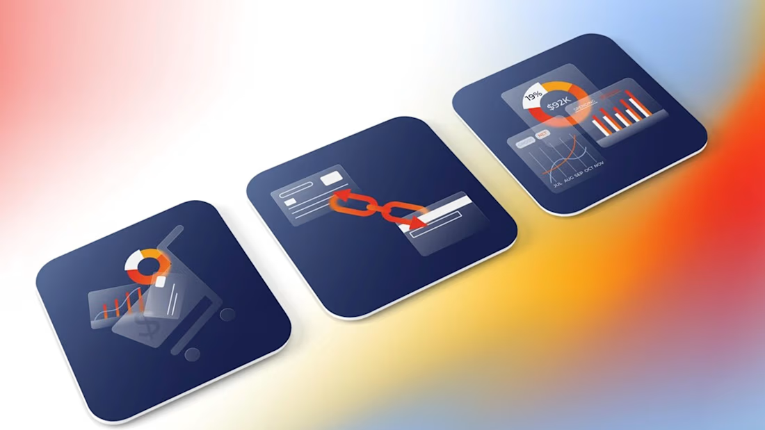
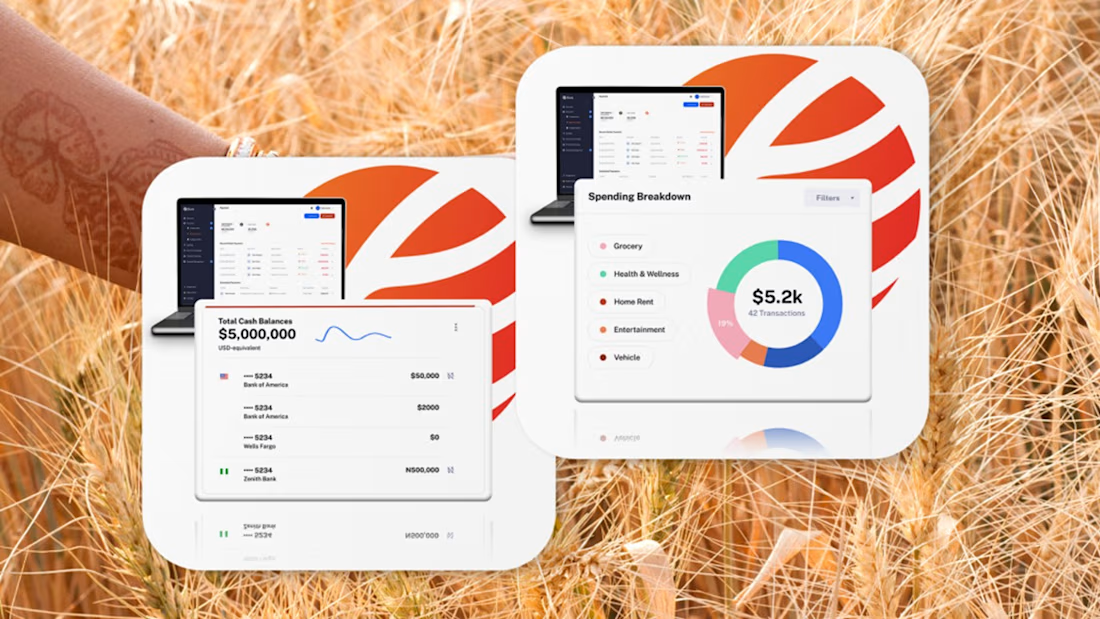
Fintech for agriculture doesn’t have to look earthy, heavy or industrial.
With Fluna, the goal was to create something more premium, distinctive and forward-looking, while still feeling relevant to the market it serves.
What I value most about this project is its longevity. I created this identity four years ago, and the client is still using the logo and visual system today.
For me, good taste in branding is not about following a visual trend. It’s about making choices that still feel right years later, and building a system strong enough to evolve with the company.
#BrandIdentity #BrandDesign #CreativeDirection #FintechBranding

Great work 👍


amazing