The network for creativity
Join 1.25M professional creatives like you
Connect with clients, get discovered, and run your business 100% commission-free
Creatives on Contra have earned over $150M and we are just getting started
Back to feedPost
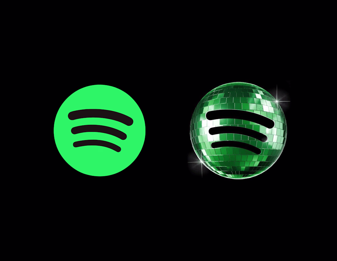
Seeing a lot of people roasting Spotify’s disco-ball logo… and honestly, I get why.
From a pure logo-design perspective, it technically breaks a lot of the things designers are trained to protect: clarity, simplicity, scalability, or even just using the right green, etc.
But I actually don’t think Spotify’s disco-ball logo failed because of the design.
I think it failed because most people saw it with zero context.
Spotify is recognizable enough that they can stretch their identity and do something playful/cultural like this without losing brand recognition.
The problem is that most of us didn’t experience it as part of an anniversary campaign.
We just opened our phones and suddenly Spotify looked different lol.
So instead of feeling intentional, it felt random.
And honestly, that’s such a good reminder that branding isn’t just about the visual itself, it’s about the rollout, the storytelling, and the order people experience things in.
I genuinely think if Spotify had introduced the campaign world FIRST:
the visuals, motion, playlists, nostalgia content, anniversary storytelling, etc.
…and THEN updated the logo…
people probably would’ve reacted more positively.
Because people are usually way more open to change when they understand the reason behind it.
Curious what other designers think though:
Was the issue actually the logo, or just the way it was introduced?
And how far can a brand stretch its identity before recognition starts breaking?
That’s honestly the more interesting branding question to me than whether the disco ball itself is “good” or “bad.”
I totally agree with you. If you had the authority, what process would you follow before publishing this logo? What would be the main focus of your efforts? I am eager to hear more about your perspective.
Yeah I think it really came down to how the logo was introduced, just like you said. Users who weren't aware of Spotify's anniversary were understandably confused - I saw so many comments from people who couldn't even tell it was a disco ball, especially given how small it...
100% this. The issue wasn't the disco ball; it was the sequencing. We experienced the punchline before the setup! When you change an icon that people muscle-memory click twenty times a day without setting the stage first, it’s always going to feel jarring.
Such a great reminder that branding is 50% visual and 50% storytelling.
I still believe the new logo for spotify is very well done, people can say whatever they want. Spotify has already gain ground as you've said so nothing to fear of
The network for creativity
Join 1.25M professional creatives like you
Connect with clients, get discovered, and run your business 100% commission-free
Creatives on Contra have earned over $150M and we are just getting started
Related posts
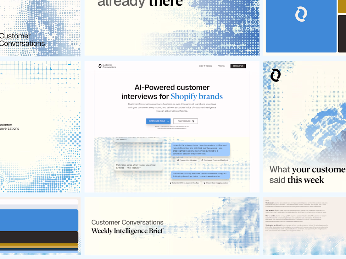
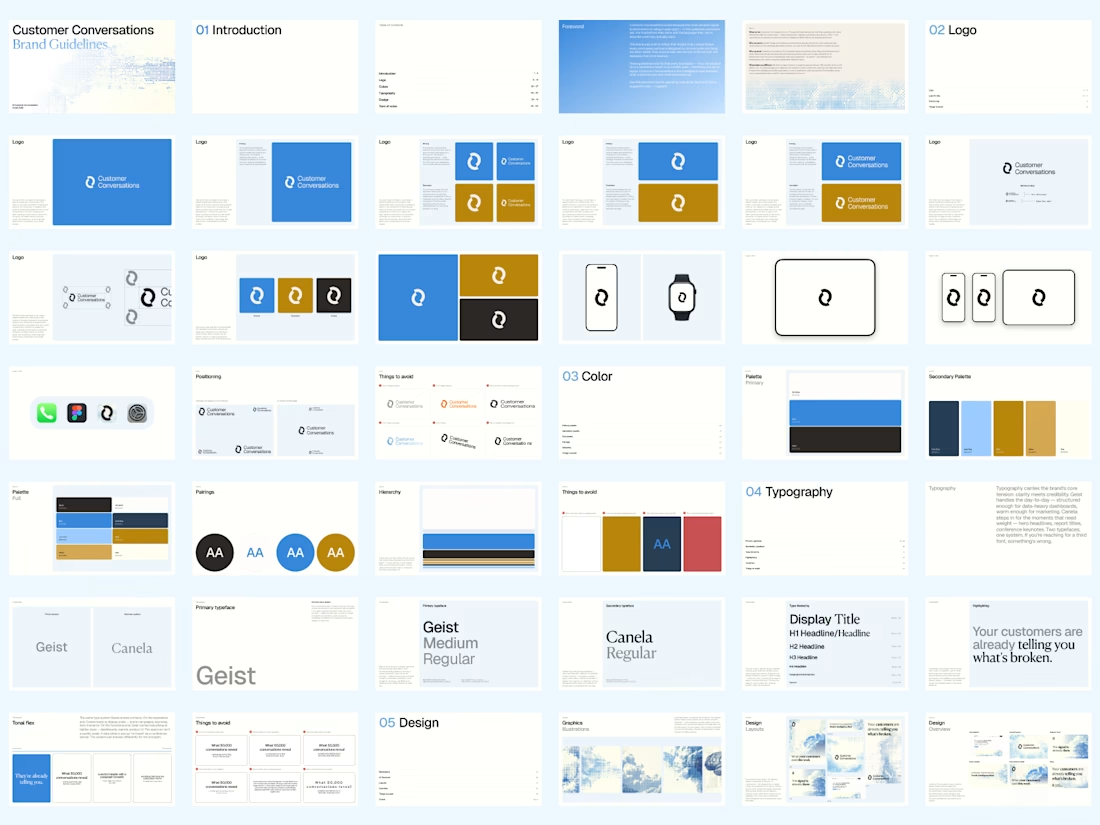
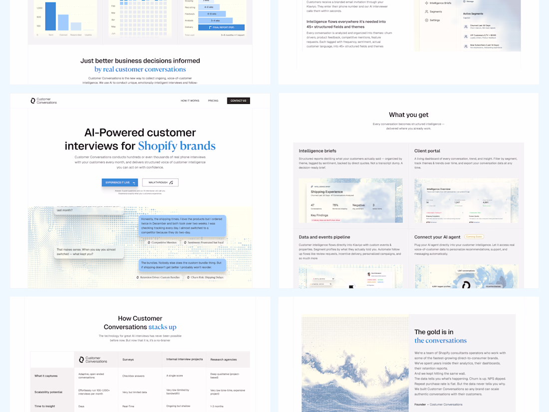
Took customer conversations through the whole journey from building out the strategy and positioning to designing and building out the brand and setting brand guidelines to designing their website.
This is standard practice for me and what I want my clients to experience as I always aim to deliver the best.
It's on another level 😉
Most designers ruin projects for one reason:
They design for their ego.
Not for the client.
A calm brand doesn’t need chaos just because you’re bored.
And an aggressive brand shouldn’t look like Stripe just because it’s trendy.
Good design isn’t self-expression.
It’s strategy.
Before choosing colors or layouts, ask:
Who’s the audience?
What’s the goal?
What actually moves the needle?
Skip that part…
And you’re not designing.
You’re gambling.
If your brand or website feels off right now, DM me before it becomes an expensive mistake.
Also... "Most clients ruin their brand for one reason: They want designs for their ego. Not for the brand." hahaha
Which one is your preference and why?
Context:
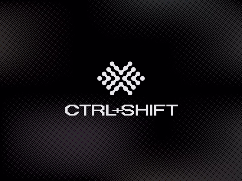
1. The logo represents an abstract and thoughtful brain symbol featuring interconnected geometric dots representing both left and right hemisphere of the brain, as a progressively pulsing neutrons resembling ideas generations as part of the creative intelligence.
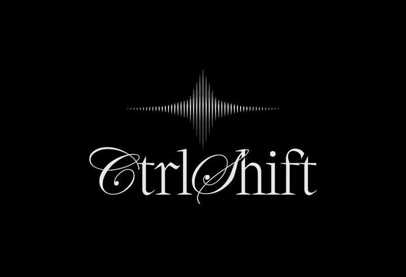
2. The logo features a modern, intelligent logomark built around a three-phased star symbolizing curiosity, signal throught the noise, and transformation. Constructed from sharp vertical lines with varying stroke weights, it creates a subtle optical illusion that reflects the brand’s core idea of clarity emerging from complexity. The three phases are conceptually tied to the brand name - Ctrl, Shift, and the final outcome: taste.
52 voted
81%
12 voted
19%
64 votes
Closed
1
Trending
Claude
Claude has entered the design space. How are you using Claude Design?
Contra University
Learn from expert creatives how to earn more using next-gen AI tools.
creativeaiflow
Creative AI workflows are evolving. What tools do you use, and what are their strengths and weaknesses?
portfolioreview
The best portfolios tell a story, not just show a grid. Share yours for feedback.
freelancerlife
Freelancer life is wins, pivots, and everything in between. What’s yours right now?