The network for creativity
Join 1.25M professional creatives like you
Connect with clients, get discovered, and run your business 100% commission-free
Creatives on Contra have earned over $150M and we are just getting started
Back to feedPost

Branding & Website for Fintech Company - Viynl Equity


The network for creativity
Join 1.25M professional creatives like you
Connect with clients, get discovered, and run your business 100% commission-free
Creatives on Contra have earned over $150M and we are just getting started

Challenges
View all


Related posts

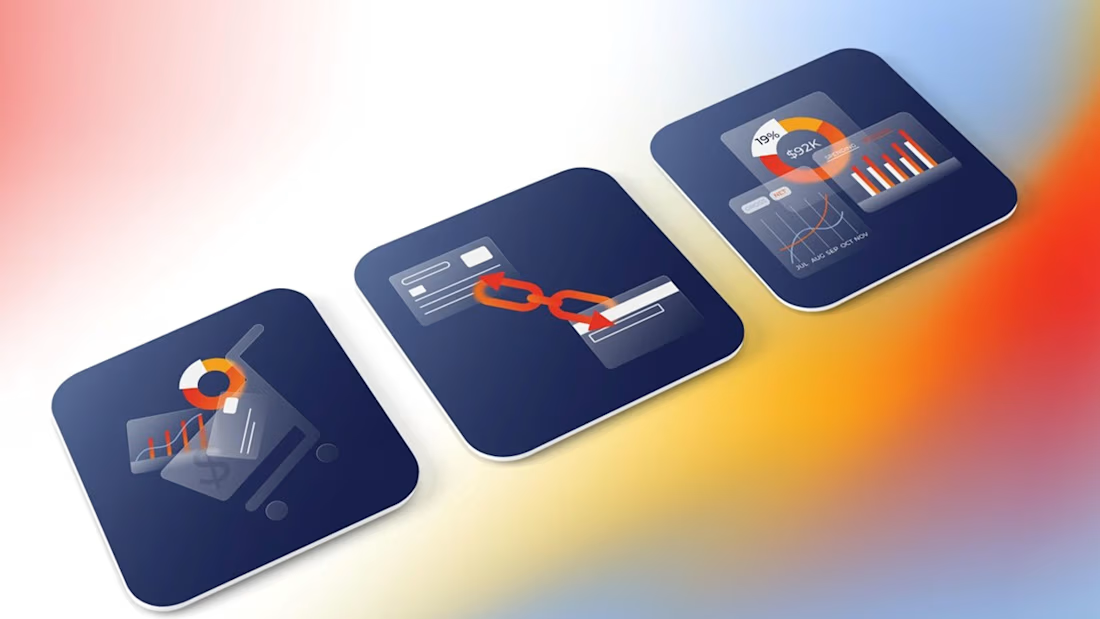
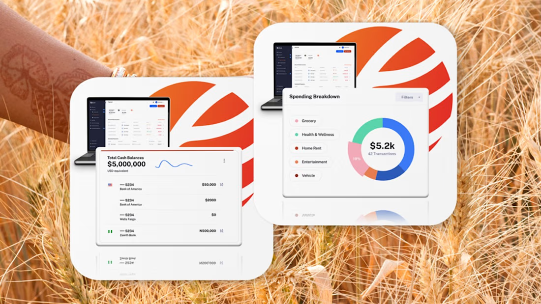
Fintech for agriculture doesn’t have to look earthy, heavy or industrial.
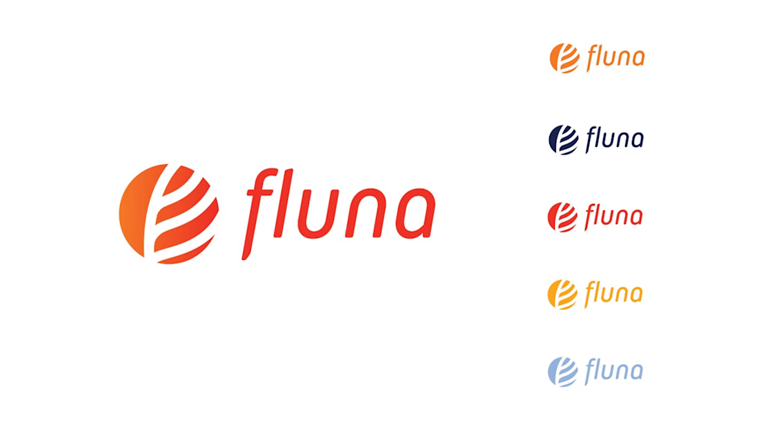
With Fluna, the goal was to create something more premium, distinctive and forward-looking, while still feeling relevant to the market it serves.
What I value most about this project is its longevity. I created this identity four years ago, and the client is still using the logo and visual system today.
For me, good taste in branding is not about following a visual trend. It’s about making choices that still feel right years later, and building a system strong enough to evolve with the company.
#BrandIdentity #BrandDesign #CreativeDirection #FintechBranding




Great work 👍

Brand Expressions for Munch
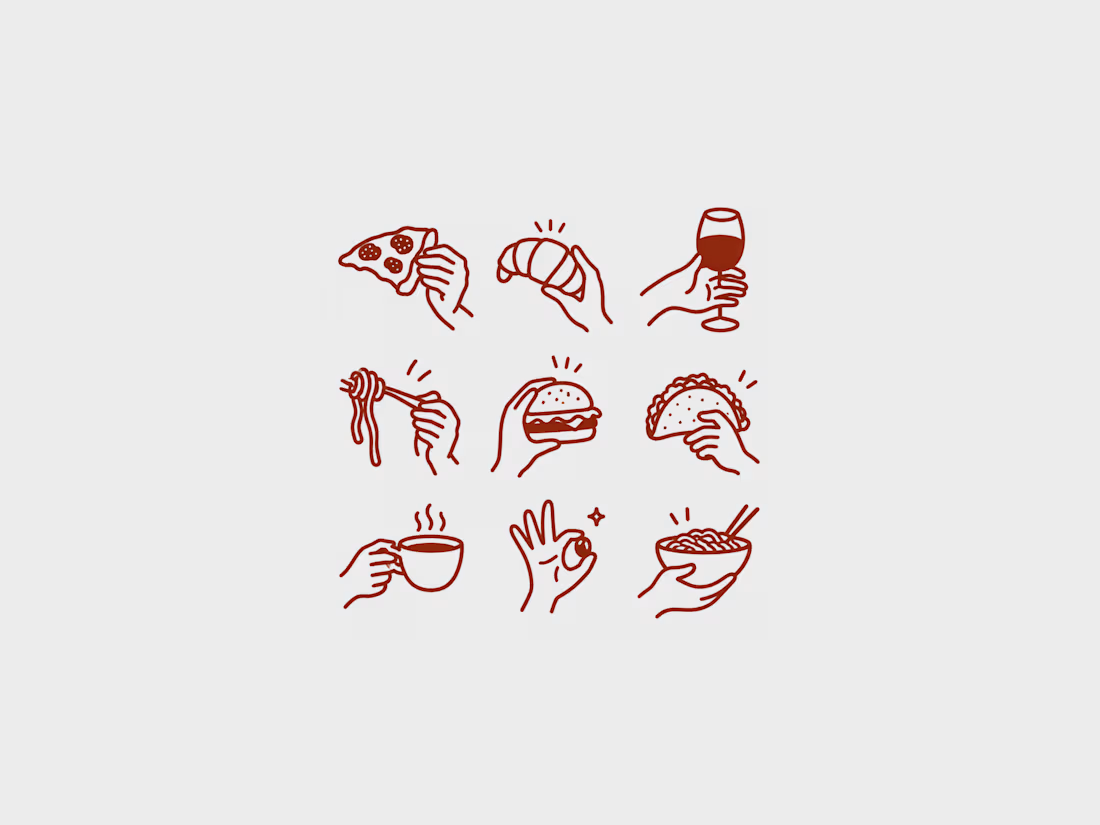
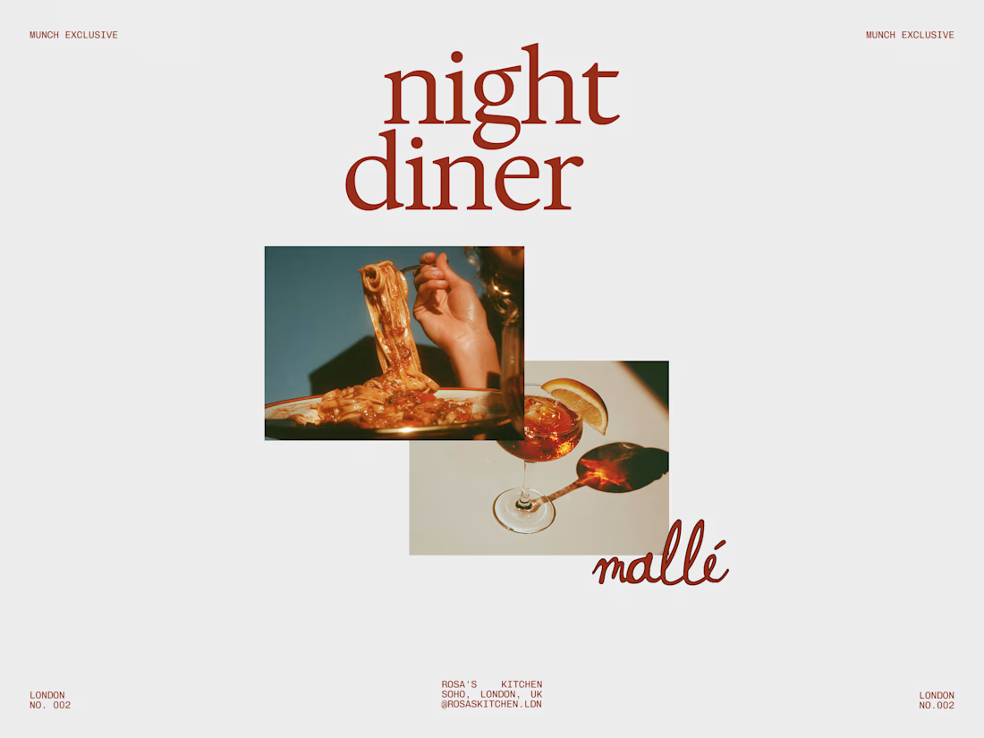
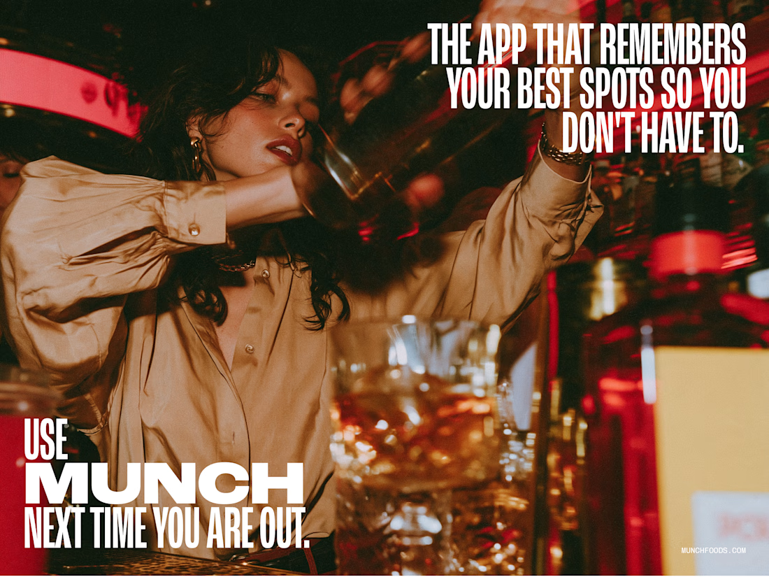
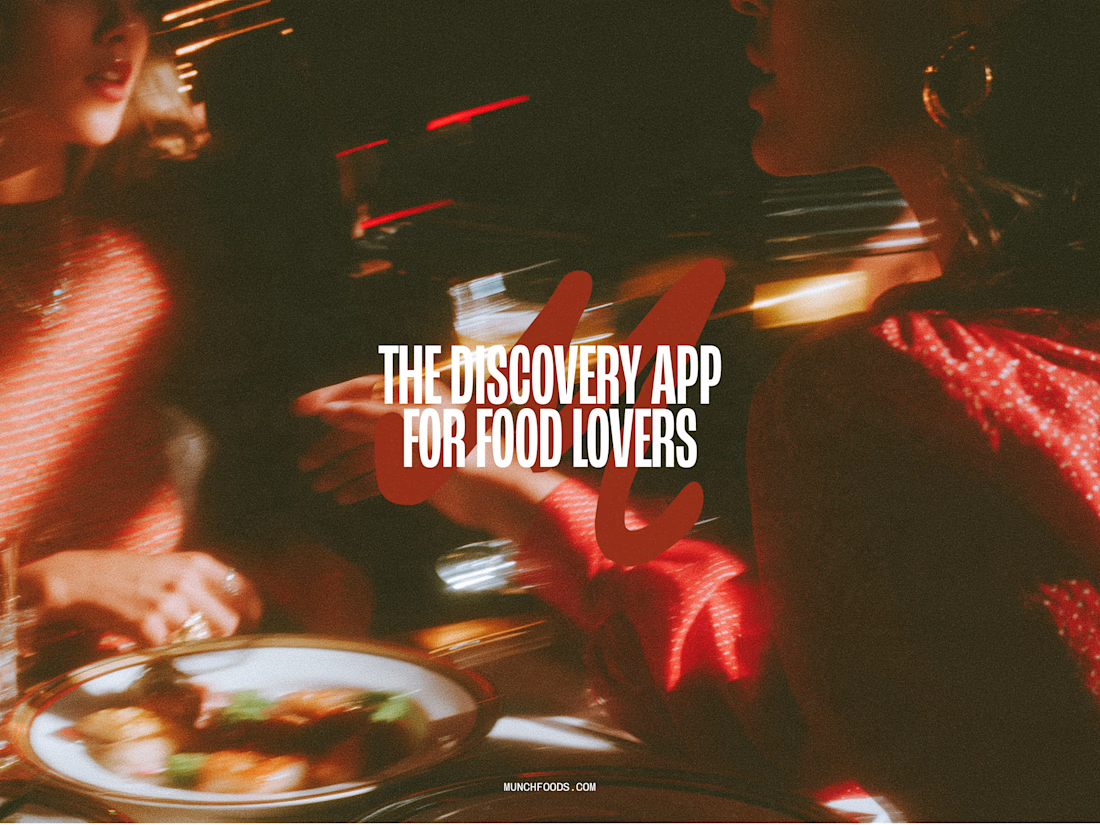

The hand-drawn gesture icons paired with that retro diner script give it real personality, feels less like a generic food app and more like something with a point of view.

Olma Hotel client Project Website preview
Instead of simply making a hotel website look beautiful, I focused on creating a design that helps visitors quickly understand:
Where they are staying → What they get → Why they should trust the hotel → How they can book.
I designed this hotel Website for Olma Hotel with one goal in mind: make the brand feel premium while making the booking journey simple and clear.
The design combines large architectural imagery, strong typography, spacious layouts, and carefully placed CTAs to create a visual experience that communicates comfort, trust, and luxury.
What I focused on:
— Premium first impression
— Clear hotel positioning
— Strong visual storytelling
— Easy-to-understand room & amenity sections
— Strategic booking CTAs
— Responsive-friendly layout structure
— Consistent luxury-focused visual language
A luxury hotel website should sell the experience before the guest even books.


This looks very attractive, but I feel like it will get more better if the blank spaces are not there, there are too many blanks spaces