The network for creativity
Join 1.25M professional creatives like you
Connect with clients, get discovered, and run your business 100% commission-free
Creatives on Contra have earned over $150M and we are just getting started
Back to feedPost
Happy Monday, everyone! ☕️
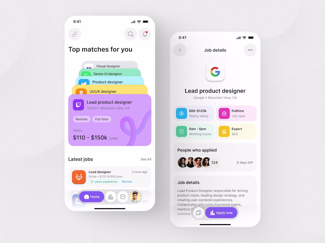
I’ve been experimenting with a 'Stacked Card' approach for the Job List to reduce the 'endless scroll' fatigue. I also used a bento-grid layout for the job details to keep key info like salary and location front-and-center.
Do you find the stacked cards intuitive for browsing, or do you prefer a traditional vertical list? Would love to hear your thoughts on the accessibility of the color-coded tags too! 👇
Nice work🙌
Thank you!
I love these cards 🔥
Thank you so much!
Good Work👍
Thank you!
super clean;
Thank you!
Oh yeahh! The right makes so much sense. I wonder why companies are not implementing this.
Exactly! It simplifies decision making early on. Often it’s a mix of legacy systems and risk aversion that slows adoption, but that’s what makes exploring new patterns exciting.
This is wonderful; however, I'll still need to swipe or perform a similar action. Those color tags are neat, but you gotta make sure everyone can actually see what's in them. On the details screen, you have a grid layout, which is not typically considered a bento layout. A...
Thanks for the feedback! I appreciate the perspective on the modular compartments, though I’d argue this actually is a bento-style execution. The detail screen uses varying card sizes and distinct visual weights to organize information into a cohesive, "boxed" ecosystem rather...
As for the "Top Matches" stack, the design is intentionally tactile. While it requires a swipe, that interaction creates a sense of discovery and focus that a flat list lacks. Regarding accessibility, those color tags are more than just "neat", they serve as secondary visual...
My apologies, I initially misunderstood and believed you were referring only to the four main tags as a bento layout. Of course, the entire screen utilizes a bento layout, while the four main tags are arranged in a grid layout. I stand corrected
The network for creativity
Join 1.25M professional creatives like you
Connect with clients, get discovered, and run your business 100% commission-free
Creatives on Contra have earned over $150M and we are just getting started
Related posts
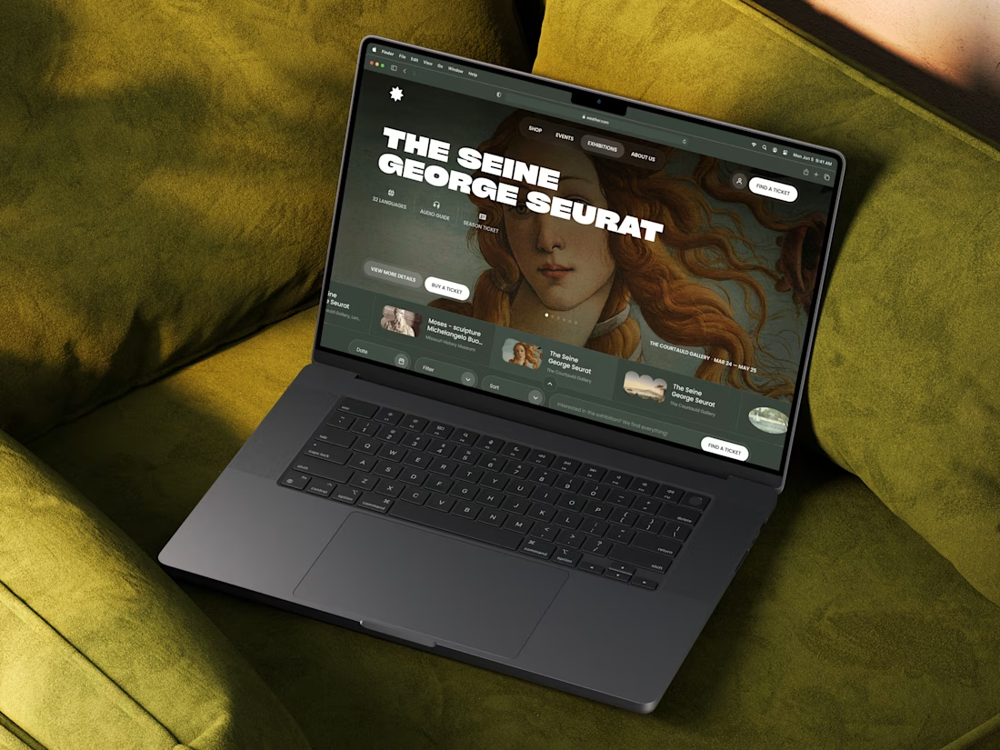
Just wrapped up this editorial-style Webflow project for a modern wellness platform ✨
Honestly, one of those projects where I cared a little too much about every detail - spacing, typography, pacing, atmosphere… everything had to feel intentional.
I didn’t want it to feel like a typical website.
The goal was to create something slower, immersive, and emotionally calm - more like moving through a digital exhibition space than scrolling another landing page.
Large typography, restrained UI, cinematic visuals, and minimal interactions helped shape the whole experience.
Designed in Figma.
Built in Webflow.
Always open to new collaborations →
Love the effect and transition ... how did you created it and then added to webflow website ?
This week will be great, I love the design
Without shadow is good for clearity
Trending
Claude
Claude has entered the design space. How are you using Claude Design?
Contra University
Learn from expert creatives how to earn more using next-gen AI tools.
creativeaiflow
Creative AI workflows are evolving. What tools do you use, and what are their strengths and weaknesses?
portfolioreview
The best portfolios tell a story, not just show a grid. Share yours for feedback.
freelancerlife
Freelancer life is wins, pivots, and everything in between. What’s yours right now?