The network for creativity
Join 1.25M professional creatives like you
Connect with clients, get discovered, and run your business 100% commission-free
Creatives on Contra have earned over $150M and we are just getting started
Back to feedPost

❝ A brand is built long before a customer picks up the product. ❞ 💫
🤔 What makes someone trust a brand they have never tried before?
▶ Sometimes, it starts with a simple visual. A name they remember. A symbol they recognize. Colors that feel familiar. And a design that communicates quality before a single word is read.
▶ Years ago, many successful businesses grew through a simple principle: keep your promises, earn people's trust, and let your reputation travel further than your advertising.
↪ That principle still matters today.
↪ For (QORAQ), I wanted to bring that thinking into a modern food manufacturing identity.
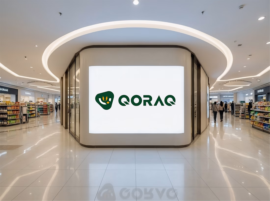
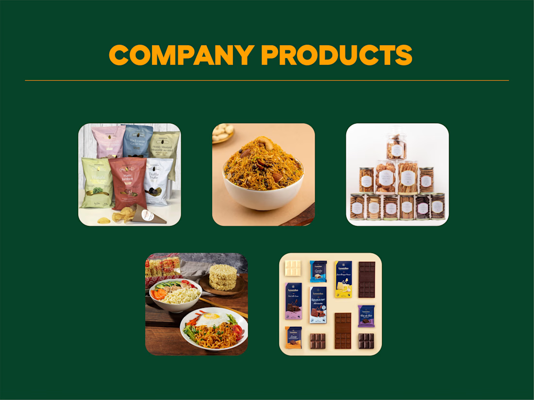
↪ The goal wasn't simply to create a logo that looks good on a screen. It was to develop a visual identity that could work across product packaging, retail shelves, business presentations, and future product categories.
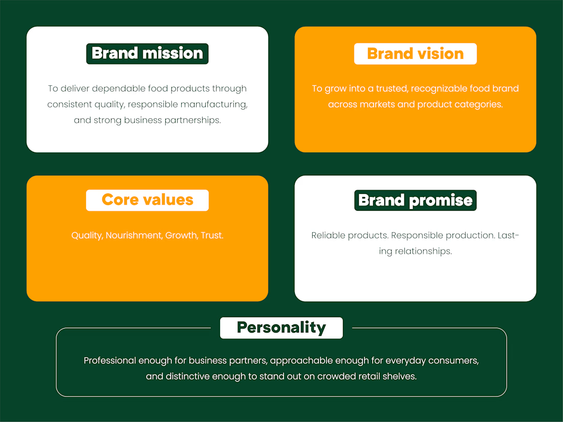
◪ Every detail has a purpose.
✅ Quality – should feel dependable.
✅ Nourishment – should feel responsible.
✅ Growth – should feel possible.
✅ Trust – should feel earned.
🤔 But here's the real question: will the identity still feel relevant when the brand grows beyond its first products?
▶ That's where thoughtful design makes a difference.
▶ A strong brand identity doesn't chase attention for a moment. It builds recognition over time, creates consistency across every touchpoint, and gives people a reason to remember the name.
For me, professional design is not about adding more elements. It's about understanding what matters, removing what doesn't, and making every decision serve the brand.
↪ QORAQ — Built on Quality. Driven by Growth.
↪ Because a brand's future deserves more than a good-looking logo. It deserves a clear identity built to grow.
👉 Best Design: www.fiverr.com/sellers/rifatislam149/edit
👉 Portfolio: https://dribbble.com/artoryxrifat
#QORAQ #BrandIdentity #LogoDesign #BrandGuidelines #BrandStrategy #VisualIdentity #GraphicDesign #BrandDesigner #PackagingDesign #FoodBranding #FMCG #FoodManufacturing #CorporateIdentity #MinimalistDesign #BrandDevelopment #CreativeDesign #DesignThinking #BuildingBrands #BrandRecognition #PremiumBranding
The network for creativity
Join 1.25M professional creatives like you
Connect with clients, get discovered, and run your business 100% commission-free
Creatives on Contra have earned over $150M and we are just getting started








Related posts


Fresh case study 🚀🚀🚀
Brand identity for Peak, an all-in-one website builder for WordPress that I design and build. A four-letter mark, a warm paper-and-ember palette and one system that runs from the favicon to the packaging.


A four-letter mark that has to hold from favicon to packaging is a tough constraint. Did you draw one letterform first and build the other three from it, or design them together as a set from the start?

Recovery Brand Identity / Logo & Visual Direction
A new identity project for a recovery-focused brand that wanted to move away from the conventional clinical look of its category.
The direction combines clinical credibility with a more modern, movement- and performance-driven visual language.
First look at the logo. Full identity coming next.
Logo design and creative direction by Lepisov Branding
Social media Branding: collab with Mike Creative Mints


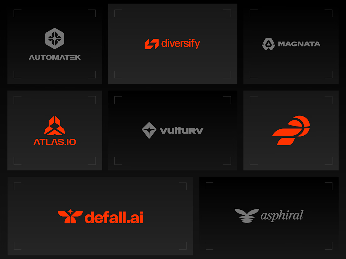
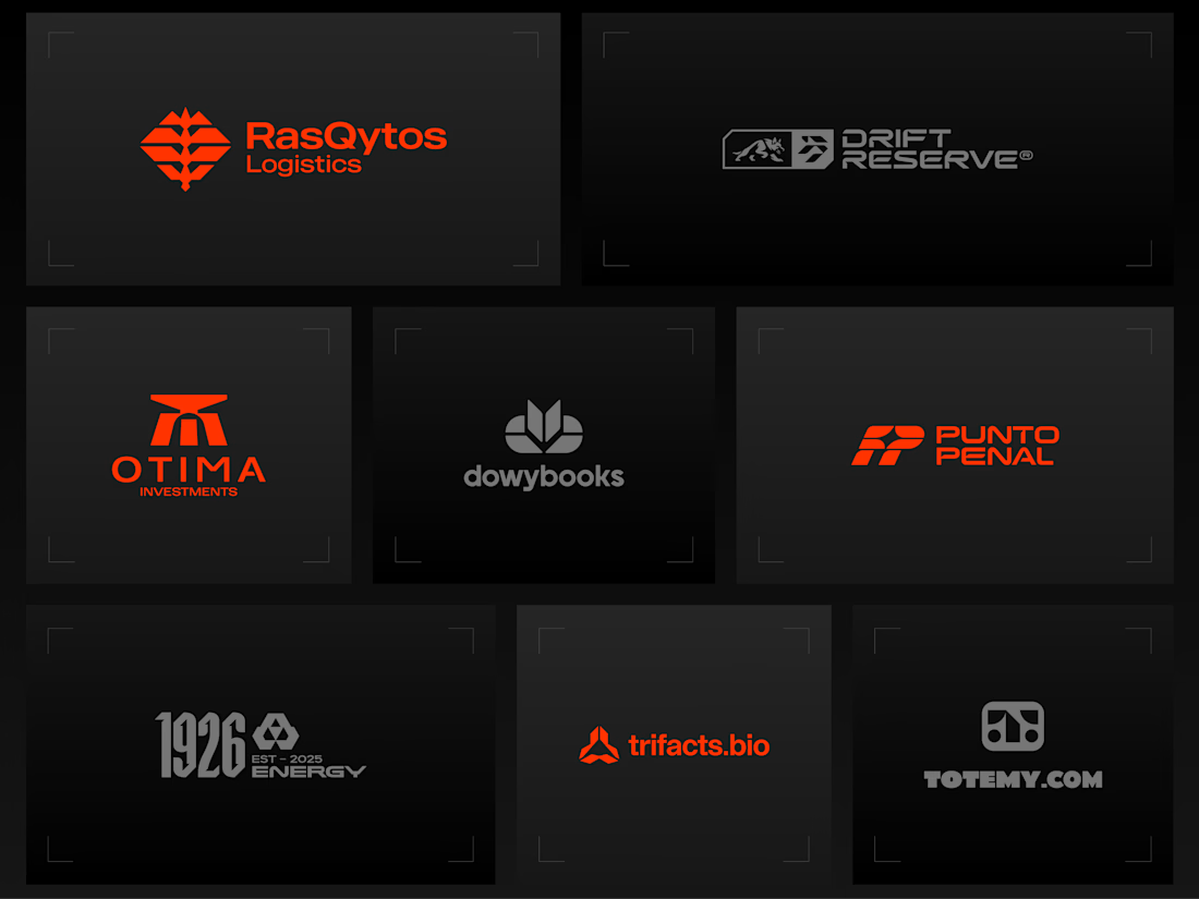
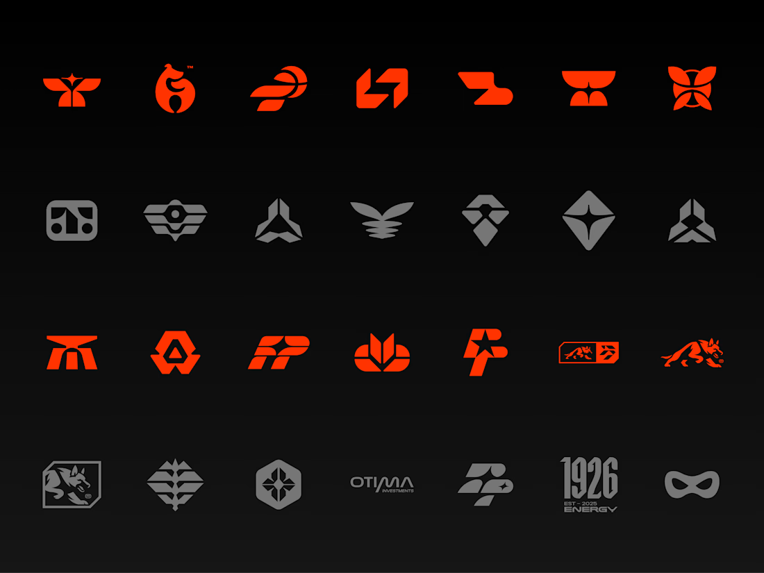
Logos & Marks — Volume 12
A curated selection of recent logo and identity work.
This collection brings together commissioned projects, unused concepts, and exploratory directions across technology, AI, finance, sports, retail, and other industries.
The work explores geometric symbols, custom typography, monograms, and abstract forms, with a focus on clarity, distinction, and strong visual character.
Selected marks are available for acquisition.
For licensing, customization, or brand identity inquiries, feel free to get in touch.


Holding the whole volume to one hot orange on charcoal makes the marks easy to compare, and the Otima symbol stacking a gate shape over the wordmark is my favorite of the set.


