The network for creativity
Join 1.25M professional creatives like you
Connect with clients, get discovered, and run your business 100% commission-free
Creatives on Contra have earned over $150M and we are just getting started
Back to feedPost

Just shared a selection of product explainer animations and storyboards. A look into my process of turning complex workflows into clear, engaging visual stories using Figma and Jitter.


Amazing work!

Turning something as dry as a 'conversion scorecard' into a story people actually want to watch is the part most explainers get wrong. When you're storyboarding, do you start from the data points that need to land, or from the feeling you want the viewer to have first?

Amazing work!


Turning complex workflows into simple visuals is where animation really earns its place. The storyboard approach makes that process much clearer.

Nice work!
The network for creativity
Join 1.25M professional creatives like you
Connect with clients, get discovered, and run your business 100% commission-free
Creatives on Contra have earned over $150M and we are just getting started




Related posts


When you forget that it's not 2005 and you don't work for 2Advanced... 😅
Designed and animated in Figma.
(it's about time to finally discover these new animation features).

That looks like an underwater design😊 Great Work!

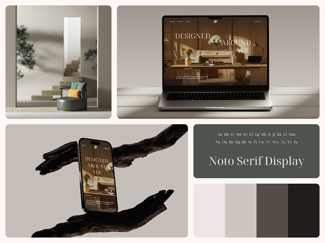
Interior Design Website
The white flowers on the mantel overlap the headline.
Thin Noto Serif Display capitals step down across one warm photo of a paneled room, so the space stays in view between the words. On the phone, the three words stack in a centered column, with Menu and Contact on either side of the monogram.
The palette runs from soft white to near black, which leaves the color to the photo: orange tulips and warm light on the walls.
The headline reads "Designed Around You", and the hero takes it literally, with the wall behind the type and the flowers in front of it.
Designed by the Hue & Machine team.
#InteriorDesign #InteriorStudio #WebsiteDesign #HomepageDesign #WebDesign #ResponsiveDesign #Typography #EditorialDesign #UIDesign #FigmaDesign


Nice!

Headquaters landing page web design 3D animation website icons


This clean design give a great vibes!!