The network for creativity
Join 1.25M professional creatives like you
Connect with clients, get discovered, and run your business 100% commission-free
Creatives on Contra have earned over $150M and we are just getting started
Back to feedPost
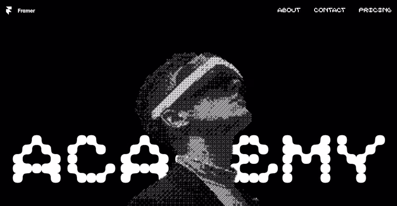
Taste Test
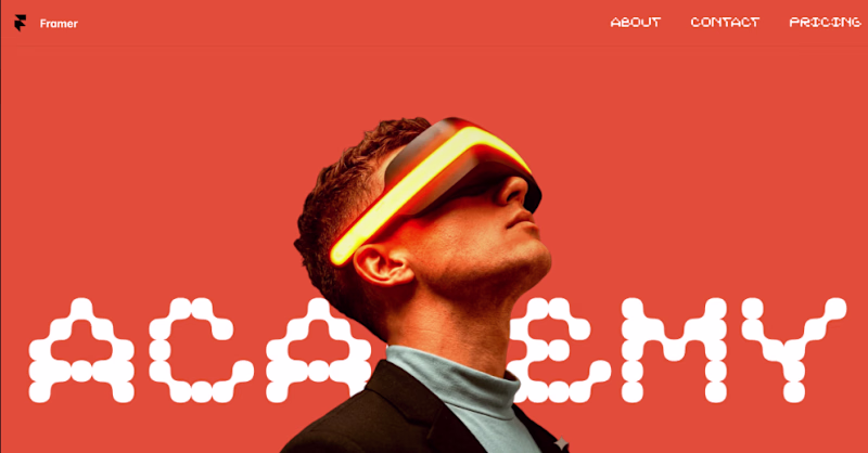
La B me parece Genial
Si, gracias Maria 👍
i will prefer the B
Yes, orange one has something special indeed.
B looks great!
Yes, is cool, we can't decide from both that's why we appreciate your response.
B is gorgeous
depending on the usage, cause A fits perfectly in some themed-style abstract design
Thank you for your feedback.
your welcome
Beautiful work, mate
How did you pull off those alphabets
Thank you for the feedback, font is ARK ES
Both depends on taste but it's B for me
Thanks for the feedback, you guys are really helping us.
I'd go with option B. Option A is also great but there's little contrast between the image and the background.
Thank you for the feedback, indeed you are right.
B works best 🙌
Thank you for the feedback 😍
It’s depends on how you’ll use it, but option B looks better
Is indeed a hard choice, maybe we will do a template with both versions 😃 Thank you for your time and feedback.
Anytime!
for me A will make people look at the design again and again
Cool, thank you for the feedback, yes is hard to choose anyways.
Glow, colors.. all makes B stand out!
Yes, indeed, thank you for the support.
Honestly, I like both, but I would go with B.
Great, thank you for the feedback 😃
I'll have to go with A.
Thank you for the feedback, but why?
I like the design more. Still, they are both great.
Nive
Easier to scan is a great feedback thank you.
The first one
You mean B orange one? Thanks for the feedback.
B, it stands out more for sure. I like A as wel, but the image as it is, gets a bit lost.
Yeah, thank you for the feedback.
One for day and one for night
Interesting idea, like a dark mode thing, thank you for the feedback.
The orange one feels cleaner
Yeah, it looks indeed cool and clean, thank you.
Thank you for your feedback.
Okay, interesting feedback, thank you.
The network for creativity
Join 1.25M professional creatives like you
Connect with clients, get discovered, and run your business 100% commission-free
Creatives on Contra have earned over $150M and we are just getting started
Related posts
Inspired by the organic movement of jellyfish, this concept explores how lighting can feel alive within a digital space.
This project was designed and built in Framer, combining visuals with interaction:
– custom code component with floating jellyfish in the background
– scroll-triggered light activation (lamp gradually “wakes up”)
– progressive text reveal for a softer narrative entry
– glass-style logo shader using Framer’s latest visual capabilities
The goal was to create a calm, immersive product moment - something between a landing page and a sensory experience.
This is solid 👏 The overall presentation is very strong
Looks geat.
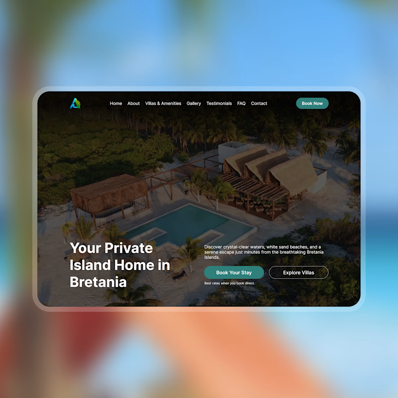
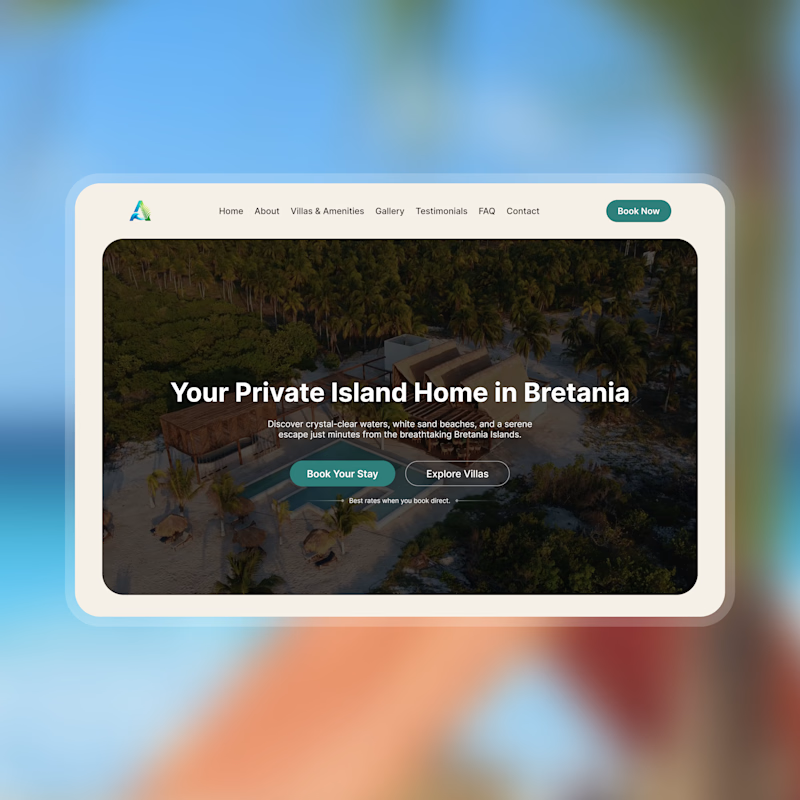
Which hero section layout would you prefer?
Your feedbacks and suggestions is highly appreciated.
Thank you.
2 voted
67%
1 voted
33%
3 votes
Closed
You could increase the brightness of A a bit, it wouldn't give a more interesting feel.
Great work either ways
Trending
Runway
AI video generation is exploding. What are you dreaming up in Runway?
Contra University
Learn from expert creatives how to earn more using next-gen AI tools.
creativeaiflow
Creative AI workflows are evolving. What tools do you use, and what are their strengths and weaknesses?
portfolioreview
The best portfolios tell a story, not just show a grid. Share yours for feedback.
freelancerlife
Freelancer life is wins, pivots, and everything in between. What’s yours right now?