The network for creativity
Join 1.25M professional creatives like you
Connect with clients, get discovered, and run your business 100% commission-free
Creatives on Contra have earned over $150M and we are just getting started
Back to feedPost
A CRM for small businesses that sell on WhatsApp. I designed and built it from scratch.
Most small businesses don’t lose sales because of price. They lose them because nobody followed up.
A customer asks for a price on WhatsApp and waits hours for an answer. A quote is sent and nobody checks back. Someone promises to send details tomorrow, and forgets.
Po is a WhatsApp CRM and sales follow-up tool that catches these moments before the sale is lost.
Here is what it does:
| Reads your WhatsApp Business chats and builds your customer list, quotes and sales pipeline for you. No manual data entry.
| Shows which customers are waiting for a reply, which quotes went quiet and which promises are late, and how much money each one is worth.
| Writes a reply using your own prices and policies. You check it before it is sent.
| Sends customer follow-up messages on a schedule and stops as soon as the customer answers.
| Sends the business owner one short sales summary on WhatsApp every morning.
You stay in control. Po prepares the work, and you decide what goes out.
The full UI/UX case study is on Behance. The link is in the first comment. 👇
If you run a small business on WhatsApp, how do you keep track of follow-ups today?
#WhatsAppBusiness #CRM #SmallBusiness #ProductDesign #UIUXDesign #AIsolution #Aumation #Solution


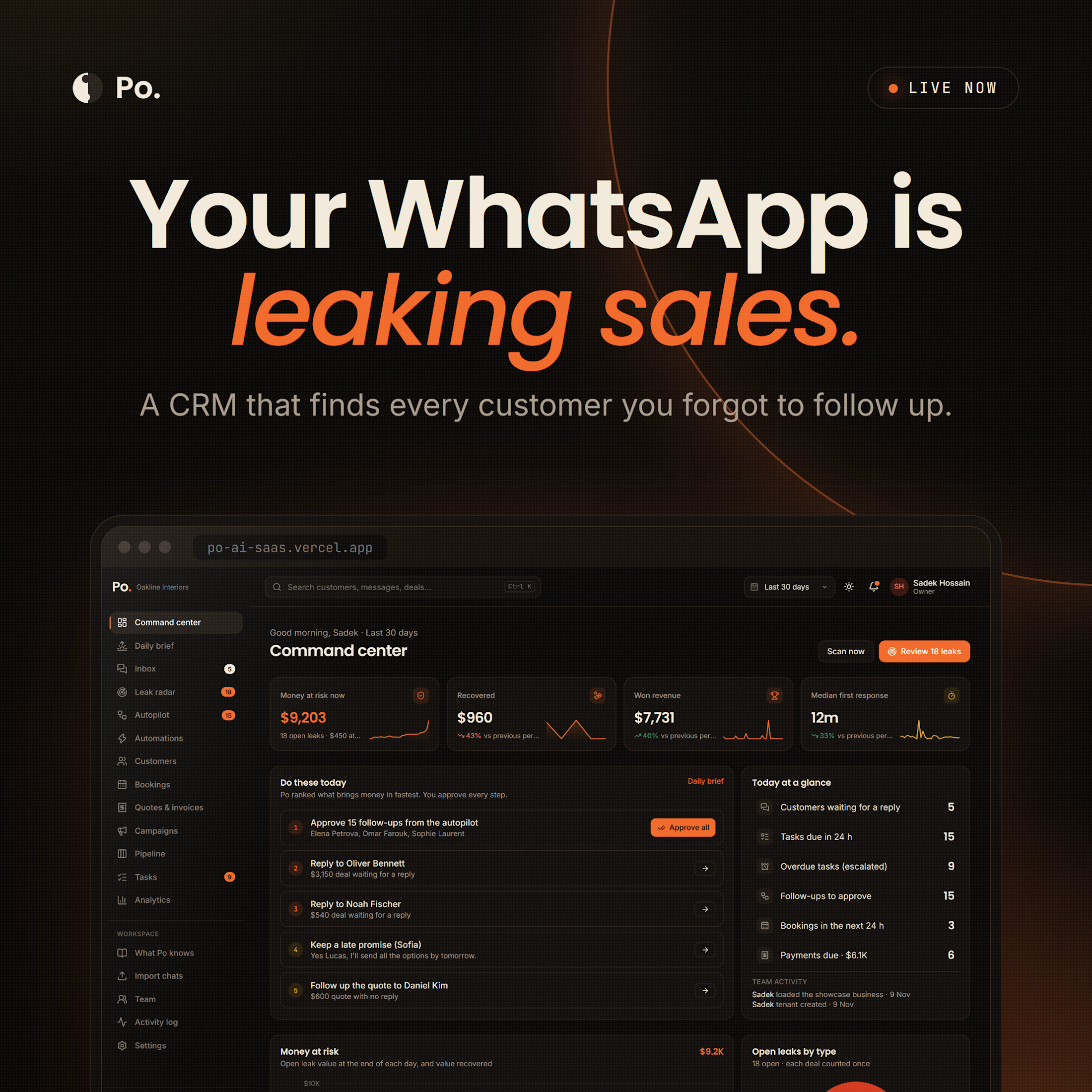

Full case study with all the screens and the design process on Behance: https://www.behance.net/gallery/258239727/Po-CRM-AI-Sales-CRM-SaaS-for-WhatsApp-UIUX
You can also try the live product here: po-ai-saas.vercel.app

The network for creativity
Join 1.25M professional creatives like you
Connect with clients, get discovered, and run your business 100% commission-free
Creatives on Contra have earned over $150M and we are just getting started



Related posts


Crenaly: a booking SaaS I designed and built end-to-end for appointment-based businesses in France: salons, barbers, beauty and wellness.
The core idea: when a client cancels, the freed slot is automatically offered to clients who asked for an earlier time. The first to accept gets it, their appointment moves in place, and the slot they leave is offered next. No double booking, no manual work.
Around it, a full product:
→ Branded booking page for each business, embeddable on their own site
→ Mobile-first booking flow, no account needed
→ Agenda, client management, team roles & permissions
→ Verified reviews, analytics, Stripe billing
Product, UX/UI, frontend and backend.
Next.js · TypeScript · NestJS · PostgreSQL · Redis


Automatically offering a cancelled slot to the next client is such a practical feature for salons and barbers. Designing and building Crenaly end to end must have made those flows much tighter.

What happens when you hold down the delete button for too long?
Well, I made sure your entire website finds out. 🔥💀
Built this little Framer component.

Nice!

Smart Glasses Landing Page
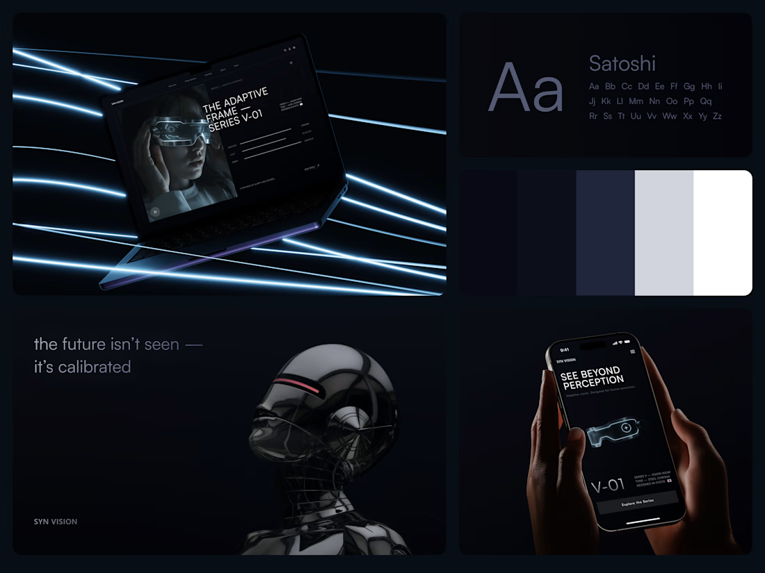
"See beyond perception." Three words on the phone, and the whole page had to earn them.
On desktop, the headline starts over the edge of a tall portrait of the glasses being worn, so the product name and the product in use read as one image. Next to it, reaction, light and depth sit as three thin gauge lines, each with a one-word reading. Specs, without a spec table.
On mobile, a 3D render of the frame sits between the headline and a single Explore the Series button. One image, one next step.
The palette stays in deep navy and soft gray, so the cool light on the frame stands out on every screen.
Designed by the Hue & Machine team.
#WebDesign #LandingPage #ProductDesign #WearableTech #DarkUI #UIDesign #TechProduct #ResponsiveDesign #UXDesign #FigmaDesign



Good work