The network for creativity
Join 1.25M professional creatives like you
Connect with clients, get discovered, and run your business 100% commission-free
Creatives on Contra have earned over $150M and we are just getting started
Back to feedPost


Exploring mini app design tools.
I built this little tool with Claude as a quick experiment.
I’ve been experimenting with building small tools that generate specific visual effects.
This one includes a few simple effects:
• kaleidoscope patterns
• a light dithering effect
• a few adjustable settings
What’s interesting is how quickly something like this can be built now. In a few hours, you can have a working tool that helps generate assets or explore new visual languages.
For designers, that changes the workflow a bit.
Tools like this can help generate assets quickly during a project. And if a client has an in-house team, the same tool can be shared so they can continue creating new variations themselves.

You can check it out here > https://kit-lab-virid.vercel.app/
The network for creativity
Join 1.25M professional creatives like you
Connect with clients, get discovered, and run your business 100% commission-free
Creatives on Contra have earned over $150M and we are just getting started



Related posts


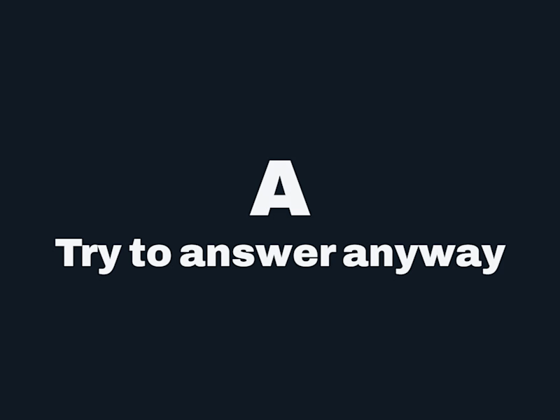
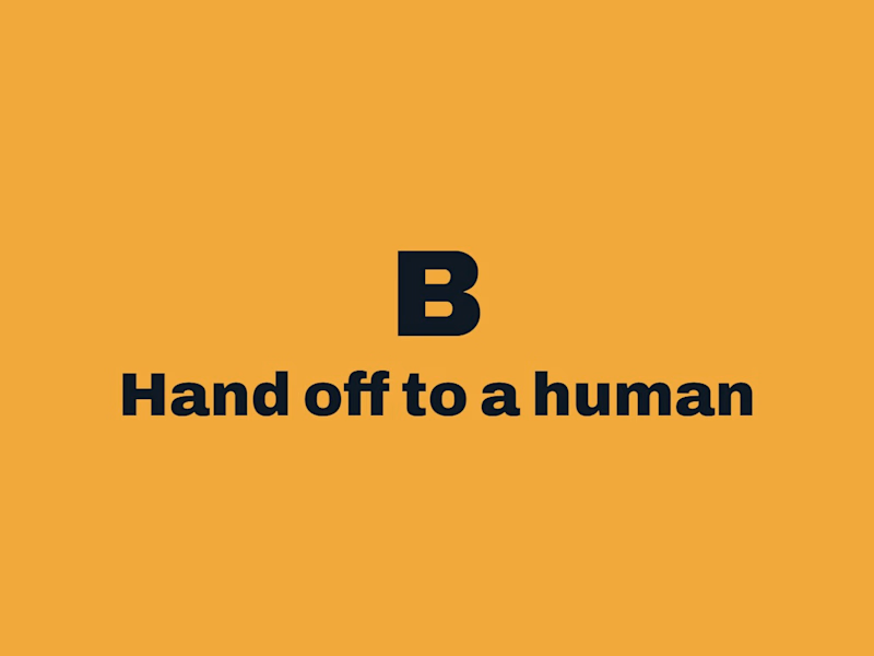


Which homepage would make you more likely to explore the platform?
HackStack features bold typography, teal gradients, and a centered layout focused on AI tools and automation. DataVistaHQ uses purple accents, a split layout, and a prominent dashboard preview to introduce its business intelligence platform.
I would like your perspective on the visual design, clarity, and first impression. Which approach communicates its value more effectively and makes you want to take the next step?
Vote for your preferred design and share what influenced your choice: the colors, headline, layout, dashboard preview, or overall presentation.
#WebDesign #AIWebsites #UIUXDesign #SaaSDesign #TransformedDesign


2 voted
17%

10 voted
83%

12 votes
Closed

Visually, I lean toward DataVistaHQ, but the cognitive load is really high. The value proposition and the stats feel like they're competing for attention.
On the other hand, HackStack has a much better visual hierarchy. The value proposition and CTA group immediately give me a...

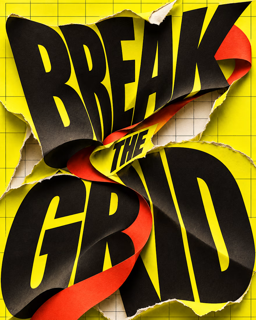
What happens when typography refuses to stay inside the grid?
BREAK THE GRID — an AI-generated visual experiment combining oversized lettering, torn-paper textures and bold colour. The words become the action: bending, tearing and breaking through the layout.
Controlled structure or creative chaos—which draws you in?