The network for creativity
Join 1.25M professional creatives like you
Connect with clients, get discovered, and run your business 100% commission-free
Creatives on Contra have earned over $150M and we are just getting started
Back to feedPost


The network for creativity
Join 1.25M professional creatives like you
Connect with clients, get discovered, and run your business 100% commission-free
Creatives on Contra have earned over $150M and we are just getting started





Related posts

This reel for @afterluc was a chance to play a little more with the visual language we usually use for his content.
It’s a fun “get ready with me” piece that opens with a teleport effect and moves into a faster, more playful edit. Since Luc’s profile normally leans toward a cleaner and more minimalist aesthetic, I pushed the typography further here, using bolder text treatments and more expressive motion without losing the visual identity we’ve built around his content.
The goal was to make the edit feel energetic and entertaining while still polished, using pacing, text, sound and small visual moments to support his personality rather than overwhelm it.
I really enjoy projects like this because they show how a consistent visual identity doesn’t have to mean doing the same thing every time. Sometimes the right choice is knowing exactly where you can break the rules a little.
Role: Video Editing, Motion Design, Text Animation, Sound Design, Color & Visual Storytelling

The jump cut into the teleport with the bold yellow OUTFIT type feels snappy. Good fit for a get ready with me reel.

The future won't build itself... or will it on this AI era?
Few animations are as fun to animate as this one was. I had the pleasure of working on several case study animations for Juice Agency, and I couldn’t be happier with the result. It took real teamwork to get them exactly the way we wanted.
If you run a design studio or are a freelancer and still share your work as still images, let's chat!
We can make all your fantastic designs look even better. 🔥

Great work!

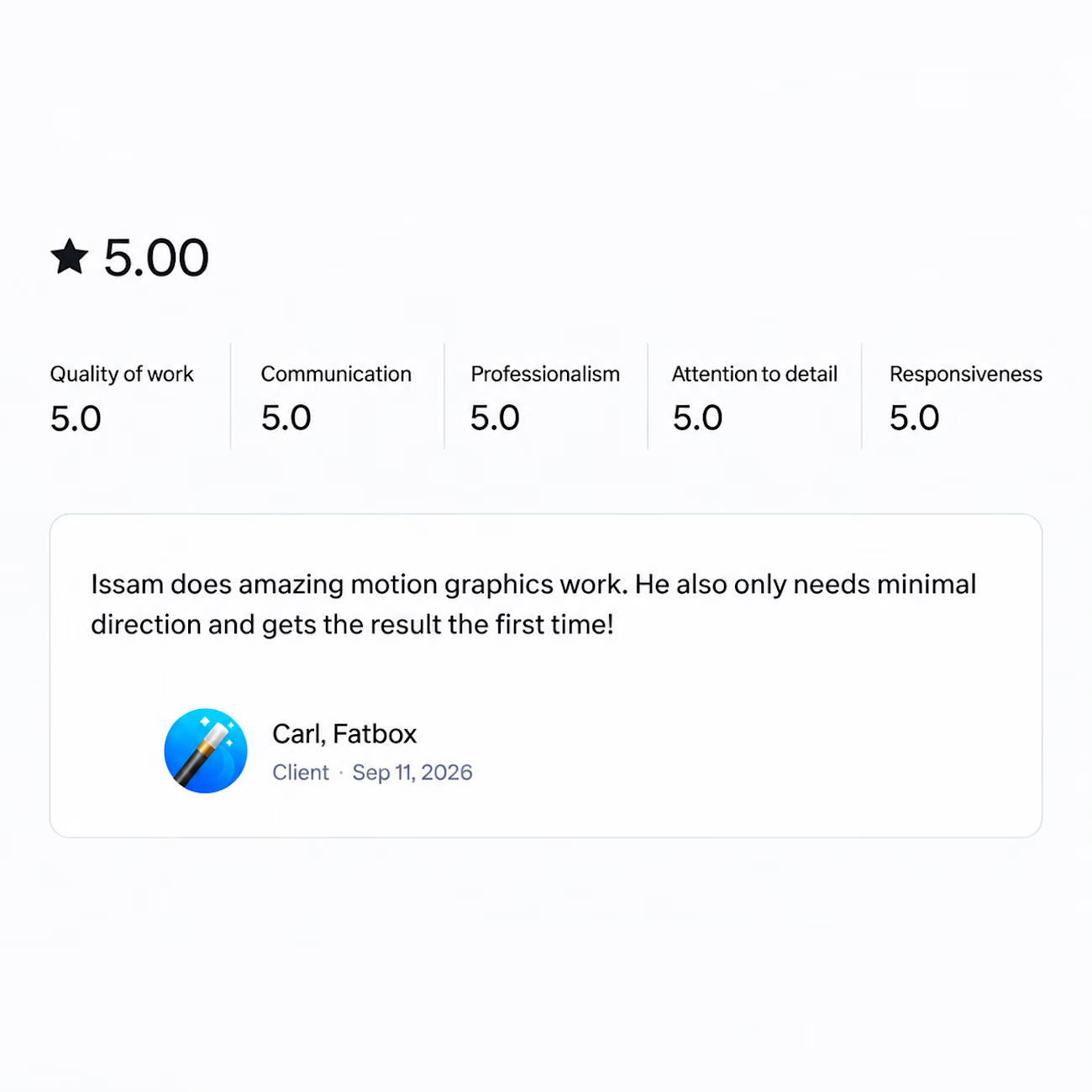
Got a review last week that made my day.
Wrapped a motion graphics project recently and the client said it only needed minimal direction and came out right the first time.
That's the part I'm grateful for. Not the compliment on the work itself, but the fact that the process actually worked the way it's supposed to. One clear brief, one round, done.
And that never happens because of me alone. It happens when the client writes a brief that makes sense, trusts you enough to let you run with it, and gives feedback that actually helps instead of feedback that just moves things around.
So thank you for that. Projects like this are the reason I still enjoy this work.

I am happy about you my brother keep it up!