The network for creativity
Join 1.25M professional creatives like you
Connect with clients, get discovered, and run your business 100% commission-free
Creatives on Contra have earned over $150M and we are just getting started
Back to feedPost

Stakeholders often don't recognize a problem until they see it with their own eyes.
That's why I created Proximity.
Color blindness, cataracts, and more. See your work through the eyes of visually impaired users. On desktops and mobile devices.
With the built-in WCAG/ADA/EAA compliance tool, you can demonstrate the importance of accessibility.
https://fit-whirl-00091684.figma.site
The network for creativity
Join 1.25M professional creatives like you
Connect with clients, get discovered, and run your business 100% commission-free
Creatives on Contra have earned over $150M and we are just getting started








Related posts

🚀 Starting My Freelance Journey - Open to My First Project!
I’m beginning my journey as a freelance UI/UX Designer, and I’m excited to collaborate with my first freelance client.
While I have 3 years of UI/UX design experience, I’m new to freelancing and looking forward to building meaningful client relationships through great design.
I can help with:
🎨 Website & SaaS UI Design
📱 Mobile App UI/UX Design
🖥️ Dashboard & Web App Design
✨ Wireframes, Prototypes & Responsive Design
If you have a design project that needs a thoughtful, user-focused approach, I’d love the opportunity to work with you and deliver something valuable.
I’d love to earn your trust through my first freelance collaboration and deliver a design solution that adds real value to your project.
Feel free to message me. I’d love to connect!
#UIDesign #UXDesign #Figma #FreelanceDesigner #WebDesign

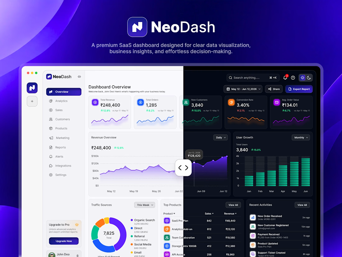


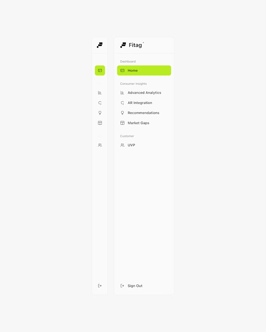
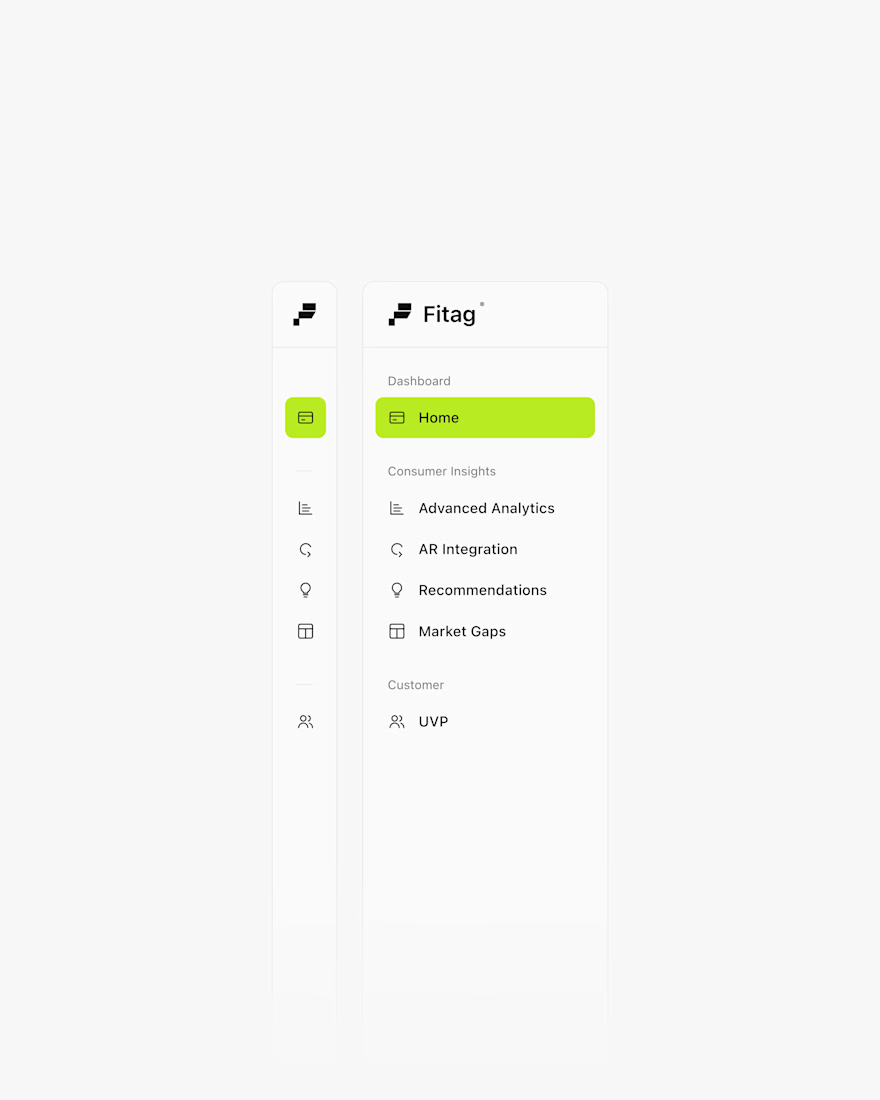

The components 🔥🔥

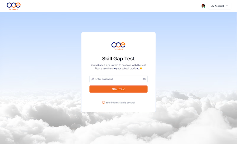
Which Skill Gap Test experience would you choose? 👀
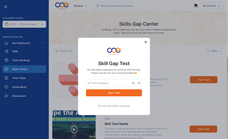
I designed two different experiences for the same Skill Gap Test.
Option A: A modal inside the dashboard — users stay in context.
Option B: A dedicated page — a cleaner, distraction-free experience.
If you were using this platform as a student, which experience would you prefer?
A or B? Why? 👇
#UIDesign #UXDesign #ProductDesign
10 votes
Ends in 19h

Dedecated Page is more professional and minimalistic ❤️