The network for creativity
Join 1.25M professional creatives like you
Connect with clients, get discovered, and run your business 100% commission-free
Creatives on Contra have earned over $150M and we are just getting started
Back to feedPost

1 of these buttons fails accessibility. Which one?
B. White on #10B981 is 2.54:1, and WCAG AA needs 4.5:1 for normal text. My fix: the same green two shades darker (#047857), 5.48:1 and still on brand.
Did you get it in 3 seconds?
Follow for more videos: instagram.com/sellwrightstudio · youtube.com/@sellwrightstudio

Got B, that bright green with white text is a classic 😅 Going two shades darker instead of switching to black text is a nice fix, it still feels like the same brand.
Nice, you got it fast. Black text would pass too, but it changes the feel of the button, so I try darkening the brand colour first and only switch the text colour when that isn't enough. Do you check contrast in Figma or after the build?
The network for creativity
Join 1.25M professional creatives like you
Connect with clients, get discovered, and run your business 100% commission-free
Creatives on Contra have earned over $150M and we are just getting started



Related posts
"SEO is dead, it's all AI now." The AI answers are still reading your pages.
• Crawlable HTML with clear headings.
• Key facts written in the text, not only in images.
• Allow the AI search crawlers you want in robots.txt.
• Structured data still helps machines read the page.
Have you checked whether AI search tools mention your business?
Follow for more videos: instagram.com/sellwrightstudio · youtube.com/@sellwrightstudio
Funny how the fix for AI search is the same old stuff, real text and clean headings. My WebGL sites are sweating a bit right now 😅

LIFT: press the button, and the doors open on your film
LIFT is a Video.js v10 skin built like a lift. Two brushed-steel doors stand where the poster would be. Press the call button and they slide open on the film.
Every part of the lift is a real control. Chapters are floors: the directory on the door lists them the way a building does, and you can start from any floor. Pick a floor while the film plays and the doors shut, the dot-matrix display counts the floors, the chime rings, and the doors open again. One chime going up, two going down, as on a real lift. The braille under each button is real: it spells the name of the control. When the film ends, the doors close.
While the film plays, everything gets out of the way, so the picture is never covered. Every control sits on solid steel or dark glass, so it reads over any footage. Lift panels are designed for everyone, so this one is too: large round buttons, a lit ring on whatever is active, a white-and-black focus ring, full keyboard control, floor changes announced to screen readers, and a reduced-motion mode where the doors stop sliding.
It reshapes itself to the width of the player, takes the standard accent-colour and border-radius tokens, and comes in stainless or graphite. The film, Going Up, is hosted on Mux, and the skin is live on my renter decor site. Designed by Shad Soha.

the elevator doors sliding open on the film is such a charming intro, lift is a really fun concept 🛗

Introducing Atelier, a new skin for Video.js v10.
I wanted to create something that feels simple, smooth, and stays out of the way while watching a video.
Atelier brings everything into one glass control bar, with a smaller pill mode for a cleaner viewing experience. It also comes with chapter navigation, video previews, quick settings, and a few small interactions that make the overall experience feel more natural.
Inspired by the simplicity of Apple's media controls, but with my own take on the details and interactions.
Built with a lot of attention to the little things.
Take a look at Atelier.
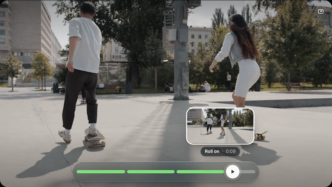
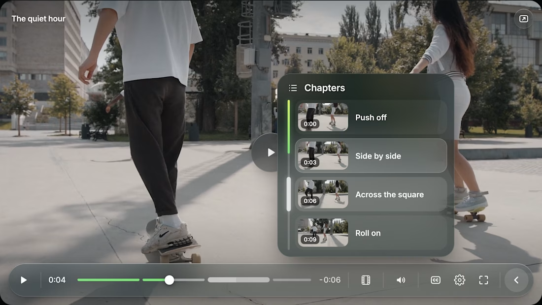
one glass control bar that stays out of the way while you watch, clean and calm 🤍