The network for creativity
Join 1.25M professional creatives like you
Connect with clients, get discovered, and run your business 100% commission-free
Creatives on Contra have earned over $150M and we are just getting started
Back to feedPost

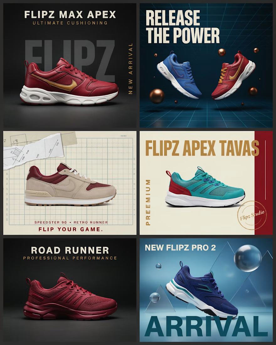
A shoe shouldn’t just be shown. It should tell you where it’s going.
That was the idea behind this FLIPZ campaign.
I didn’t want to create six random product posts that happened to share the same logo. I wanted the entire grid to feel like one visual story — a story about movement, performance, personality, and the different moments a pair of sneakers can own.
The first frame introduces the world of FLIPZ. Then the story starts moving.
One shoe becomes a statement of power.
Another becomes built for the road.
Another speaks to speed, comfort, and everyday performance.
Each design was given its own visual language, but everything was carefully connected through color, typography, composition, lighting, and product styling.
The result is a campaign that feels less like a product catalogue and more like a brand experience.
Because great product design doesn’t just answer “What are you selling?”
It makes people think:
“I need to be part of this.”



Really lovely concept...the way this comes together is so good
The network for creativity
Join 1.25M professional creatives like you
Connect with clients, get discovered, and run your business 100% commission-free
Creatives on Contra have earned over $150M and we are just getting started

Challenges
View all


Related posts

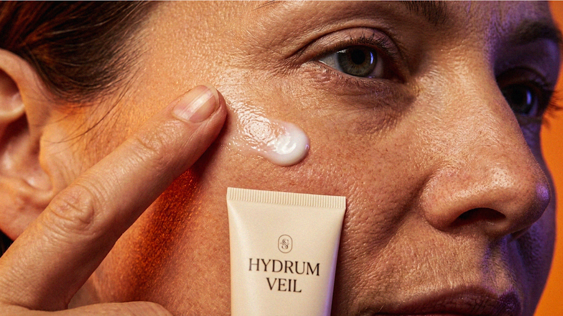
I Just Created HYDRUM VEIL 🔥
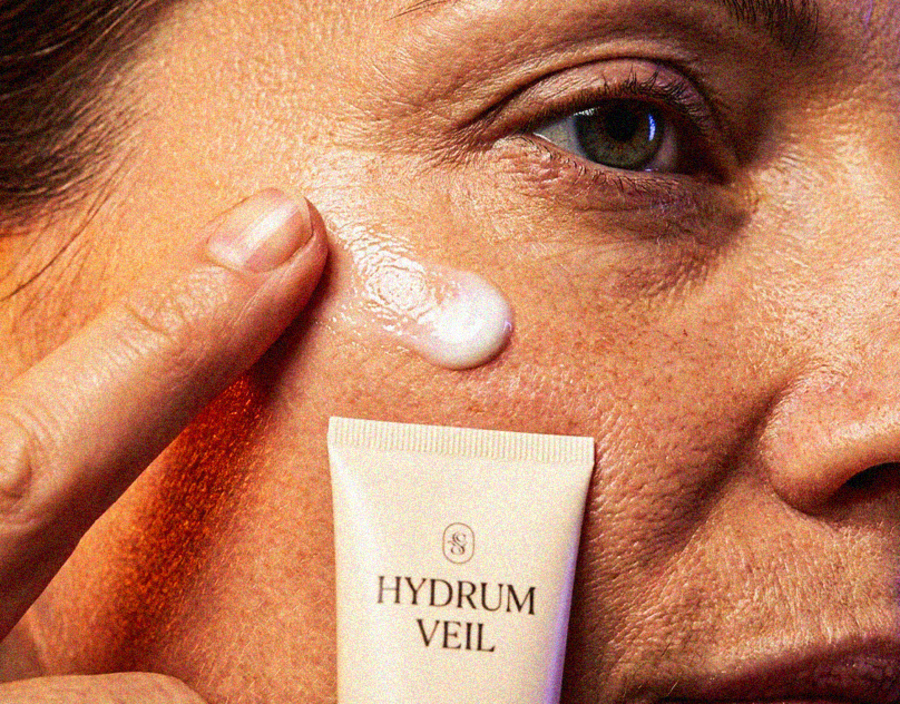
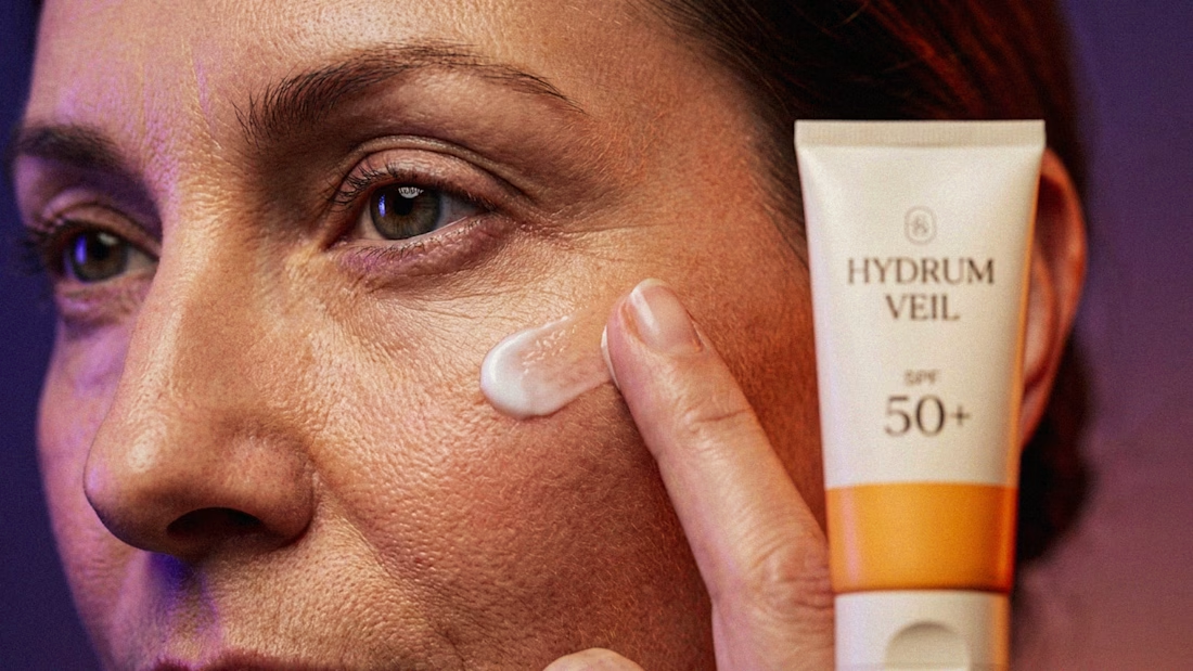
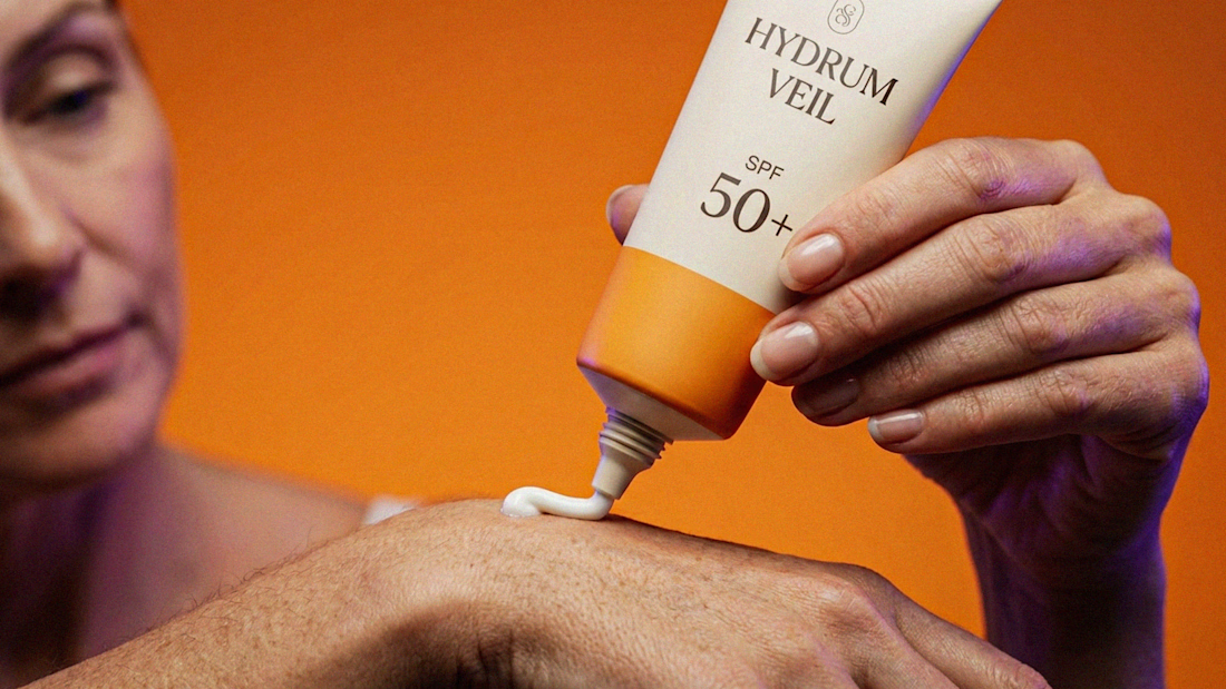
HYDRUM VEIL is a skincare brand built around a premium SPF 50+ sunscreen, developed as a complete brand identity, packaging design, and seasonal advertising campaign.
The project explores a question most seasonal beauty work gets wrong: how do you make a limited-edition campaign feel festive without making it feel cheap?
Instead of stacking decorative props, the campaign holds a strict visual system - vivid pumpkin orange, deep twilight violet, warm cream, and restrained black and lets a single product carry every frame.
Drop your replies in cmnts.....!!!!! 🙌
branddesignertastetestBrand DesignGraphic DesignPackaging DesignAdobe IllustratorAdobe PhotoshopClaude




Wonder -- Visual Expressions

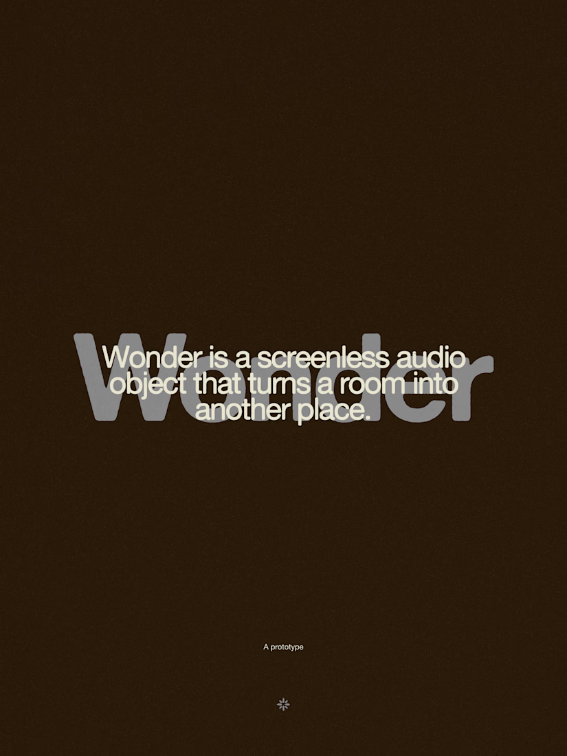
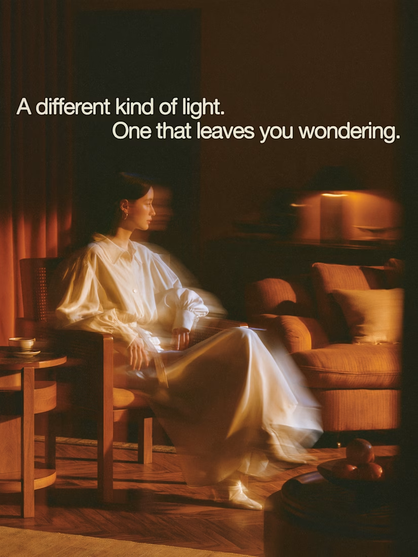


The restraint in the warm palette really lets the sound-object concept breathe—especially that shift from readable type to atmosphere.

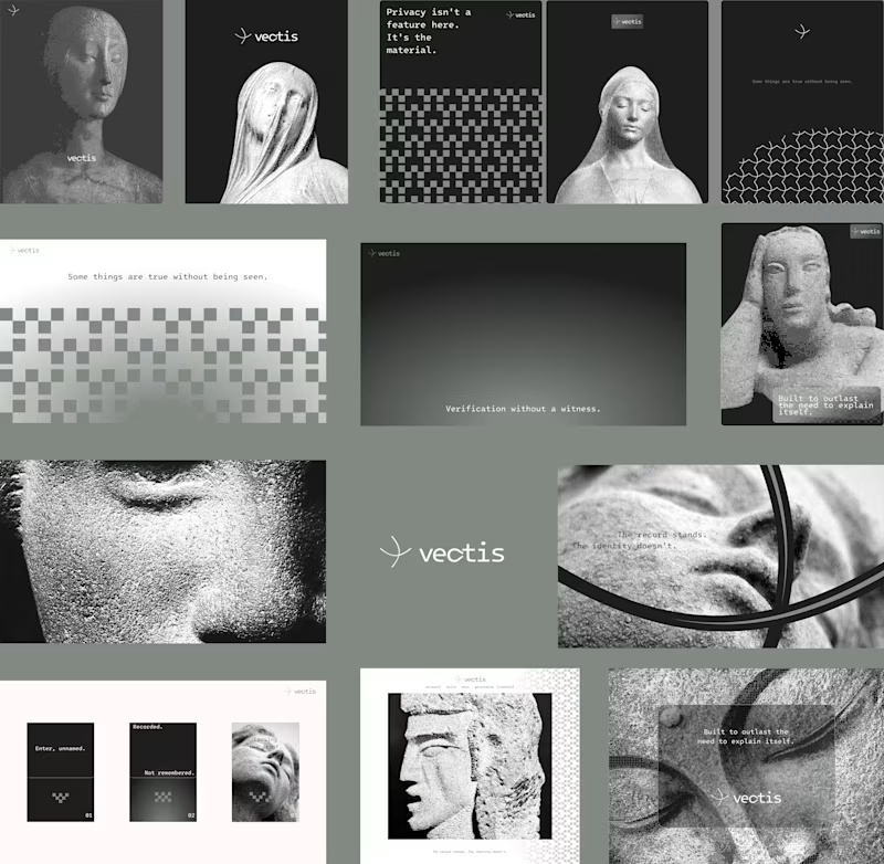
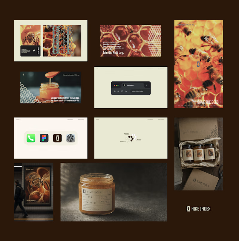
Two case studies, two totally opposite registers.
One is carved in stone and says nothing.
One drips off a spoon and won't shut up about which field it came from.
Which one do you want first?
vectis — zero-knowledge privacy, dithered like a forgotten statue
HIVE INDEX — raw honey with a paper trail. No two lots taste the same, and we don't correct for that.
45 voted
51%
43 voted
49%
88 votes
Closed

Vectis