The network for creativity
Join 1.25M professional creatives like you
Connect with clients, get discovered, and run your business 100% commission-free
Creatives on Contra have earned over $150M and we are just getting started
Back to feedPost

New case study. Sapra Media, a film, music and live-events studio rooted in southern Iran.
Their old site was a rented template with broken characters and stock photos. We rebuilt everything around one idea, Culture, in production. A custom stencil typeface, a logo framed like a viewfinder, one red REC light as the only colour, and a home page that works like an editing timeline you can scrub from 2011 to 2026.
Hand-built, zero third-party scripts, live at sapra.io
Full case study → https://contra.com/p/lRYlMMsN-sapra-media-identity-typeface-and-website
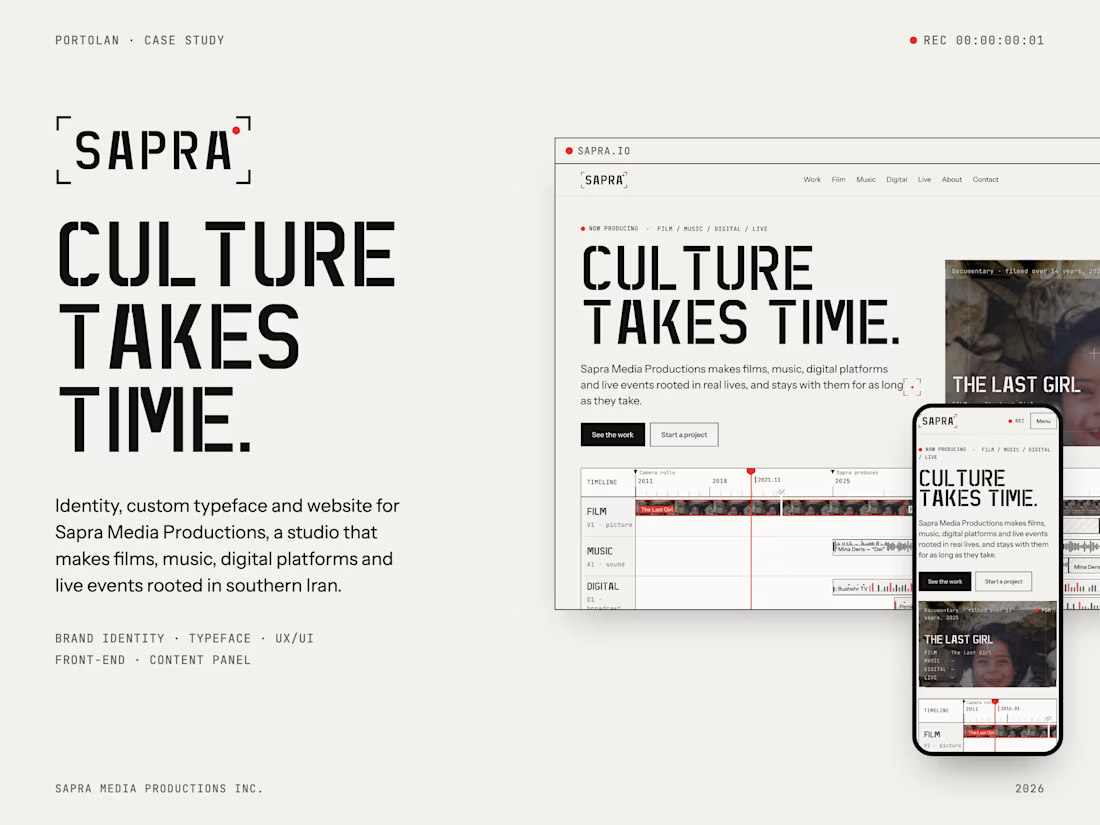
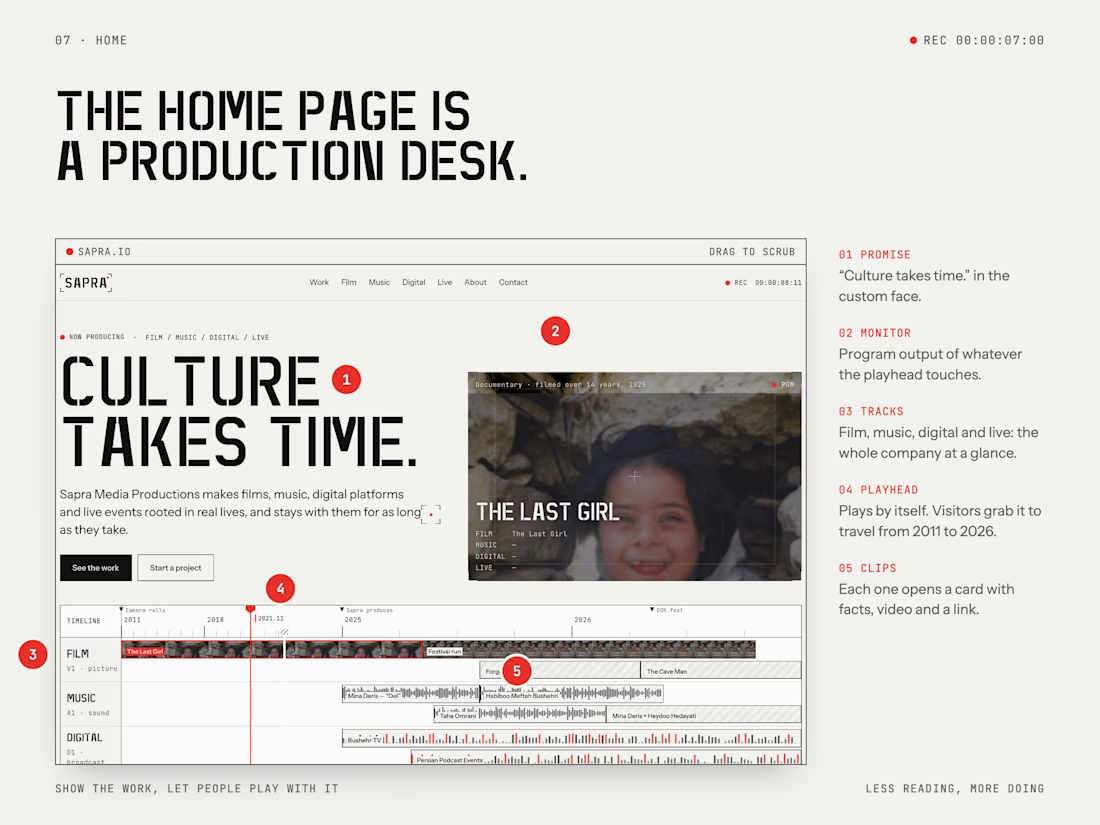
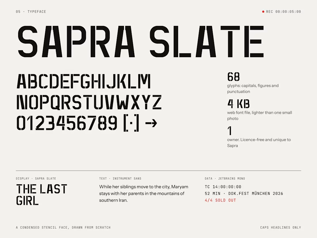
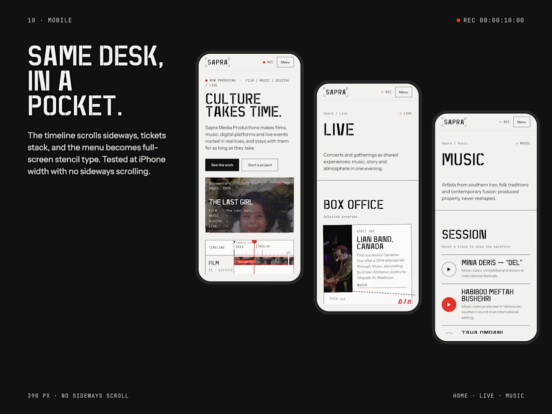

Custom stencil typeface fits a production studio perfectly. The timeline scrub homepage is a great idea.
Thanks Rafee! The stencil came from the flight cases every crew and band carries, so the letters already belonged to their world. Glad the timeline landed.
The network for creativity
Join 1.25M professional creatives like you
Connect with clients, get discovered, and run your business 100% commission-free
Creatives on Contra have earned over $150M and we are just getting started
Related posts


What happens when one website has to talk to two different people?
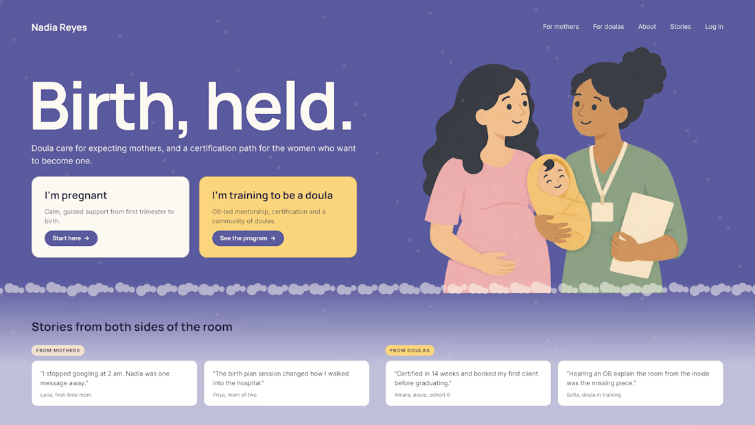
A client of ours teaches two audiences at once: expecting mothers who want a calm pregnancy, and women who want to become doulas. One brand, one site, two very different reasons to visit.
The usual fix is a hero that speaks to "everyone" and lands with no one. We designed it as a fork in the road instead:
1. Two doors in the hero. "I'm pregnant" and "I'm training to be a doula", side by side, equal weight. The visitor picks a path in one click, and the headline above them stays about the shared value.
2. One voice, two tones. The mothers' path is softer: fewer words, more room, gentle photos. The doula path is more structured: modules, certification, dates. Same fonts, same colors, different rhythm.
One proof section, split in two. Testimonials from mothers on the left, from doulas on the right. Each visitor sees people like them before the price.
Writing for everyone is writing for no one. Give each reader a door.
Have you ever designed a page for two audiences at once? How did you split it?


Love that purple hero with the two cards right up top.

The contact page is usually the last page anyone designs.
We made it one of the best
Recent client work: a contact section UI design for a company with offices across cities. Globe in the back, every location up front, and small interactions that make the whole web design feel alive.


Impressive work


Really nice one, Max!


