The network for creativity
Join 1.25M professional creatives like you
Connect with clients, get discovered, and run your business 100% commission-free
Creatives on Contra have earned over $150M and we are just getting started
Back to feedPost

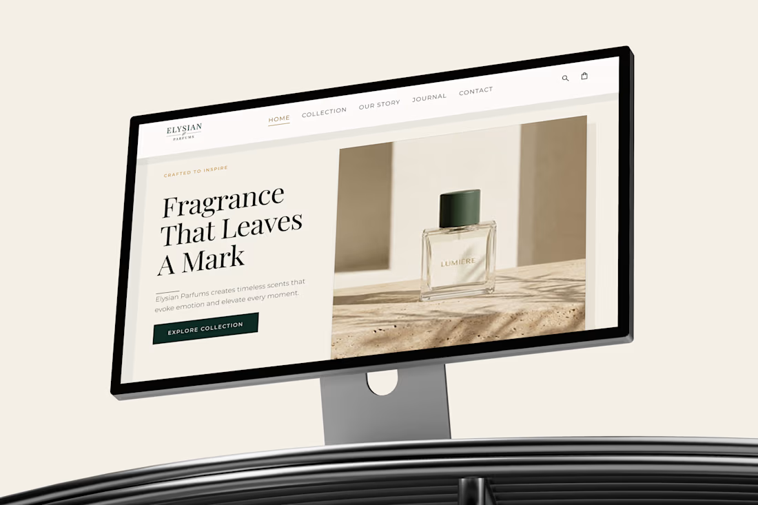
What if a fragrance website felt like the fragrance itself?
I designed Elysian Parfums around quiet luxury, editorial storytelling, and sensory visuals, creating an experience that feels less like an online store and more like stepping into the world of the brand.
Would you wear this brand?
The network for creativity
Join 1.25M professional creatives like you
Connect with clients, get discovered, and run your business 100% commission-free
Creatives on Contra have earned over $150M and we are just getting started


Related posts


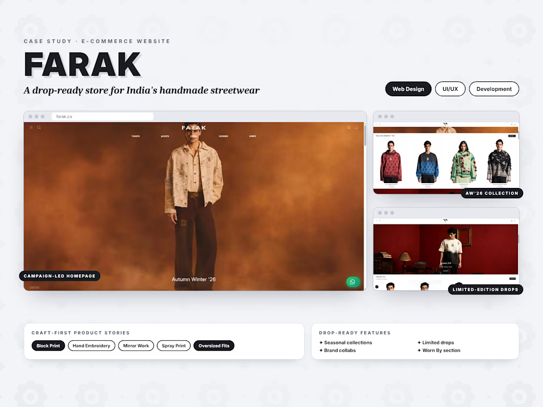
New project live: FARAK 🧵
I designed and developed an e-commerce website for this Indian handmade streetwear brand. It showcases seasonal collections, limited drops and craft-first products, with a smooth shopping experience on every device.

Handmade streetwear with limited drops is a fun brief. Curious how you handle sold-out drops on the product pages, keep them visible or hide them?

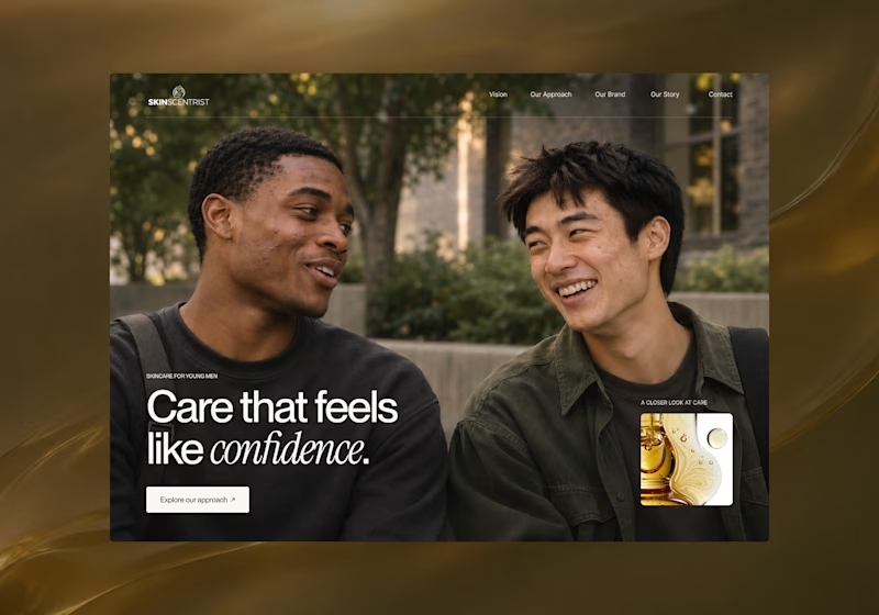
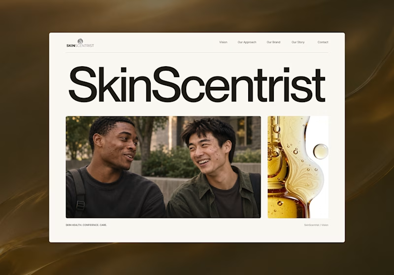
I’m exploring two homepage hero directions for SkinScentrist, a skincare brand focused on helping young men feel more confident in their skin.
Both concepts use the same imagery but take very different approaches to storytelling and visual hierarchy.
Direction 1 feels more emotional, immersive, and lifestyle-driven. The full-screen photography and bold messaging create a stronger connection to confidence and self-care.
Direction 2 feels more minimal, editorial, and brand-focused. The oversized typography, clean layout, and product imagery give it a more refined, contemporary skincare feel.
Direction 1: immersive, personal, emotional
Direction 2: minimal, editorial, premium
Which direction feels stronger for a modern skincare brand?

14 voted
93%
1 voted
7%
15 votes
Closed

Direction one — the full-screen photo feels warmer.

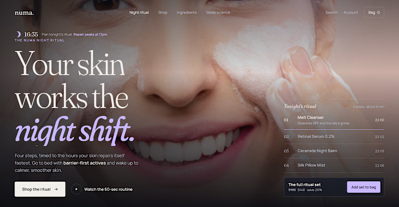
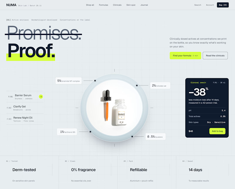
Two Shopify hero sections. Same skincare brand. Two different approaches.
Which one would you choose?
Option A: Night Ritual
Immersive photography, emotional storytelling, and a complete skincare routine with a direct add-to-cart option.
Option B: Lab Specimen
Bold typography, ingredient breakdowns, clinical information, and a clear path to purchase.
Both serve the same brand but take different approaches.
A builds an emotional connection and sells the experience.
B builds trust through product transparency and helps shoppers understand the formula.
But which approach would drive more conversions?
If you were designing this Shopify storefront, which would you choose?
A: Lifestyle & Storytelling
B: Product & Science
And why?

2 voted
18%
9 voted
82%
11 votes
Closed

I'd go with Lab Specimen! 🔥 The bold typography and clean, futuristic layout really stand out. Night Ritual looks beautiful too, but Option B feels more unique and memorable.