The network for creativity
Join 1.25M professional creatives like you
Connect with clients, get discovered, and run your business 100% commission-free
Creatives on Contra have earned over $150M and we are just getting started
Back to feedPost
Layout Innovation — Asymmetric Split Screen Spotlight
📐 Framer Layout Showcase: Asymmetric Spotlight Components
Standard horizontal block
scrolling can quickly put a user's attention to sleep. To drive absolute focus
to seasonal packages or high-margin services, I designed an asymmetric
split-screen asset grid inside Faro.
The Layout Tactics:
· Combined high-contrast visual grids with balanced serif typography blocks.
· Kept boundaries strictly responsive to protect visual assets across large
monitor displays.
· Implemented a friction-free layout structure that natively balances white
space with deep tones.
Let's break your site out of boring containers. Click through to inspect the component performance:
🔗 Framer Marketplace: https://www.framer.com/marketplace/templates/faro/
🌐 Live Preview: https://farotravel.framer.website/


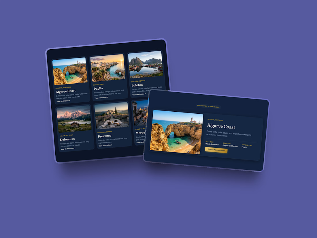

The split layout is interesting.

Thanks Vansita! I really wanted to break up the standard horizontal block scrolling pattern that you see on most travel sites. By pairing high-contrast visual grids with solid typography blocks on the right, it naturally anchors the user's attention to featured spots without visual fatigue. Glad it caught your eye! 🙌

The network for creativity
Join 1.25M professional creatives like you
Connect with clients, get discovered, and run your business 100% commission-free
Creatives on Contra have earned over $150M and we are just getting started



Related posts


New project in progress: the website for Adara, a residential architecture and planning practice in London. We'll post updates as the build comes together.
First, the services section on the homepage. As you scroll, the house comes apart floor by floor, and each service opens on the right, from planning advice to building regulations.


Great stuff! Would love to know what the brief looked like. You clearly took it somewhere special.

Landing page for B2B search analytics platform.
For startups, converting users is extremely crucial.
You might have 3~5 seconds to get the user's attention, so it's very important how the design looks and feels.
Premium design + animation like this helps turn users into sign-ups. Proud of this one.


Nice work