The network for creativity
Join 1.25M professional creatives like you
Connect with clients, get discovered, and run your business 100% commission-free
Creatives on Contra have earned over $150M and we are just getting started
Back to feedPost
Taste Test

Before → After ✨
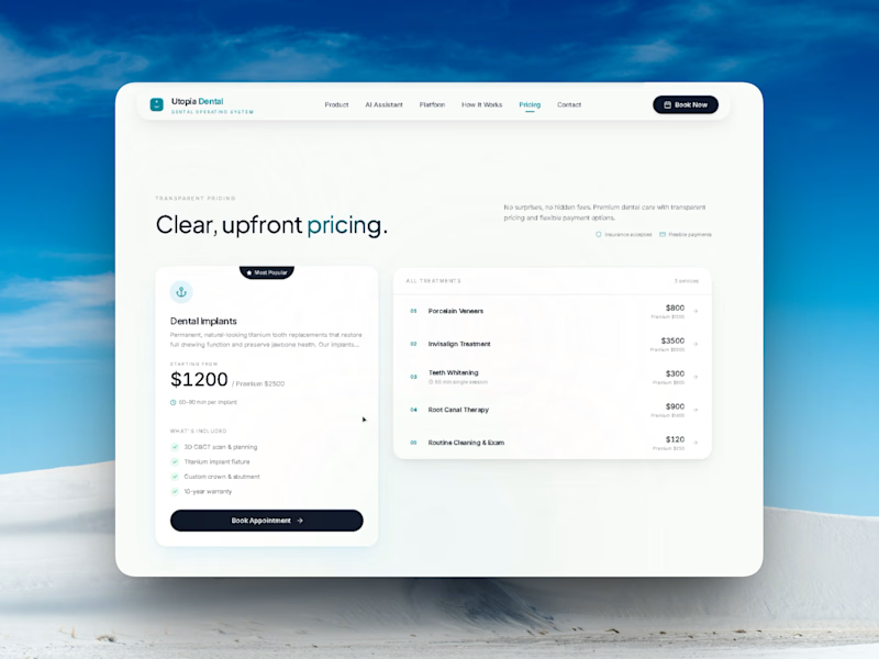
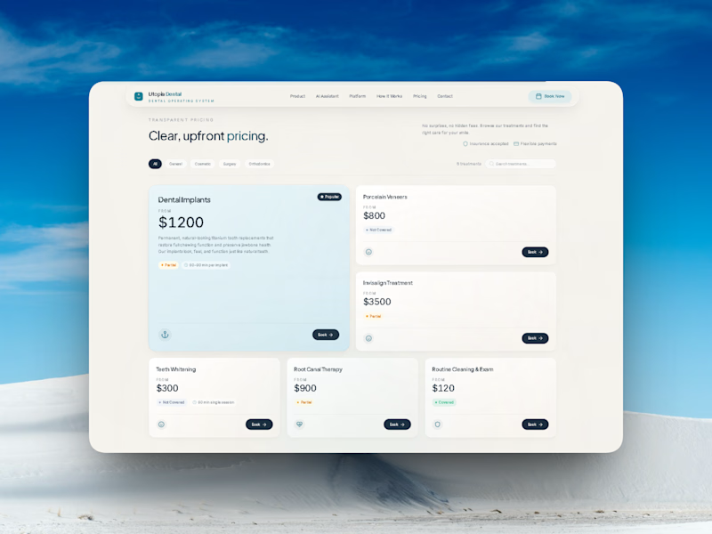
As part of the SmileCare Dental Portal challenge, I redesigned the pricing experience to make it cleaner, simpler, and easier to scan.
Before
• Multiple treatment cards competing for attention.
• More visual noise.
• Harder to compare treatments.
After
• One featured treatment card.
• Simplified treatment list.
• Better whitespace and hierarchy.
• Stronger focus on the primary CTA.
Sometimes great UX isn't about adding more—it's about removing friction.
Which version do you prefer? 💬 Before or After?
Building SmileCare Dental Portal has been a great opportunity to rethink how patients explore treatments and pricing.
#SmileCareDentalPortal #UXDesign #UIUX #ProductDesign #WebDesign #HealthcareDesign #DesignIteration #ContraCommunity #BuildInPublic
6 votes
Ends in 1d
The network for creativity
Join 1.25M professional creatives like you
Connect with clients, get discovered, and run your business 100% commission-free
Creatives on Contra have earned over $150M and we are just getting started
Related posts

Designed a modern, inspiring website for Greenova – Clean Energy & Solar Solutions.
Stunning hero section with powerful visuals of renewable energy, clear messaging, and a premium feel that highlights sustainability and a brighter future.

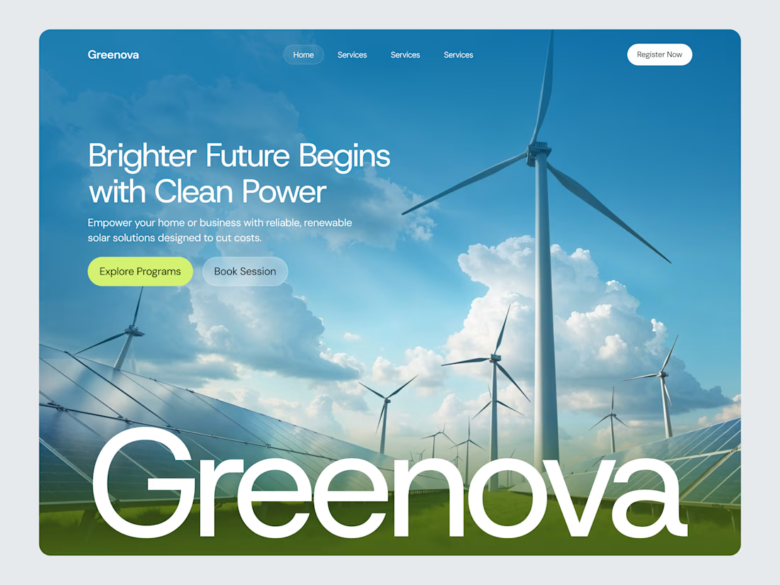

Clean, fresh, and impactful. Great design!

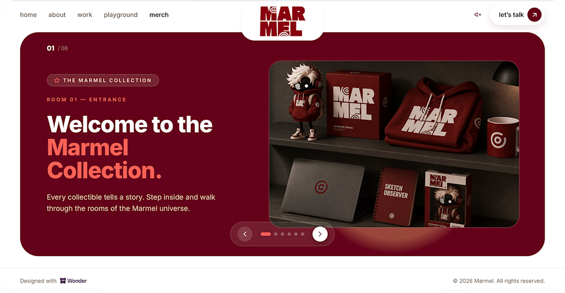
My submission for the Wonder Challenge is live ✨
I created my personal portfolio website with Wonder — from prompt-based design exploration to a complete Marmel portfolio experience.
Wonder helped me build the design foundation quickly, Claude helped bring it into code.
Live portfolio:
Web site live
Don’t forget to leave me a message in the Playground section. I’d love to read it.



Great

Design is rarely about making things prettier. It's about making better decisions.
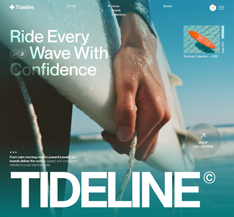
For this surf brand concept, I explored two hero directions.
A → Product-first. Puts the board and experience at the center.
B → Lifestyle-first. Creates a stronger emotional connection before introducing the product.
Which hero creates a stronger first impression?
A or B — and why?
Your feedback helps shape better design decisions.
#UIDesign #LandingPage #WebDesign #Figma #UXDesign #ProductDesign #CreativeDirection #BrandDesign #JuiceLab #DesignProcess

11 voted
32%
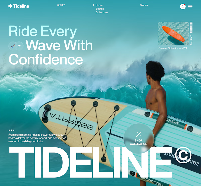
23 voted
68%
34 votes
Closed

Both work well, but B feels more premium to me.








Trending

Claude
Claude has entered the design space. How are you using Claude Design?

Contra University
Learn from expert creatives how to earn more using next-gen AI tools.
fifaworldcup2026
The World Cup is here and the whole world's watching. How are you designing for the world stage?
creativeaiflow
Creative AI workflows are evolving. What tools do you use, and what are their strengths and weaknesses?
freelancerlife
Freelancer life is wins, pivots, and everything in between. What’s yours right now?